Interiors Birmingham 2010 was a marginally more relaxed affair for me in 2010 as there was no filming with Channel M. Instead I ambled around at my leisure, sourcing products, interviewing for a trends dissertation and meeting new contacts. In my dreams! In fact, I raced around, trying to fit in all of the above, plus attending the seminars, tweeting, taking photos and still trying to control the Rose Cottage site from a 120 mile distance 🙂 Women & multi-tasking, we’re the bomb. All done on Nurofen and Red Bull.
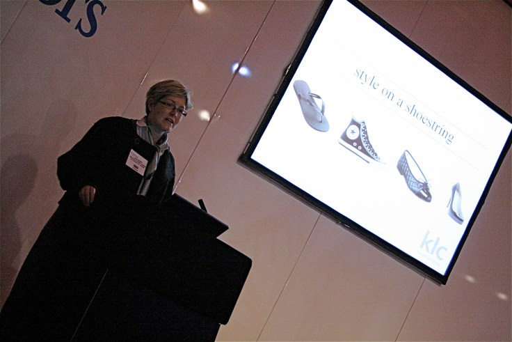
Favourite section this year – Hall 2’s Thinking Space, which incorporated an area curated by designersblock, a section dedicated to New Design Britain and a stand created by Bimingham City University. Also here was the Seminar Theatre which had a packed schedule of speakers hosting talks on everything from colour technology trends to bar design. My interest was sparked by a talk entitled Style on a Shoestring by Julia Begbie from the KLC School of Design as it sounded perfect for the kind of miracles Moregeous is often asked to perform 🙂 KLC run interior and garden design courses in London and regular readers of the Moregeous blog will know I’ve been on a one of their great fun and very informative day courses, plus I recently had a chat with the very approachable Jenny Gibbs, who set up KLC almost 30 years ago, at the BIID day in Manchester (Jenny is now president of the BIID – British Institue of Interior Design).

Eagle eyed readers may also have noticed that the Moregeous blog title has changed, life is all about the budget these days. After listening to Julia’s talk, which essentially was all about realising a high end look at a fabulous fraction of the cost, I realised I’d just smiled all the way through it, recognising many of the interior, building and styling tricks recommended as already employed for our own and clients properties by Moregeous Design. High spending might be possible for the Candy and Candy’s of this world but for us normal folk, it’s watch your wallet time.
Julia began her talk by explaining what was meant by ‘Style on a Shoestring’. It wasn’t about cutting corners and cheapening design, but about recognising that times are are tough for the vast majority of people. Though clients want a high end look, they may not have a high end budget, they may decide not to blow their limited funds on rented accommodation or they may be planning a move soon. They may prefer to invest their finances in other items such as pensions or cars, but still want a cool home. Lots of opportunities for designers to be inspired by design at the top of the market, yet cleverly translate it for their clients. Channelling the Chanel look via Top Shop, the runway look via the high street, if you like. Julia used lots of images to illustrate her points:
Example 1

The image above shows a bedroom from the portfolio of prolific Dutch designer Piet Boon – his work is To. Die. For. It’s a super stylish interior designed by Boon for his client, with the bed wall cladding fabricated from (I’d imagine) expensive timber. However, this look is SO easy to replicate. Local timber merchants all stock pine and timber cladding, which could be fitted to your bed wall and painted a luscious deep shade. PLEASE don’t leave the timber bare pine or it’ll look like the type of ropey sauna Avram Grant might visit.
I smiled at this image because this is exactly what we’re doing at our current project Rose Cottage – below is the just fitted cladding which frames the bath panel and areas behind the WC and basin. You can see it in all it’s pine glory pre-paint just under the loo and also what it looks like painted in a delicate Eau de Nil shade to create the client’s dream shabby chic bathroom (Addendum – this bathroom just won it’s Jan 2011 episode of ITV’s May The Best House Win – see blog for that date for images)

Example 2

Julia also spoke about the trick of repetition, which is used by designers to give power and drama to schemes. Instead of using one mirror, use several – you can see how this works to great effect in the Living Etc image above. This doesn’t have to be expensive when you shop at companies such as Ikea, or you could even buy second hand mirrors of approximately the same size and paint them all the same colour to create unity as well as repetition.
Smiled again, as below was a recently finished landlord makeover done on a very low budget, where I used 3 Ikea mirrors to add some interest to a room which lacked a focal point:

Example 3


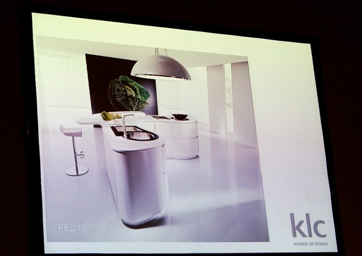
Some food for thought next on the heart of the home and you can see from Julia’s two images above how Ikea might have taken inspiration for their budget kitchen from the super glam Pedini image. I liked that Julia made this section personal by talking about her own kitchen refurb, her love of the crisp and minimalist Pedini image, but she explained that her budget ruled out a spend this high. Finding inspiration in high end design isn’t about stealing business from companies, because let’s be honest, not many of us could spend £20k on a kitchen before we’ve even considered the building and fitting costs. We would buy these kitchens if we could afford them, but we can’t, so we improvise!
We need to analyse the images we like, to see why we like them, and then work out which elements we can replicate. Julia said she wanted to organise a large digital image for her new kitchen to ‘get the Pedini’ look and it reminded me of this Ikea kitchen I finished in 2007 for a friend of mine. Although the units were basic white gloss, the use of a bespoke glass table, granite worktop, splashback, chunky slate floor and digital blind personalised the space and gave it the elements of style which resulted in it being featured in a national magazine:

Example 4

Another image Julia showed was the above close-up of a Bulthaup kitchen, where a mixture of materials ensures interest and adds style – the chunky steel section contrasting yet complimenting the timber worktop. I cannot tell you how simple this is to do. This kitchen below was a house I redesigned in 2005 where I used the Ulriksdal Ikea oak kitchen, but had fabricated a 1400mm central steel section to house the hob. It worked brilliantly as any splashes from cooking hit the steel not the timber and food could be prepped & chopped directly on the steel surface. I know this to be true because I lived and cooked there! Back then I think it cost me around £200 buying from a local steel fabricator, so expect an increase in material cost now, but it’s still way less than the Bulthaup model.

Example 5
I was too busy writing to snap a shot of the sticker images Julia referred to next, but she mentioned companies like Rockett St George and 95% Danish who supply cool and inexpensive wall stickers to funk up your walls if decorating is not an option (maybe you rent or are shockingly bad at painting). A great way to change the look of a room or add a new vibe without spending too much money or time!
This is a rental flat we finished last year in West Didsbury which featured in 25 Beautiful Homes. The plain white wall of the living room was brought to life with 4 packs of Ikea wall stickers and a few crystals!

Julia’s informed, accessible and interesting talk hit the nail squarely on the head for many of the interior designers in the room who don’t have the luxury of clients with endlessly deep pockets. Clever designers dealing with clients who have ‘normal’ budgets make sure they source at the top end, then add in their own and the client’s ideas, to come up with something unique – after all anyone can buy off the shelf! Follow the basic design principals and then mix it up a little, remembering that not everyone will like what you do, but as long as your client does, that’s what matters.
My digital blind client told me she smiled to herself every evening when she turned on the kitchen light and pulled her cactus blind down, she didn’t give a fig what her more conservative friends thought! And that kind of feedback, as those blinking annoying adverts say, is priceless.


Some great tips here and lovely images. Those walls stickers are stunning – and I love the three mirrors!
Thanks Rowena. My tenant loves the stickers too, I don’t think she’ll ever leave!