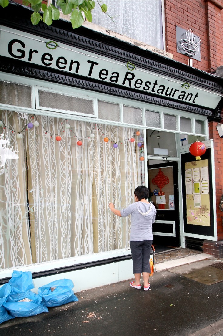
So I had the brief and owner Jenny started to peel off the window stickers – Green Tea was to be glamorous but not girly, comfortable but not old fashioned, fresh looking but not too clinical. Simple eh? Hmmm, not so much 🙂
As you will see not only did the ideas bounced around change dramatically, but as did the extent of works, mainly down to a little buggar called Dry Rot, an old friend of mine from the 90’s and my dpc days. Co-incidentally when I was having a post-work drink with Helen and Pete from Didsbury Life a couple of weeks ago, they mentioned that we’d surveyed their house over ten years ago – luckily it was a very positive experience, but what a small world it is and what a reminder that you should always act in people’s best interests as you never know when you’ll meet up with them again…. had we done a bad job or tried to rip them off, I wouldn’t be here working on Green Tea, a salutory Life lesson, pun intended.
Where was I? Oh yes, the interior!
The Green Tea Girls had sent through to the Life Team some images they liked (below) and from these the initial branding ideas were born – clean and crisp, with a single accent colour. Their leaning was towards lime green, similar to the image of the London Ping Pong Dim Sum restaurant, which the girls felt reflected their healthy, fresh food really well and ensured their look was much more contemporary, with the dated flowery wallpaper banished forever!

They also liked this image of a Lebanese restaurant in Soho with a cool and stylised exterior and just the single striking deep yellow.

BUT!!!!!
I just wasn’t feeling the lime. Don’t get me wrong, I love a bit of lime and have used it to great effect on previous jobs, but somehow it just didn’t seem relevant to Green Tea. It didn’t say anything about them, didn’t tell their story or reflect anything I’d heard about them. In order to delve a little deeper, I asked Helen to forward a short list of questions trying to evoke some sense of what they were all about, their likes and dislikes, their passions, their sense of style and self – client homework, if you like 🙂
Some of the key words I got back were: fresh, family, BenXi, chilli, different, nature, simple, grandma, spicy, and when this was coupled with the initial brief, ideas started to spark off in my head. It was important for the girls to ‘tell their story’ and promote their home region in China, the Liaoning province. Research showed me that this was an area noted for it’s natural beauty and there were several key elements:
Mountains – steep elegant and breathtaking
Lush tree growth – green pines, delicate willows and the famous maple leaf festival in the autumn
Water – lakes and streams abound
Flowers – Magnolia Sieboldi
Caves – with stalagmites and stalagtites
This very strong connection with nature, together with the clear desire coming from the questionnaire that the girls wanted diners to feel relaxed and comfortable as well as being in a ‘contemporary space’, distanced me even more from the interior design looking too crisp, harsh and sharp, both in terms of the materials specified and the colour palette. Everything I’d discovered had a feeling of warmth to it and I felt that we could keep the look fresh whilst maintaining a sense of tradition and relevance.
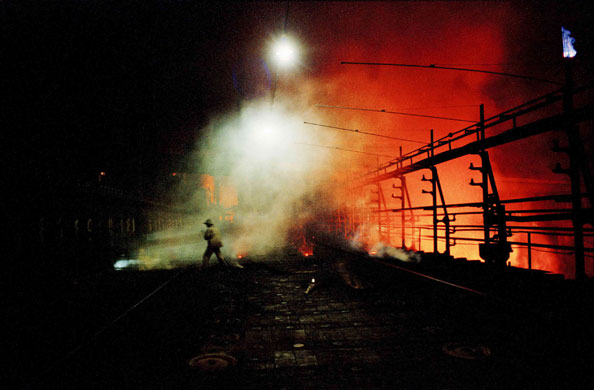
There is another element to this province which I felt was important to include. Coal and mining are massive news in the region, not so glamorous in terms of interior design you might think, until you look at the image below soley in terms of colour. The fiery maple red…. the deep charcoal black….. the smoky cream…..
 So, easy peasy (!), I wanted to reflect both in the design and materials specified, the history and culture of the Green Tea Girls and the Liaoning region.
It was all starting to come together, just as the walls started to fall apart….


Leave a comment