So, in between tenants refurbs and filming at Rose Cottage, Project Green Tea has been moving on a pace. This is a first for me, trying to describe why I’ve plumped for a certain scheme, so bear with me. Bit risky this too, if you decide the final scheme doesn’t reflect these words, so it’s neck on the line time! The image below captured for me a certain rough beauty, fiery reds with the ethereal nature of the dust clouds and the industrial nature of the area of BenXi and I wanted to reflect that alongside the natural beauty of the region above with its towering mountains, vivid coloured maple leaves, caves filled with stalagtites and romantic legends.

First to colours. As mentioned previously, lime green wasn’t hitting the spot for me and surely it’s clear that the obvious replacement as the accent colour for the scheme was the deep red-orange of the images above.
But with black and white? For me that was too stark and ‘takeway’ like, what the girls wanted was a restaurant which was contemporary but relaxing. Taking inspiration from the deep charcoal of the coal mined in the area, I plumped for Night Jewel 1, a Dulux (yes, we tested it cause they are a bit hit and miss!) paint which proved to be deep, rich and really rather sexy. Their image is tiny so to give you an idea, it’s very similar to the below RAL hue.
I tried several whites in Green Tea next to the charcoal to see exactly what they looked like – I wanted the creamy tones of the region’s magnolia flower, without, need I even say it, resorting to Magnolia *shudders*

I hadn’t used any paints from the Light and Space Dulux range before and one of the testers was their Morning Light shade, turned out to be the perfect milky white and really did seem to shimmer slightly, reflecting more light when compared to the other tester pots tried on the wall.
Next question – how to bring in the maple red? Paint one of the walls? Too simple, not glamorous enough.
Wallpaper?


I looked at a few similar to the ones above and they were all just a bit bedroomy, been done before, boring!
Something was niggling away though, something I’d seen and liked but never used. I rummaged through my box of tricks in the office to find this wallpaper – Eureka!
 At the same time there were discussions within the Green Tea team about rearranging the seating to include benches. I winced at the thought of benches scraping against such amazing wallpaper and it struck me that panelling the lower metre of the whole restaurant may well transform the space as well as providing protection to the lower sections of the walls. Panelling is traditionally vertical but here it would be horizontal to represent the natural strata in the coal. Painted charcoal maybe….with the banding of the maple colour above…. what about a picture rail to give height and perspective like the mountains of the region?…. I started to visualise the space and got a wee bit excited (in a nerdy interiors way), but also a little scared as these were BIG changes to be done in a SMALL time frame. How had we started this job? Oh yes, a lick of paint…..
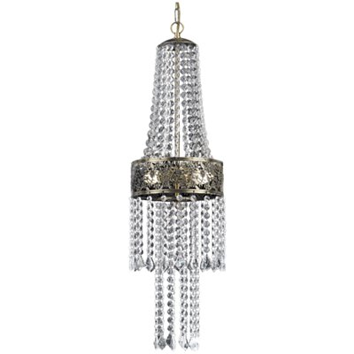
What about the WC? This had been in a very sorry state and definitely needed to be made Moregeous. With the new charcoal panelling and picture rail there was a danger the small room would feel claustrophobic, so some serious shimmer was needed to bounce the light around. It would come in the form of the super-luxe pendant below whose crystal drops form Green Tea’s very own stalagtites, and the cultured pearl paper chosen to retell one of the legends of the BenXi region of a beautiful pearl treasure.
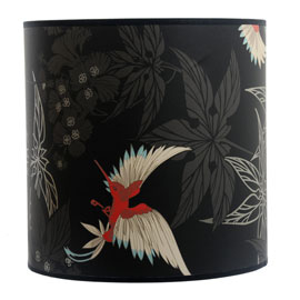
What about lighting in the main room? The two original pink paper lights just wouldn’t cut it in the new space but there wasn’t the budget for an all-singin scheme so a touch of glamour with pendants was required. I looked at lots, and I mean LOTS of light…. some with obvious oriental influences, some with maple red features, some were too small, some too plain…
But finally one was just perfect, delicate, pearlised, ethereal, and looked fabulous against the charcoal picture rail and maple wallpaper:
Nearly there……well, apart from actually DOING it all that is. Every idea was bounced back and forward between me, the Didsbury Life office and the Green Tea girls as everything had to tie in, branding, menus, web-site, interiors, exterior…. The final touches needed to be the artwork and that does take time to find, however a very fitting temporary solution was to hand. Sometimes I take images just because I think they’re gorgeous and they sit patiently in my Mac waiting for a chance to reappear in a scheme or a blog. A few years ago when travelling back from Scotland, I drove through the centre of the country on the A68, a stunning drive through amazing British countryside on a crisp autumn day. The below maple leaf image has just been waiting for Green Tea…


Interesting to read about the creative process there – harder than it seems to articulate it, because it’s often so organic and shape-shifting!
I found it really quite difficult to put down in words something which is usually in my head! Hopefully when it’s all finished (praying for the paper to arrive soon!!) the images will back up the words….