
 A few months ago I wrote a (very helpful, you’re welcome) post giving some tips on designing small bathrooms, inspired by the fact that I was indeed designing, yup you guessed it, a small bathroom.
The brief was to make it work well as a practical family space, whilst still being glamorous as a mummy sanctuary and roomy enough for 6’4″ dad to shower. No mean feat when a space was only 1.8 square. Consider the fact that the average bath measures 760 wide, so nearly half the room is taken up already or that a double bed is 2m long, and you get a sense of the challenge of making this room tick all the above client boxes. On the plus side there was a large square window flooding in light and the door was perfectly tucked away to one corner, which was very helpful. This not only allowed the bath to run down one side of the room but gave space for it to curve out into a P Shape to give a better showering area.
The 1800mm (1.8m) room length left 100mm spare at the end of the 1700mm bath, so we tucked in a slightly angled shelf for toiletries. There was literally just enough wall run for a basin and WC next to each other, and I mean *next* to each other. 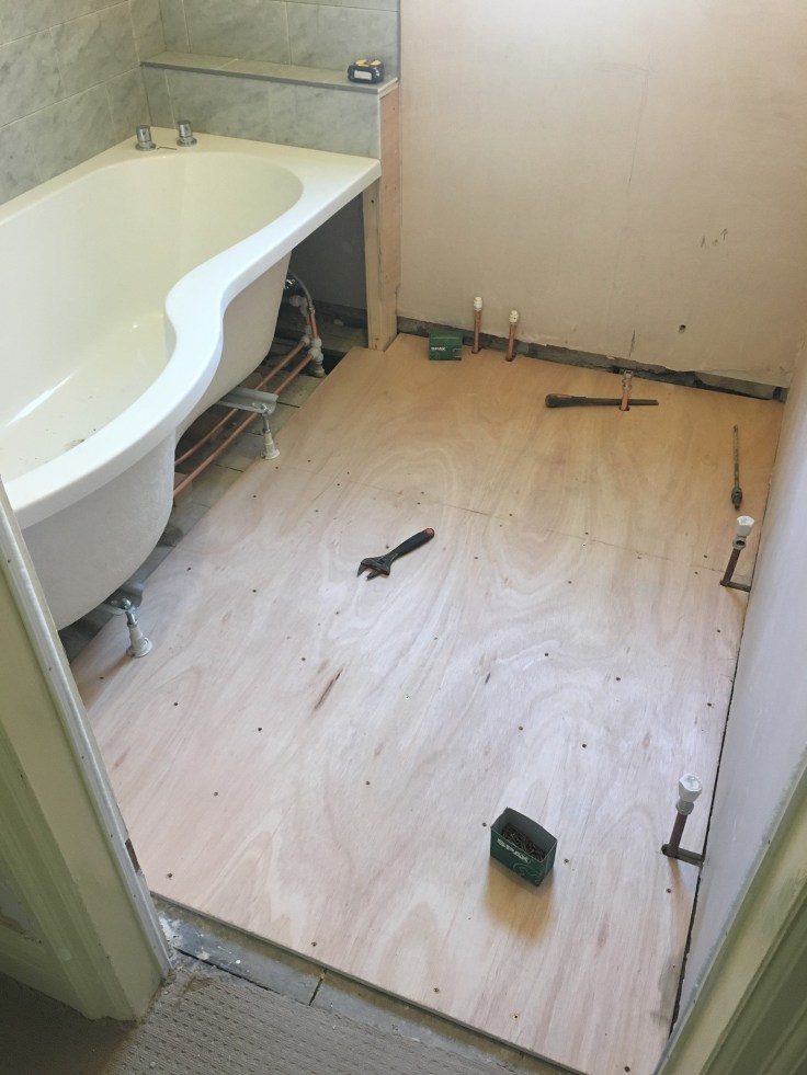 The budget was a consideration so plywood was only run to the areas where tiles could be seen, rather than under the full bath. This is a sensible choice if sound or heat loss isn’t an issue. Always fit 18mm plywood if you’re using ceramic or porcelain tiles as grout lines to tiles may crack if laid direct onto old floorboards, which have a tendency to move underfoot.
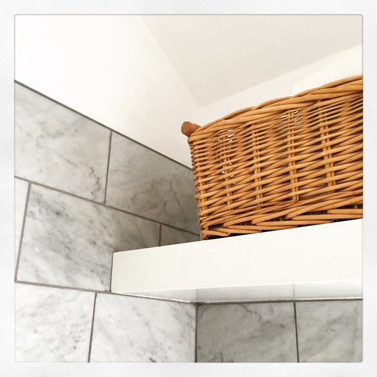
With little room at floor level, I designed in an overhead shelf (a bit of a Moregeous signature now) for storage, towels and greenery, perfectly used by the client. Lighting is so important in a bathroom and in this one there aren’t just LED ceiling spotlights but under shelf lighting and dimmable wall lighting too. Over the invisible mirror 😉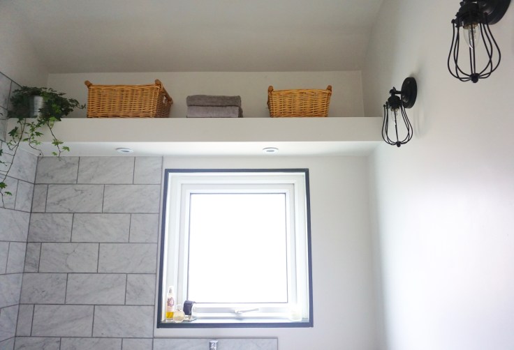 The wall hung cabinet gives the client lots of storage to keep the whole look clean and tidy, and fits in brilliantly even right next to the bath. The whole suite was from Soak, a company I’ve used a couple of times and they’ve been spot on: brilliant prices, great service and value for money products.
I adore the grey marble tiles from Topps Tiles, very affordable considering they’re real stone. They give a fabulously glamorous feel and add real luxury to the small space. Using a darker grout gives a contemporary edge, which we complemented with the dark framing to the window and woodwork.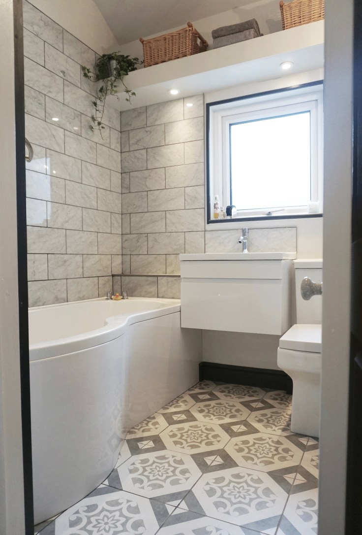 Choosing pattern for small areas can scare people but it really REALLY shouldn’t. These utterly gorgeous tiles from the Baked Tile Company make the floor sing, adding personality and style to the grey and white scheme. I think they work beautifully with the marble and the very modern charcoal radiator, also from Soak. We brought the WC forward a little just to stop it being tucked too far behind the basin cabinet. Always check where things will be positioned by drawing them on paper, or even on the floor!
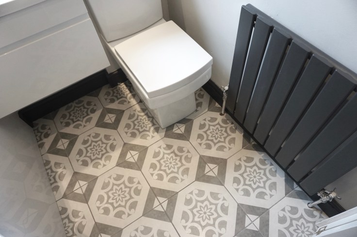 Just a bit of a difference to how it was before 🙂
 Another little suggestion for P shaped baths – because the screens are so large and kind of in the way – is to position the taps on the opposite end, the ‘head’ end instead of the feet end. This way when the client is bathing her baby, she can easily reach the taps without reaching round the screen. It also makes the taps easier to clean around too, when they aren’t under the shower constantly getting wet.
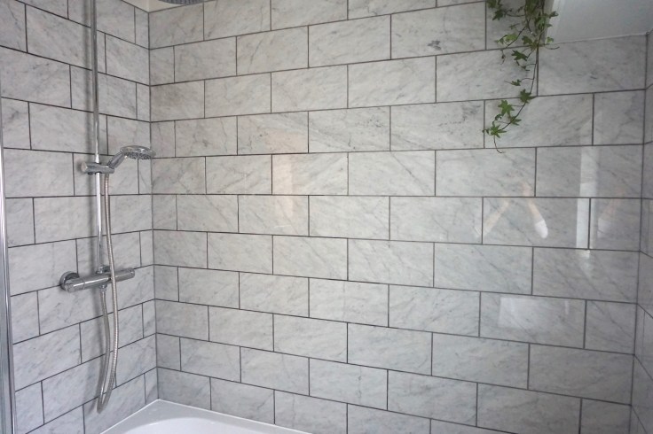 My final tip… always insist on a G&T when doing the final touch ups ;-)

Love it! Those tiles are gorgeous and the shelf is a great storage space. I hope my current bathroom renovation turns out looking this good! 🙂
Thanks Anna 🙂 The tiles were great value actually, and my client loved them. I’ll pop over to your blog to check out your bathroom! Sian x
what a great transformation, so clean and fresh!
Thanks Jennifer! X