 I haven’t posted this past fortnight, which makes me very remiss as a blogger but honestly, I’ve just been recovering from the emotionally rocky start to my year and trying to catch up on all the things which have lapsed over the last couple of months. I’m a renovator, landlord and human being before I’m a blogger, so those things have had to come first, with only enough energy to fit in some Netflix and filming for a new TV show as well.
Sorry, what??! Yep, as if we’re not trying to juggle enough, I’ve started filming for a new BBC property show! I’m sworn to secrecy and if I say anything at all they’re going to set Daisy onto me. See above. She is clearly a very vicious hound so I’m keeping schtum and simply saying…. watch this space 🙂
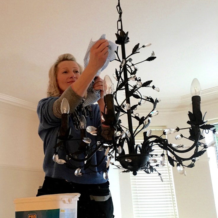 We’ve had three lots of tenants out in the past month, which has meant the requisite cleaning, fixing and sorting duties for the hands-on, self-managing landlords that we are. As you can see, I *really* make it easy for us by putting simple lighting up which just takes a quick wipe….errrr….. maybe not. This is in the Princess Flat, so named because every girl who’s ever viewed it has fallen in love with the chandeliers, wallpaper and gorgeous cream furnishings, and announced it makes them feel like, a, yep, princess. Extra design details mean we never have any voids and we have extremely loyal tenants. I believe, as a landlord, that if you create lovely homes, tenants will care for our properties and treat them with respect. This is largely true, though the cleaning abilities of today’s Millennials on moving out does leave a lot to be desired. Millennials cannot clean to save their lives, I have decided. Sorry Millenials.
 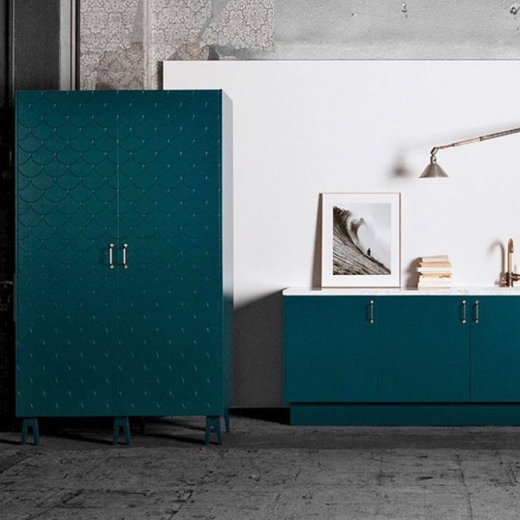 I’ve been aware of Superfront for a few years, the Swedish company who make gorgeous doors and handles for Ikea kitchens, but hadn’t seen this Big Fish design actually in a kitchen before this week. The image above isn’t the kitchen I visited, but you get the idea from their stock photo. It look even better in ‘real life’ and I’m extremely tempted to use them for here at Moregeous Mansions. I’ve been designing and installing kitchen layouts using Ikea carcasses and doors for over 20yrs and they’ve stood the test of time in all my properties. Very tempted indeed.
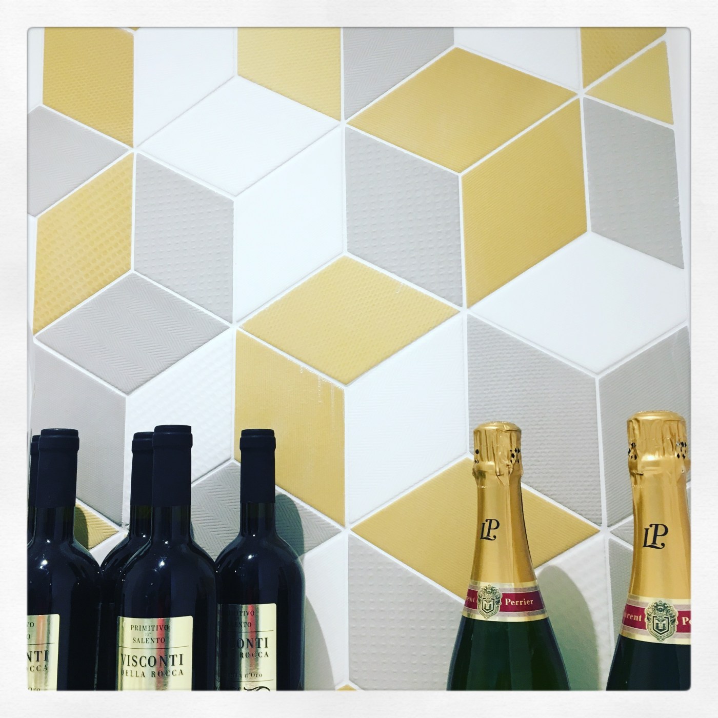
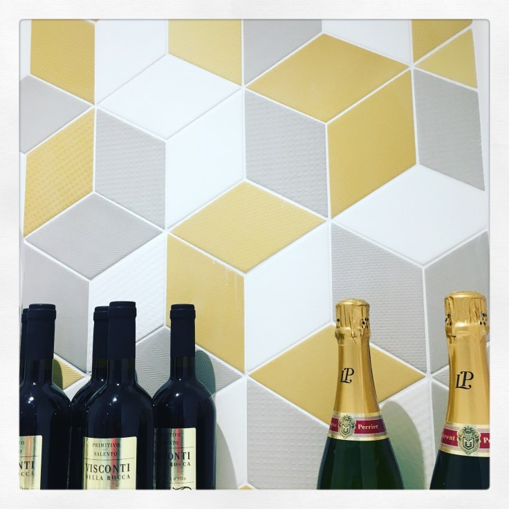 Still hung up on tiling decisions here at home too and am rather taken with all the new geometrically designed tiles which you can personalise by playing around with shapes and colours to create your own unique pattern. We’ve three bathrooms to do here: one is already tiled in Viola Calacatta by Mandarin Stone, one is soon to be done in herringbones by British Ceramic Tiles (See some herringbone inspo HERE) and the third is driving me potty as I can’t decide what to use. I quite like these above at Casa Ceramica in Manchester, but maybe not with the yellow. Maybe black. Arghhhhhhhhh, there’s too much choice!!!
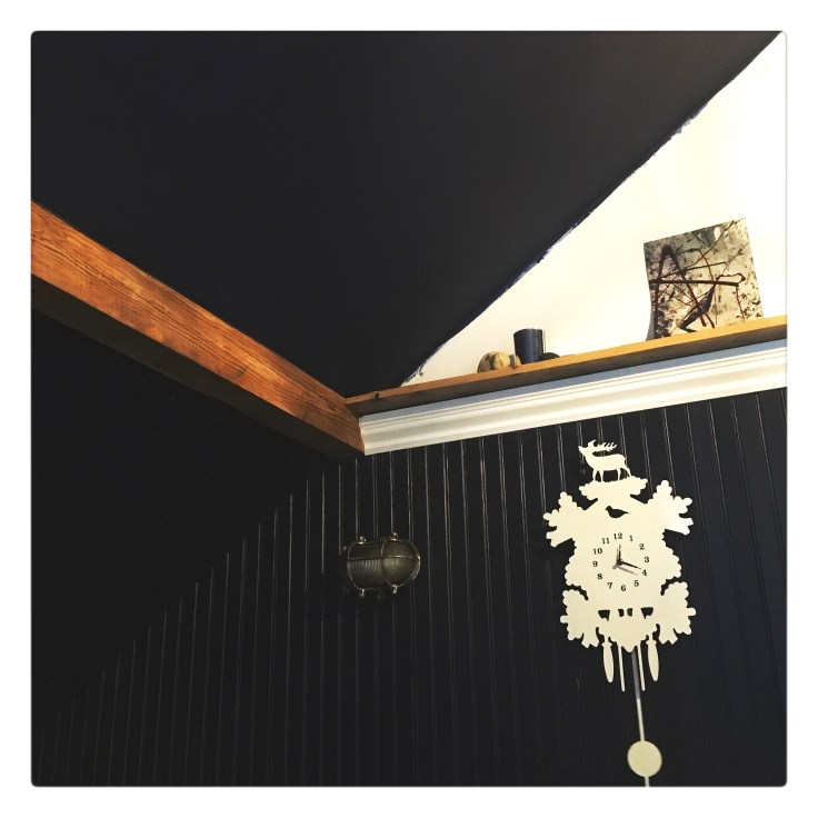 Up in the dormer things have really progressed. We’ve fitted the ‘new’ decorative cornice, copied from our original architraves and carved into new pine by the very clever Dresser Mouldings, around the lower mezzanine room to create a lovely shelved area. Because the moulding is so wide, when it’s fixed to battens against the wall it’s deep enough to sit a shelf on and can be made to any length. I’ve used long pieces of the original floor boards on the top to create the shelf. Looks good huh? Really pleased with the outcome, it’s exactly as I’d imagined it would be. Just need to wallpaper now!
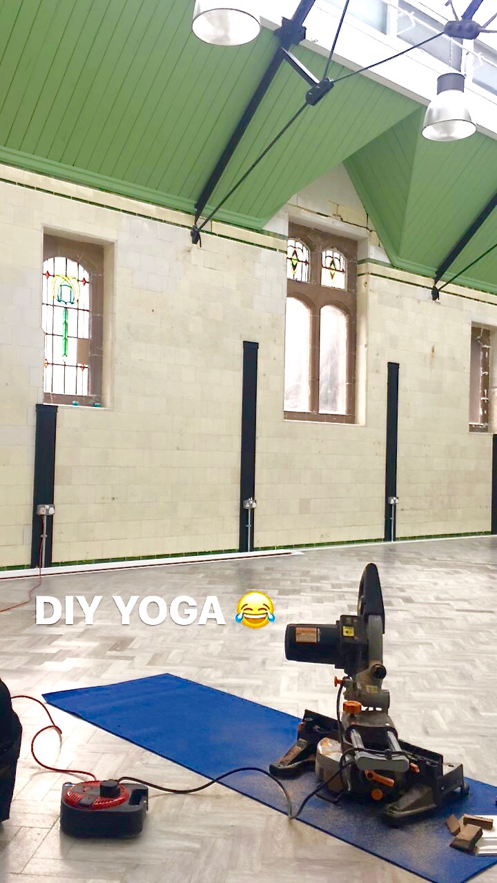 Over on our volunteer job at the Baths, there’s been a lot of snagging and design work needed to finish off the newly restored Studio 2, ready for a bug launch party this weekend. We installed some beautiful lady’s slipper skirting in the new treatment room, paint stripped and cleaned some of the stone windows, painted the vertical timber posts which mark where the old slipper bath cubicle walls were and nearly finished the edge beading before being thrown out by a yoga teacher and 25 downward dog focussed ladies. I’m not sure they’d ever seen a yoga mat being used under a chop saw before but we had to protect that gorgeous Amtico floor somehow!
I used a F&B colour there which I’d not tried before – Tallow, a light reflective shade which picks up the glow of the original Edwardian wall tiles wonderfully. It’s such a perfect capture of the deep cream richness of church candles and gave me good coverage even with one coat. Spot on. I will do more coats to be professional, just saying how impressed I was with the depth of colour even with only one. Not all paint brands can be relied upon to nail the pigment depths and some need way more coats than they state on the tin. You do pay more for F&B but you get the coverage you pay for, plain & simple.
This next week’s a busy one: more renovating, our utility starting to be fitted, client garden design jobs, more DIY at the Baths and some writing jobs. No rest for the wicked huh 🙂
PS Daisy is really Matt the Landscaper’s new puppy who came to visit with him last week. How cute??!

Wow you have so much going, not surprised you don’t have time to blog!! Look forward to hearing more about the new show x
Oh the guilt of not blogging though 😉 Thank you Vicki, I’m looking forward to being allowed to share :)))