Been a bit waylayed with Rose Cottage, Green Tea and life in general for the last few weeks and just realised I’ve not posted any images of the completed living room/kitchen and shower room in Project Squeeze, and you’ve already seen the Bedroom shots weeks ago!
Originally it was an attic space which had been converted into a very pokey, dark and dingy studio flat, with the living room/bedroom as one room, plus separate shower and separate kitchen. The sketch below shows the original layout – the room on the left was the kitchen, the narrow strip in the middle was the shower room and the largest area to the right was the bedroom / living room. The corner shown in the image above is the area below where it says 1700 high (to the left of the chimney breast).
 With a bit of Moregeous jiggery-pokery, stud wall shifting and a couple of extra Velux windows, Squeeze has become much more light and airy, with the kitchen and living room now in the large right hand room. By moving the shower room to the far left instead of in the middle and having the entrance in from the bedroom, it meant the space could be upgraded to a one bedroomed apartment – much more desirable. Below is the layout plan which replaced the kitchen and bathroom above, you can see that it’s a squeeze (NOW you get the title!) but it works. If you’re stuggling, look above where it says 2060 top left – that’s where the loo below is now. I angled the corner you see below bottom right to give a better view into the living room.
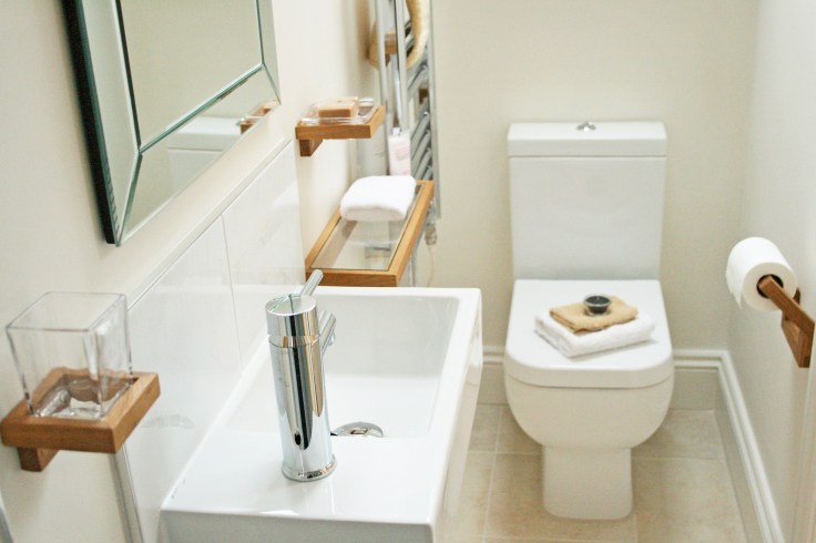
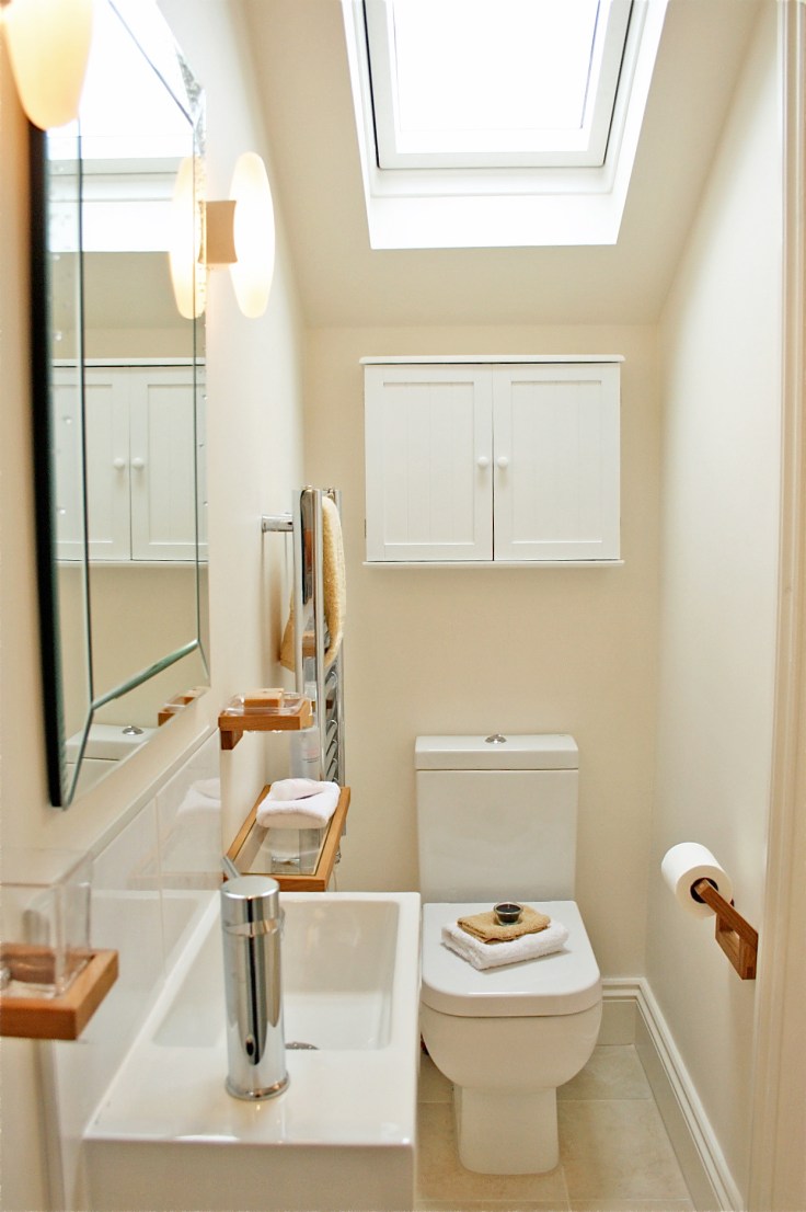
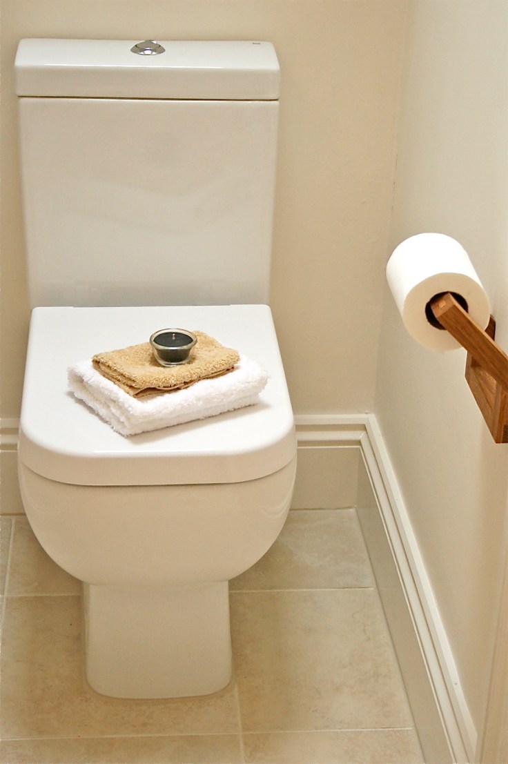
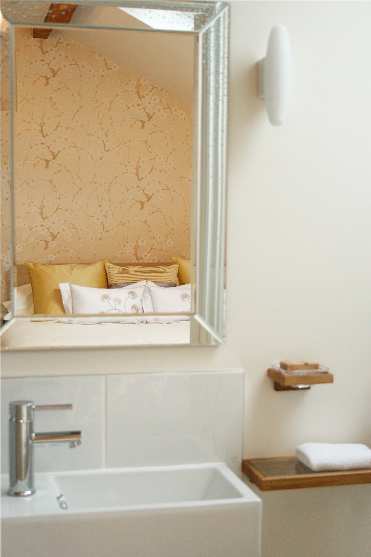
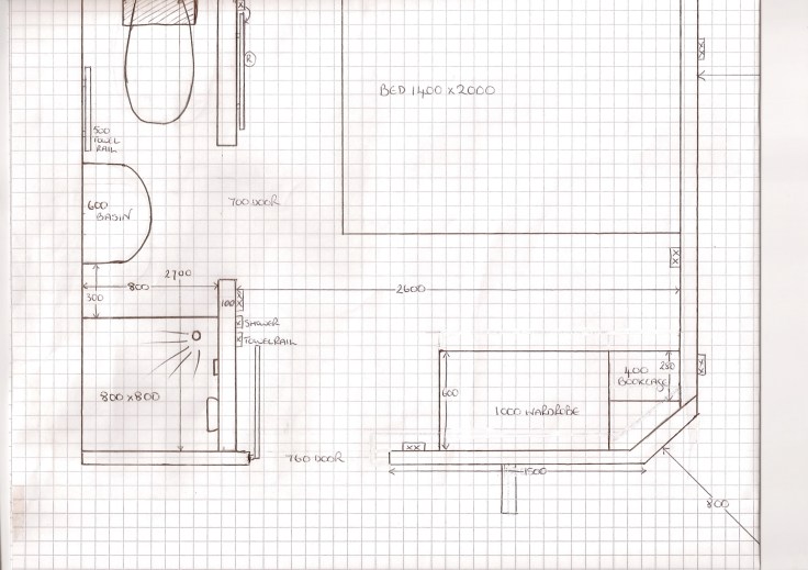 Still finishing off the living room images, but here are some shower room shots to show you what can be done on a budget with a VERY tight space – only 800mm wide and 2700mm long. Ignore the basin which says 600 – the basin ended up being a linear style which allowed more room to manouevre but was still perfectly adequate for a shower room for a single person.
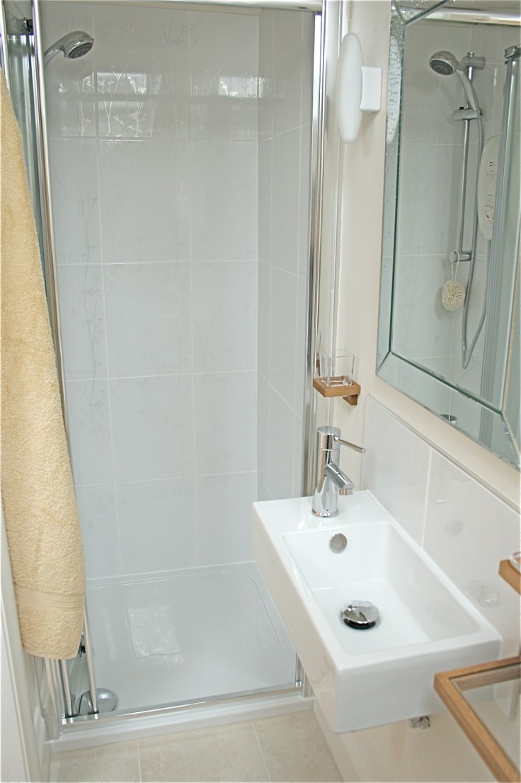 The limestone effect tiles are ceramic, the shower wall tiles are B&Q from their Designer Gloss Tree collection, the solid oak accessories B&Q, and the basin, shower cubicle and tap from Landlords Essentials. The lights are Habitat Claire Norcross’s Haruki which I’ve used before and the crystal mirror a BHS special. See – you don’t have to spend a fortune to be More than Gorgeous!!
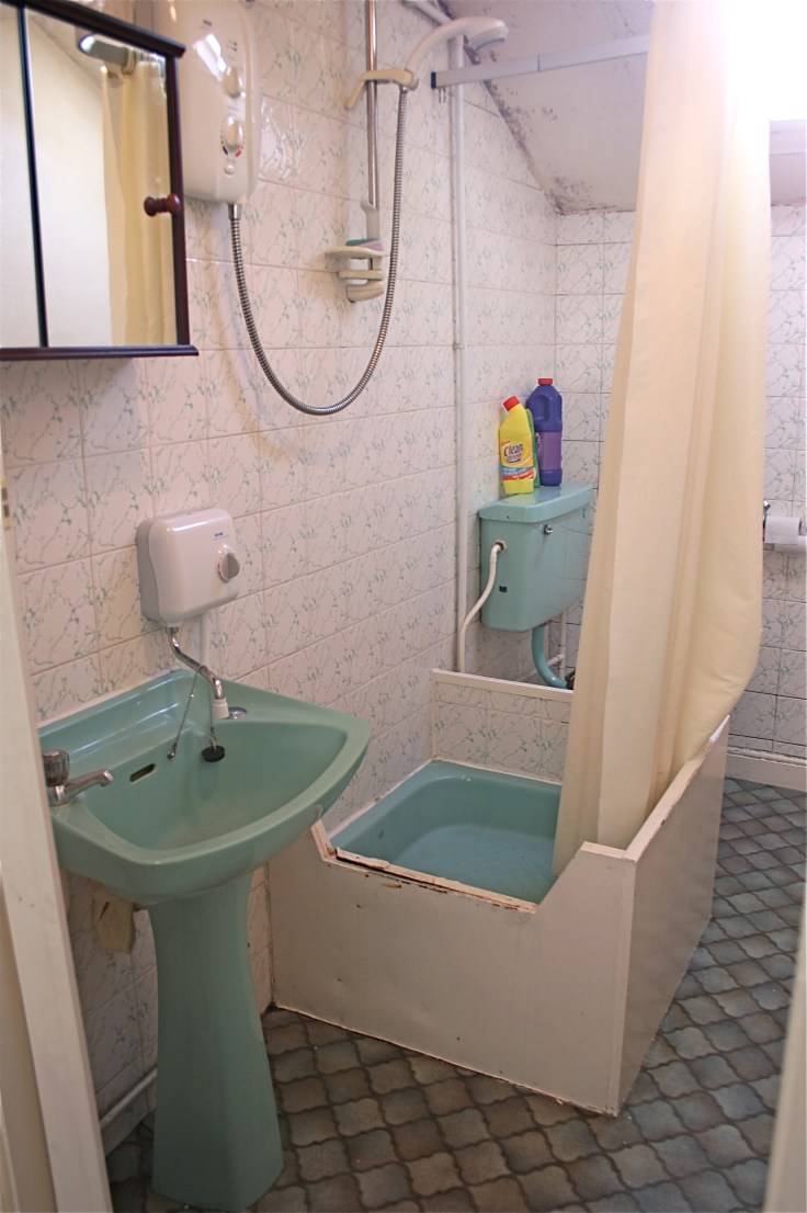
This was it before, btw…..

What a transformation! Small, but perfectly proportioned. Looks fantastic.
They don’t make diamonds the size of bricks (spoken as a 5’3″ person) 😉
Can’t understand why you didn’t leave that lovely original bathroom in. Very, erm, retro!
And on a serious note, a stunning job. Gives me bathroom jealousy.
Retro is one way of describing it….
Hi,
Love the limestone effect tiles…..hope you don’t mind sharing where you purchased these from…thanks.
Karen
Not at all! They are a ceramic tile which looks like limestone (easier for rentals as less maintenance). They are from Waxman Tiles in Halifax – http://www.waxmanceramics.co.uk and the tile is called Kronos. It comes in four shades, the floor tiles are 33 x 33, and the wall tiles vary, hope this is helpful x
This looks FANTASTIC.
I love the layout. It’s much better. More logical, “cleaner”, brighter… the shower in the middle was really weird.
Great job.
Weird, and also green which is marginally worse 🙂
wow! I’m looking to add a bathroom in a small space very similar to this. Thank you so much! It’s gorgeous!
Hi this looks great! We are doing a room of exactly the same dimensions and were
wondering what the dims of the sink are?
Hi Lucy
The basin was approx 275 from wall to front and 400 wide, I just got it from my local plumbing merchants. There are lots online if you tap in the dimensions you want under cloakroom basins. There are some here (not a sponsored link, just a tip!) : http://www.betterbathrooms.com/bathroom-suites/wash-basins/cloakroom-basins/ x
Many thanks! Lucy
Hi, I know this post is almost 5 years old but I have a question about the shower. Is that a swinging in glass door? What are the dimensions of the shower?
Hi, I’m so sorry for the late reply! It’s a folding door, which folds inwards to save space x
Where did the door come from and is glass?
Hi Ruth, sorry I missed your comment earlier than this! Yes it’s glass but I can’t remember where it was from. Most plumbing suppliers will source you one in that size though x
Thank you so much, you’ve inspired me and given loads of motivation with your project squeeze to tackle my en-suite shower room.
Amazing!! I’m so pleased to read this 🙂
I love the shower room and it has given me ideas for our own downstairs loo, which I would like to upgrade.