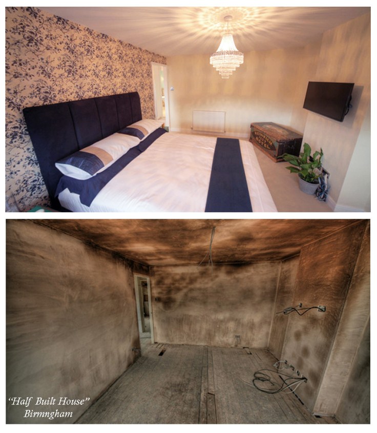
So, those interiors designers amongst you, how would you like the responsibility of transforming a newly married couple’s bare plaster, barely floor-boarded space into a dream master bedroom with this as a guideline…..
Elegant master/hotel style/romantic grey/relaxed neutral/ glamorous silver (but not patterned wallpaper throughout) /chick mellow yellow (unsure to love or hate)/English country house
…..yet still surprise them. Hmmm. Not a huge amount to go off really is it. Plus I was under pressure not to make all four houses in the Half Built House series look the same…. but EVERYONE wanted grey!! The purple / grey trend seems to be everywhere at the moment and I didn’t want Claire and Matt’s bedroom to be “so 2012” 😉
I felt we could achieve an elegant classic look with the feel of an ‘English country house’ without it being twee, but also had to bear in mind their ‘wants’ for the other rooms on the first floor – Matt wanted a super modern office and they both wanted a contemporary bathroom which wouldn’t date. A couple of their ‘like’ images were also quite brave and showed a lack of fear about colour and strong pattern – result!
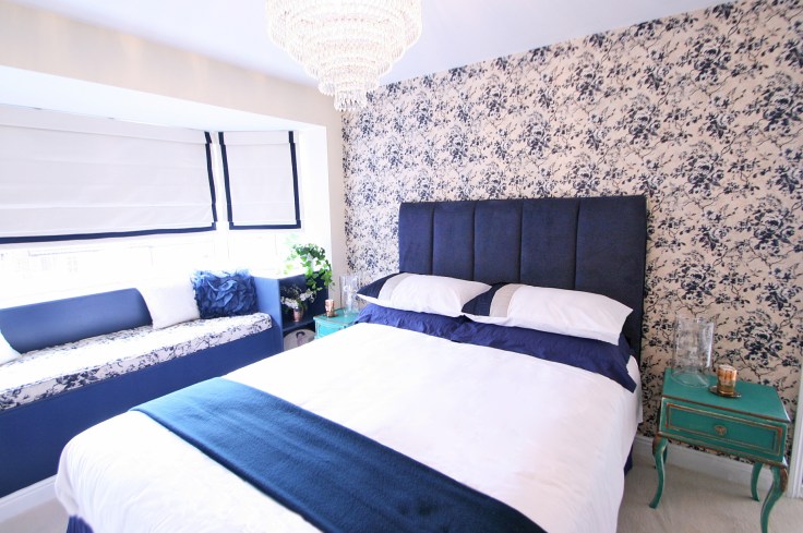
This is the scheme I came up with, inspired by both a beautiful Rose & Lee copper candle I’d bought at a vintage fair and also the amazing verdigris green colour created when copper reacts with other chemicals and water. I chose a deep French navy to temper the rich green. Not a colour combination which, to be honest, I’d seen used before but I thought it looked lush.
 The gorgeous verdigris bedside cabinet in the image above was the creation of Annie Sloan paints using a new colour for them – Florence – perfect for our scheme and it inspired the bedside tables I upcycled.
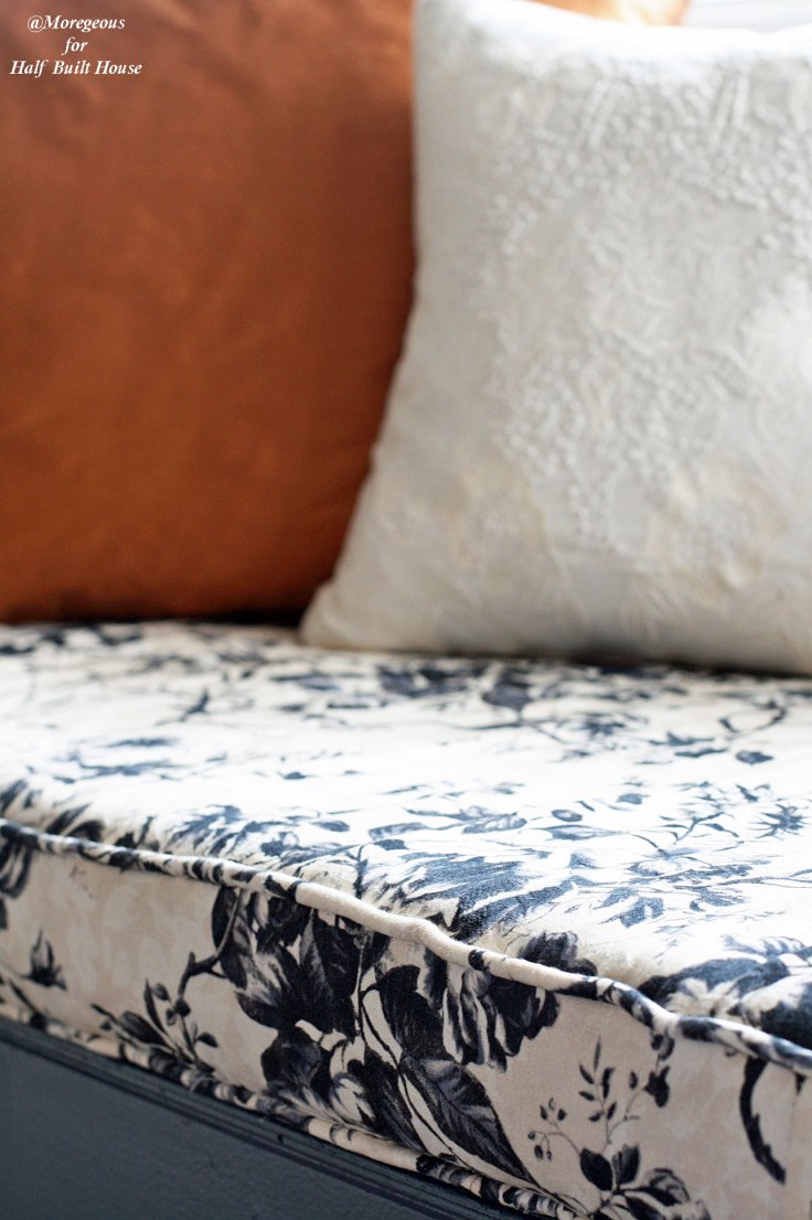
The addition of the French navy allowed me to specify a House of Hackney pattern called Dalston Rose which I’d seen at Interiors UK in January, though I decided to pare back its use to only one wall and the window seat cushion to suit Matt & Claire’s more restrained style. It gave a funky feel to a traditional country house look, not for nothing have their designs been likened to Colefax & Fowler on acid.
 Next I specified Dulux’s Barley White for the remaining walls as it blended so well with the creams of the wallpaper. It’s vital when choosing paint to get a sample and actually put it on the wall, then compare it to the fabrics or wallpaper you’ve picked to make absolutely sure everything works perfectly together.
I’d decided on a deep Breton Blue for the window seat woodwork, with the Dalston Rose fabric used for the padded seat to match the feature wall. The super talented Glyn Smallwood Upholstery made the bespoke cushion and also a fabulous oversized navy headboard from an image and some fabric from a packed-to-the-rafters trade warehouse in Birmingham which we sent up to him – I wanted the sense of a Chanel padded handbag! No more rough underfoot floorboards for this master bedroom once the boys at Happy Feet Flooring had visited, only a soft cream carpet for warm newlywed tootsies 🙂
For the newly configured three drop as opposed to five drop window bay (I’ll blog this properly later!), I asked Kay at Curtains Made For Free to create a special French feel by making cream linen roman blinds with a navy ribbon inset trim. She hadn’t made them before but did a wonderful job, they were just how I’d imagined they would be.
So….. did you like what you saw on TV?


Leave a comment