
Delighted to be posting some before & afters and an overview of the design thinking behind a restaurant I recently reimagined, redesigned and decorated. As you can see below, it was a complete transformation which included virtually a full rewire, completely new male & female loos, re-plumbing, joinery, full decor, upcycling, upholstery, and even dressing for around £20k all completed in a fortnight. Not bad at all! I’m so proud of what the team achieved in such short time period of hard work, given that there was no real on-site planning time possible. Clients Mike & Em loved the concept board, and were brave enough to just go with the big top flow, albeit given a contemporary twist
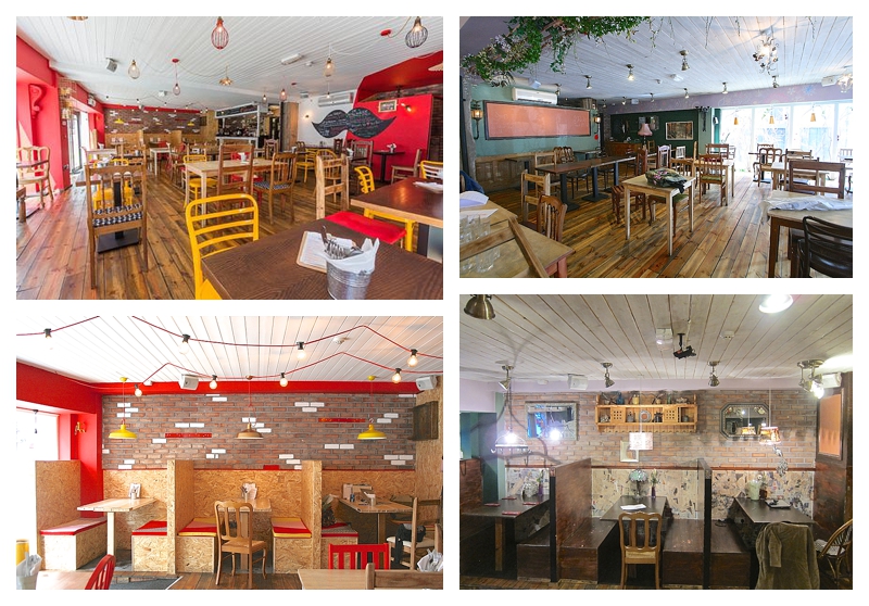
Without it being too blatant, the backdrop was to be the circus bright lights, using vibrant red and yellow brights, black and gold accents, festoon lighting and the slightly sawdusty vibe of OSB. I love brave clients who have great imagination and though they didn’t want a themed and childish space, our new restauranteurs felt a fun, colourful and energetic scheme suited their vision and menu – all in all, Splendid 🙂
The dirty white washed ceiling boards were filled and painted White Hot to brighten up the whole room and make the relatively low ceiling feel higher. I liked the linear feel to the timber cladding above and saw no reason to take it down and replace it, that simply seemed wasteful. On the limited wall space mostly consisting of vertical columns and a horizontal band circling the room at high level, a bright Pretty Poppy was used, with Valspar coming up trumps after I’d tested 9 different paints from other brands in an attempt to get exactly the right shade. I definitely heard swearing when Harry & Stu saw the blue masking tape and sussed my cunning plan to get them to create a colour block to frame one corner of the restaurant and add interest to the white ceiling. I’ve already written about the very cool ladies loo ceiling here.

Pretty Poppy and a fab circus yellow called Kernel of Truth were also used to paint a few of the wooden chairs to tone down the overwhelming timber vibe previously going on (and that’s from someone who loves timber!). As the timber floor was great and staying put, full on wooden chairs just looked way too much. The UK has traditionally been very conservative about painting timber furniture but what’s better, reusing chairs to make them look great in a scheme or sending them to landfill?!

I sprayed a bright Plastikote yellow onto two of the three booth area pendants, with the third a burnished gold, all three hanging against a red brick wall made to look brighter and more ‘reclaimed’ by painting some of the bricks White Hot. Totally loving different coloured lighting cables which we’ve been doing for a while and gives endless possibilities for visual interest.

To inexpensively and quickly transform the the booths from dark, dingy spaces where no customer had ever wanted to sit into bright, welcoming seating choices, I had them clad in OSB (thanks Gary for all your hard work!), constructed pale scaffolding board tables which were customised using white chalk paint and gold edging, and finally created padded seat covers in fantastically vibrant shades of all the colours used in the scheme, with a few other patterns thrown in. Great job by Terry & Heather our upholsterers. We sanded and varnished the OSB to stop it being rough on client’s clothes #toptip

The lighting was an interesting challenge, with coloured cables, wall lights, festoons and filament lamps from Urban Cottage Industries, cage lights and fittings from Heals, a couple of Seletti Egg shades and some high street finds too. There’s such a plethora of amazing lighting choices out there now, and the industrial trend hit our design mark brilliantly, but with more punchy colour and glamour than in most industrial interiors.

Lots of fun was had with the finishing touches, even on such a tight time scale. Can I have a giant ‘tache please Gary? were not words our skilled carpenter wanted to hear with the amount of joinery needed on site but make one he did to be used as a massive menu board. MDF, undercoated then triple blackboard painted – I love it 🙂

Vintage finds & artwork from Levy Market, locally commissioned typography from Northern Letters, little men sprayed gold and some clever high street sourcing completed the look which I hope you’ll agree is bright, fun, on trend yet individual and totally suited to a restaurant called The Splendid Sausage Company 🙂


I love all the little details Sian, it looks fantastic