

Making this episode seems like it was both a million years ago and yesterday. Mr Moregeous hollered up to the office last night that the Beeb were repeating Your Home Made Perfect, the hit BBC2 TV show which I project managed through it’s set up and worked on pre-pandemic. What a team to have pulled together this amazing show with it’s three stunning reveals – firstly with a reveal vision from each architect, Robert Jamison and Laura Clark, and then the winning design realised at the show’s end.
It was a pleasure and privilege to work with Sylvia and Julian on this episode, to try and bring Robert’s incredible architecture to life and deliver it via the couple’s meticulous builder Darren. My job was to support the homeowners through their renovation rollercoaster, to assist with specifying and sourcing products, and to deliver the reveal whilst also adding in the homeowners personality if they so wished.
This is a long blog post with a LOT of advice in it – are you buckled in and ready?

There’s a LOT of head scratching which goes on during this process, on the journey from virtual reality to actual reality. I thought it’d be interesting for you to see some of the process and products which helped to realise the dream, and turn Sylvia & Julian’s dark and divided home from a building site on into a light and airy home full of character. With a bath in the kitchen. Let’s not forget the bath in the kitchen.


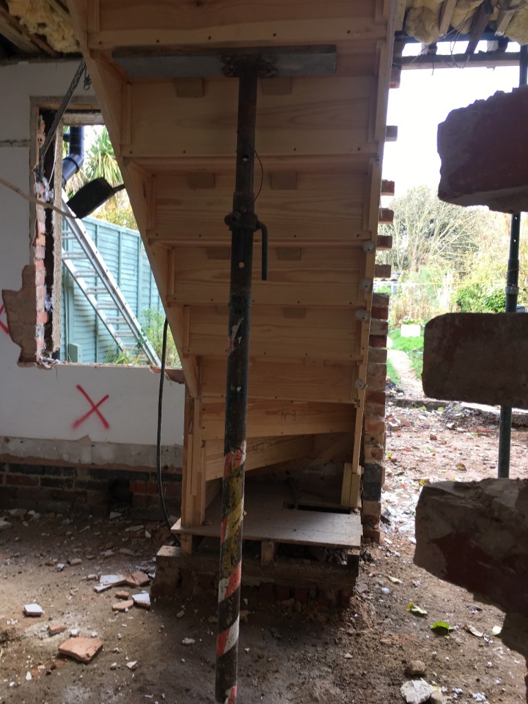
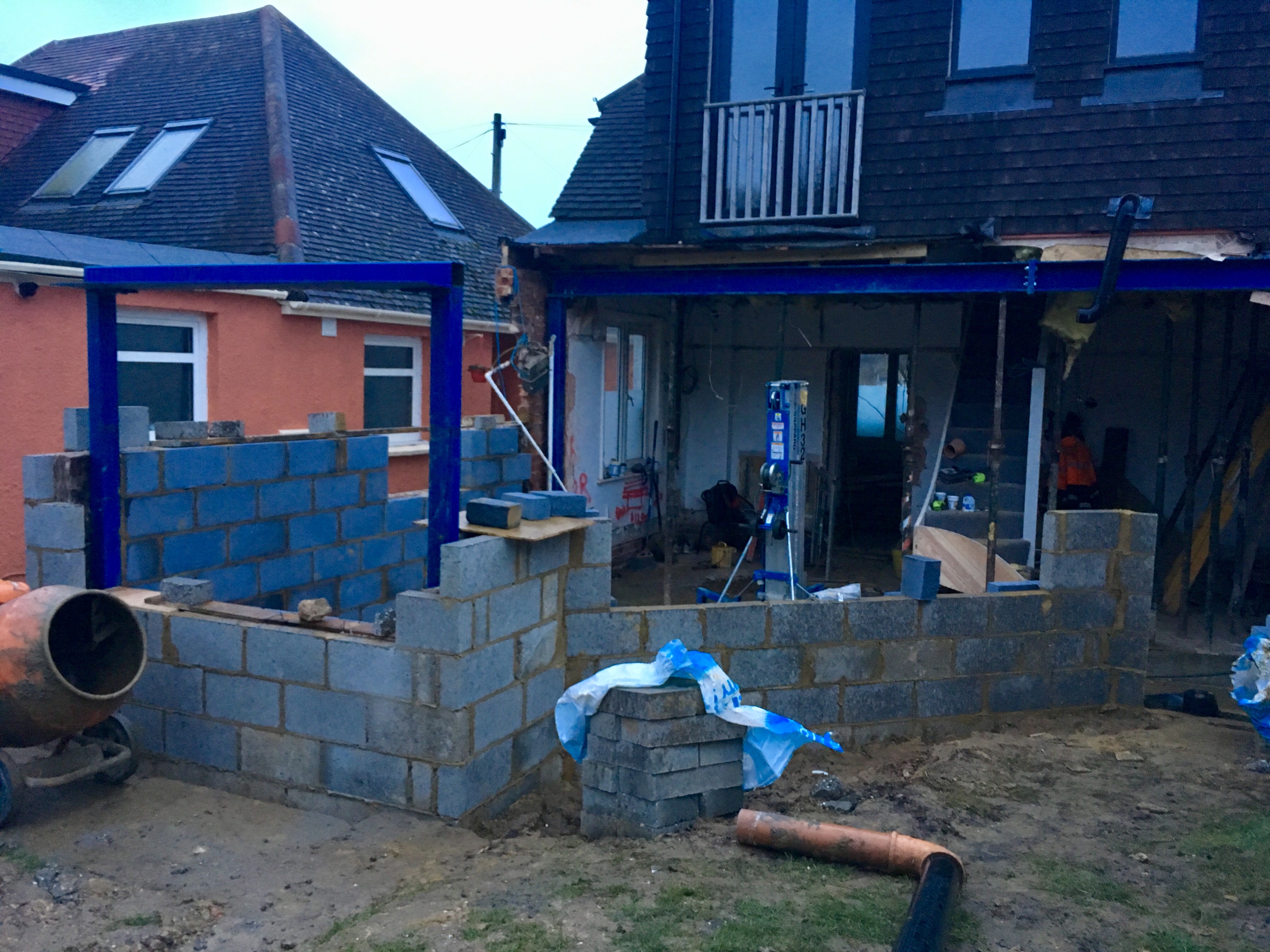
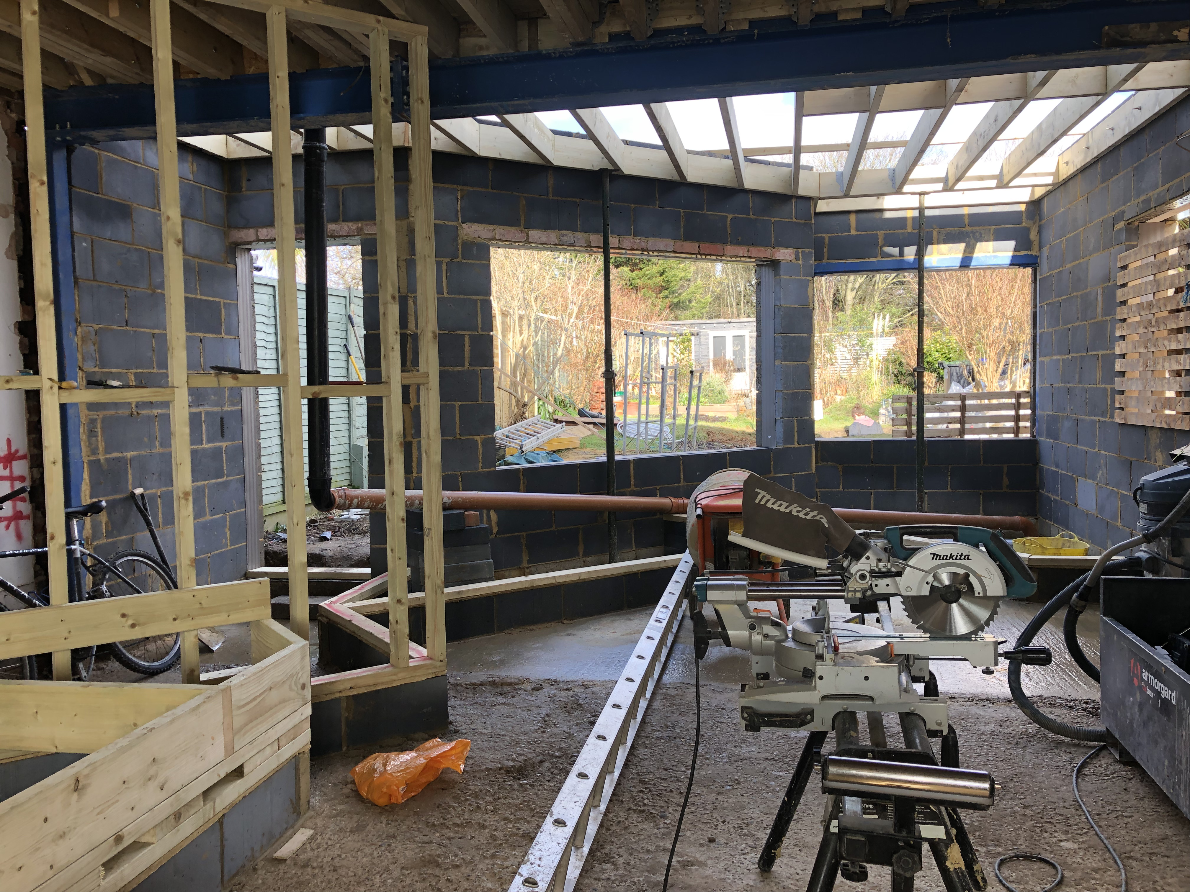
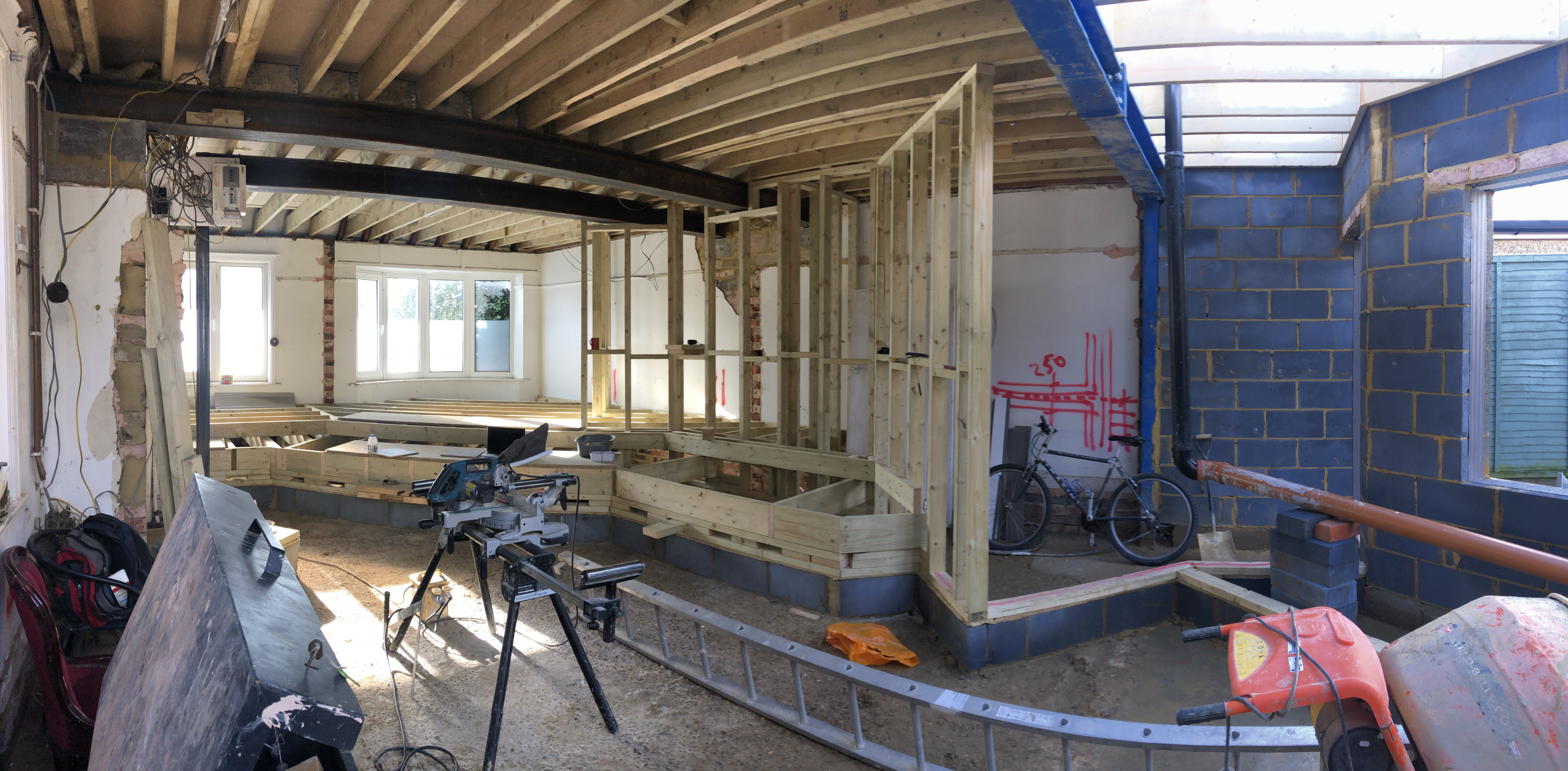
Blockwork began to bring the new structure out of the ground in one area, whilst the old staircase, once positioned slap bang in the middle of the house, was prepped for removal. One thing reinforced to me through all the YHMP builds was that staircases are often in really daft places and often don’t fully maximise the space of the houses in which they sit. That’s actually pretty crazy isn’t it, considering at some point someone designed them in. A good architect will look at the relationship between the ground and first floors and consider whether the existing stairs can be adjusted slightly to make a huge impact, or whether they need to be moved entirely!
When renovations are in this state of disarray renovators should be making all their decisions – kitchen, flooring, bathrooms etc – to assist the build to run quickly and smoothly. It feels so early to homeowners but it really isn’t, as things like plumbing and electrics happen pretty quickly once walls are up and the roof is on.
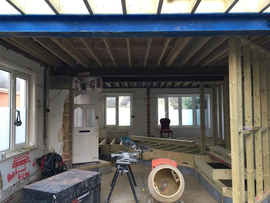
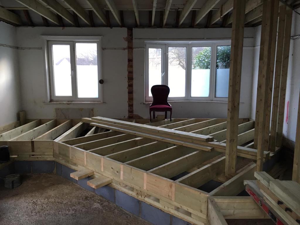
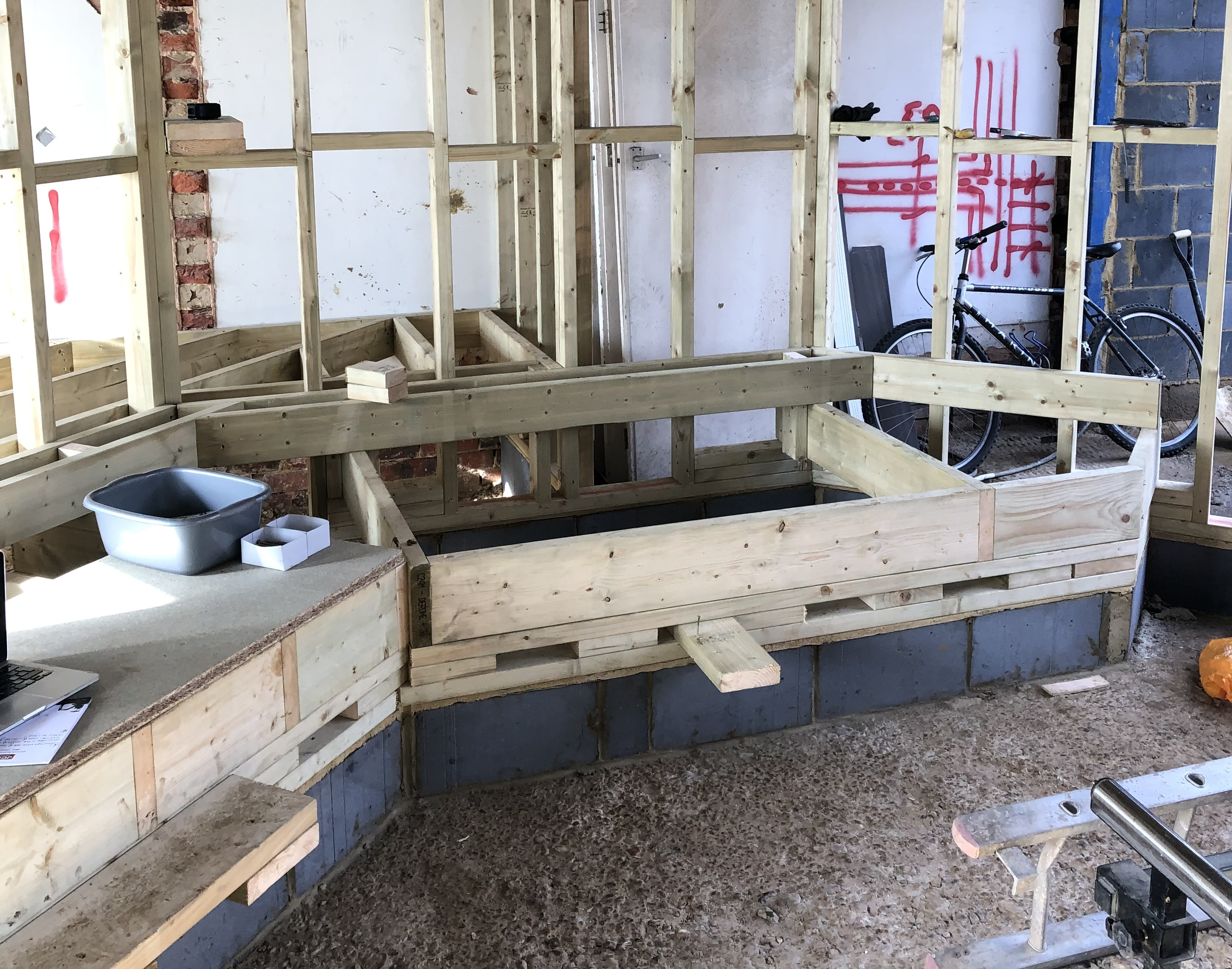
You can see here how Robert’s living area started to come together: the elevated platform and step area built in timber, the supporting steels. This was complex joinery and takes time to do, totally revolutionising the ground floor of this Brighton home. It was interesting to hear very clearly on the show how our couple couldn’t quite ‘get’ the differing levels even once it was at this stage. This is the very reason why homeowners employ architects – to most people this just looks like a mess of joists but to those with a mind like a design crystal ball, the ceilings, walls and finishes can already be imagined.
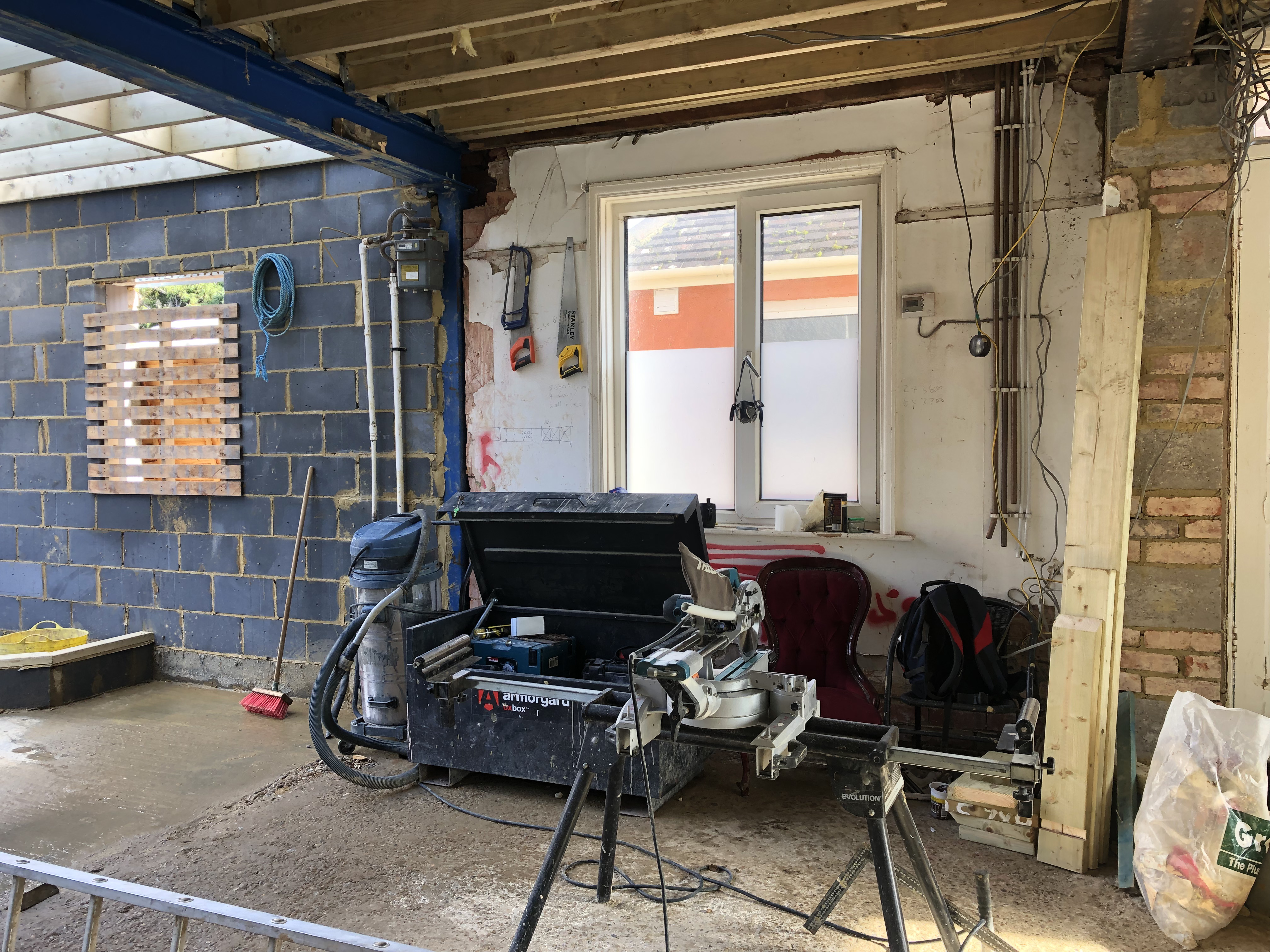
At this point we were busy discussing tiles, flooring, baths, kitchen worktops and lighting – hard to do when a renovation looks like this, isn’t it? Everything feels dark and dusty and like it’ll never actually stop being a building site. It will of course, and trust me when I say as a project manager that this process happens far faster the clearer and earlier the decision-making process occurs.
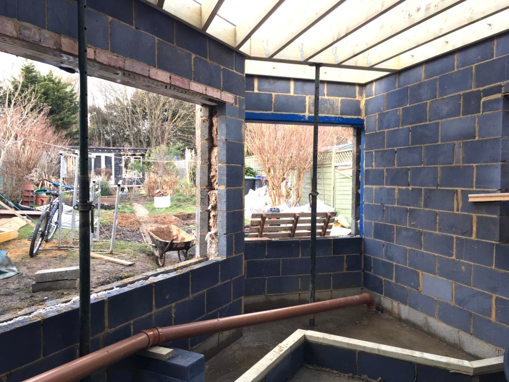

As the roof started to go on, the hardwood Iroko windows began construction in the factory of a fantastic maunfacturer up here in Manchester – yes, to send via Shiply down to Brighton! Sometimes it works out more cost effective to source items out of your geographical area, especially big items like windows or joinery if you’re building in an expensive area. It’s a good tip that, write it down 😉 Generally speaking windows shouldn’t be ordered until the openings are actually built to ensure accurate measurements are taken.

Here you can see the kitchen wall elevation to the left, the main entrance to the house in the middle, and the areas for the new staircase to the right. Getting the sizes and shapes of windows correct is so important; there was a big debate about the one in the middle of this wall. This is where design experts and architects come into their own, working out light levels and what should be positioned where. I love the stairs drawn on the wall by Darren here. Drawing on walls is totally allowed you know 😉


During the renovation, as with most builds, things change and alter dependant on circumstances and budget. This opening above on the kitchen wall was bricked up both due to budget constraints and to allow for more requested kitchen units, but was then opened back up as light coming into the centre of the room became a concern. In my experience, if something is niggling during a renovation, if your gut feeling is that you should or maybe even shouldn’t do something, then usually your gut is right. Here the extra cost lay in carefully removing half the blockwork and buying/installing the window, but that cost was considered beneficial and ‘worth it’ in terms of the light and feel in the kitchen area, central to the property.
Sometimes there’s a cost to be borne for the change, to make something ‘right’, but usually it’s better than leaving it far too late to change and having the dreaded Renovator’s Regret. It’s a rare renovator who has an unlimited budget, so compromises always have to be made… just choose those compromises carefully 😉

At the same time as the build, all the above was going on in the background. Taking time to pull together a moodboard is critical to achieving a cohesive scheme and comparing materials, colours and textures is all part of this process. Sylvia and Julian loved warm and inviting tones, so we wove greens, coppers and rich timbers into the scheme. There was going to be a lot of grey to the flooring and tiling throughout the ground floor but the clients didn’t want to space to feel brutal or cold. Colour & warmth was going to be key.
Always order samples and compare and contrast these with each other, even if they aren’t going to sit directly next to each other. Always. Please 🙂


Images of the windows and doors started to appear on the shared WhatsApp, making everything feel very exciting, even though they were being made so far away. It’s one of the joys of modern day comms that visuals are so easy to share and make decisions on, everyone can ‘see’ what’s happening at every stage.


If you’re commissioning joinery items to be made and don’t have the funds to have everything drawn up for you, then maybe provide the manufacturer with a screen shot capture of the look you wish to achieve. This way you know what will be manufactured and what you will pay for will actually look like what you’re imagining. Never assume what’s in your head is also in someone else’s head – it rarely is. This door on the left above is an actual inspiration shot used in this build, the one on the right is the Brighton side elevation door waiting patiently in the factory for it’s delivery date!
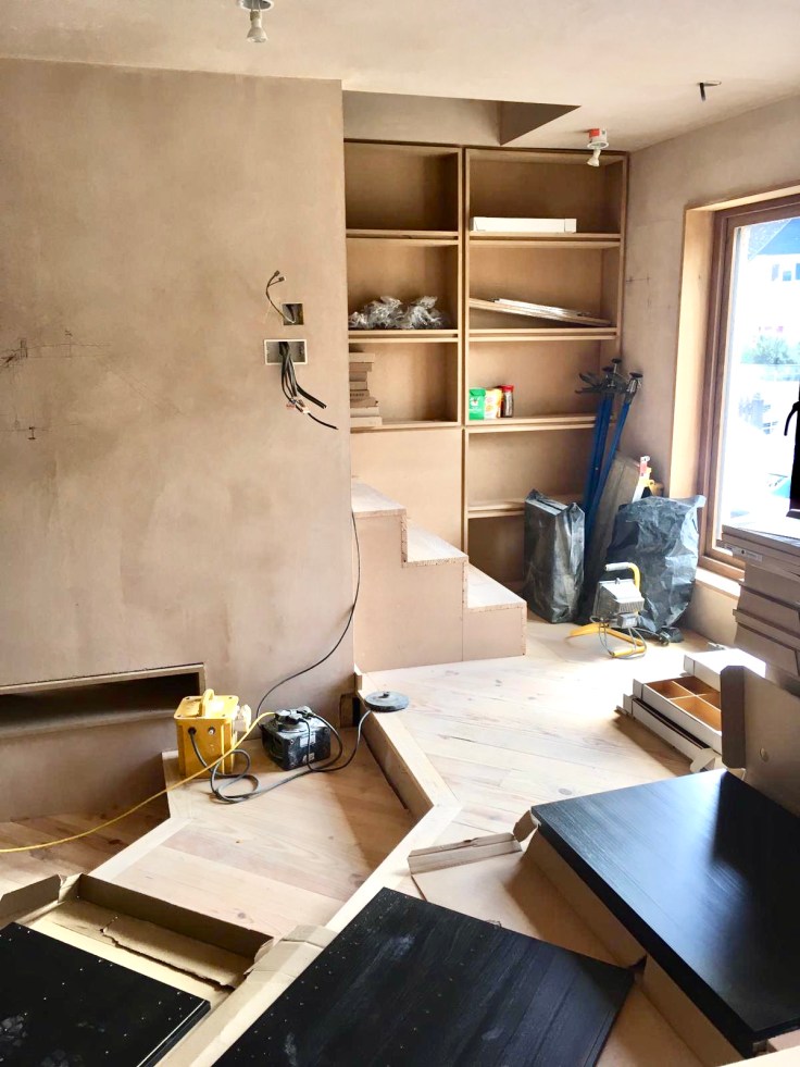
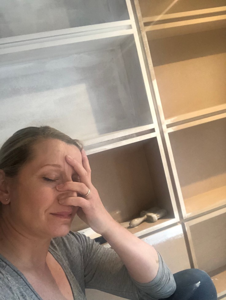
Your Home Made Perfect is a show stoppin’ show as and as such the edit can’t always include, amidst all the amazing architecture, some of the innovative design solutions created. People just own a lot of stuff, as much as minimalist designers don’t want them to! In response to Sylvia’s desire for more storage, Darren created a niche at the bottom of the new staircase by pulling it a further 200mm into the room instead of right up against against the gable elevation, thus allowing the rectangular shelving unit to be built against the gable wall. This didn’t impact too much on the room and also had the advantage of creating a wider under stairs area as well. Top tip – get MDF sprayed cause it’s a buggar to paint. I had so had enough of painting at this point, as you might be able to tell.
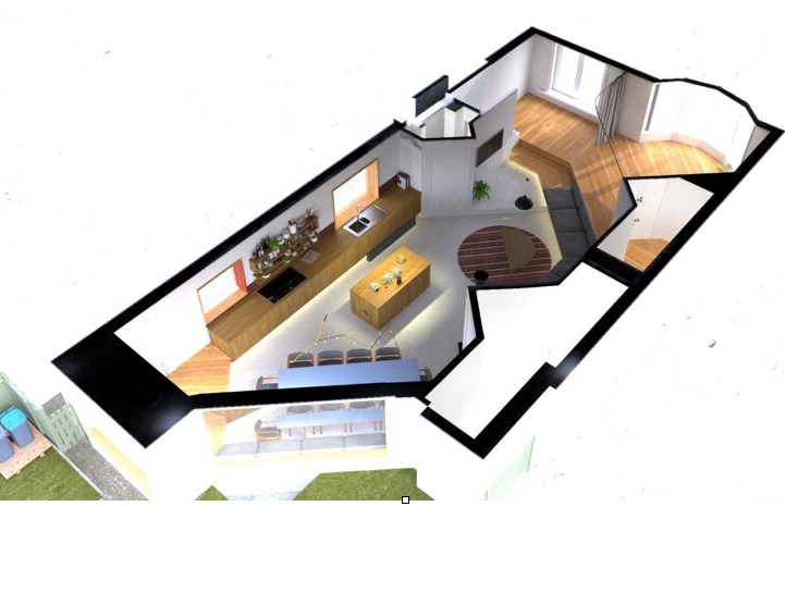
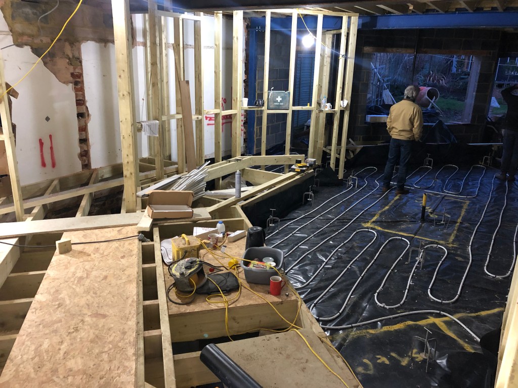
It’s clear to see from the layout for Robert’s design (above left) that the wall space for radiators was very limited. Recent advances in under floor heating tech have ensured it’s now pretty straightforward to run pipework to both new, existing, solid and timber flooring, so UFH was the obvious solution here. It’s transformative, having UFH, especially if you’re going to lay tiling extensively to a ground floor. Porcelain tiles feel cooling and fabulous in a tropical villa but definitely a bit nippy underfloor in Brighton in February. As you can see above, in the kitchen area the UFH was pinned direct to the rigid Kingspan insulation with a black DPM layer in between. On the left is the raised timber deck for the bedroom area. Here, rigid Kingspan was inserted between the joists to prevent heat loss down, slightly lower than the top surface, and then the wet UFH pipework laid onto the insulation, notching over the top of each joist to connect the areas. In this way you can see it’s entirely possible to have a wet UFH system to a ground floor even if you have a mix of solid and suspended timber flooring. Boom – no radiators required!


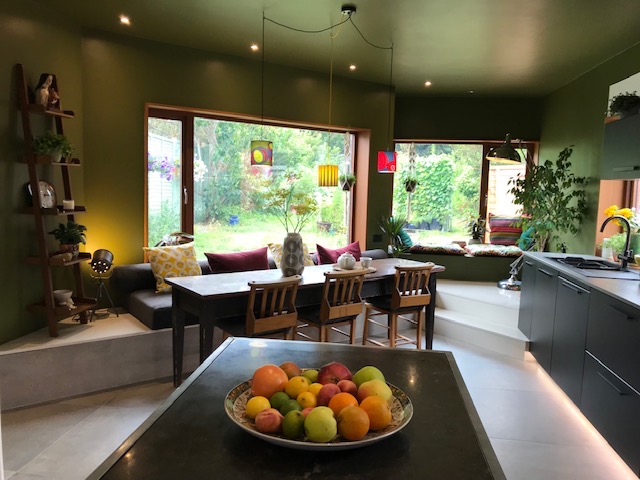
And as if by magic, the walls were plastered, the windows fitted, the first fix of electrics complete, the bath dropped into place and the floor tiling down. Of course…. it didn’t really happen this fast and there were a tonne of decisions to be made. We summed and ached over where to fit downlights and suspended pendants, working out where light was needed most and avoiding the dreaded builders acne of excessive spotlights. The original specification had been for a poured concrete floor but it just worked out far too costly, and also the whole area around the bath and the raised steps needed waterproofing & protecting too. The obvious and sensible solution was to tile, so we sourced at a great price the most fabulous large format porcelain tile from Mandarin Stone – it’s called Industry Cement if you like it, we chose the 800 x 800 format. This large size meant that all the steps and area around the bath could easily be cut to size and also that the grout lines were minimised to better echo the feel of poured concrete. We actually looked at over ten different concrete style tiles, but this one had a dappled textured feel and slight warmth to it – it was the clear winner for this scheme.
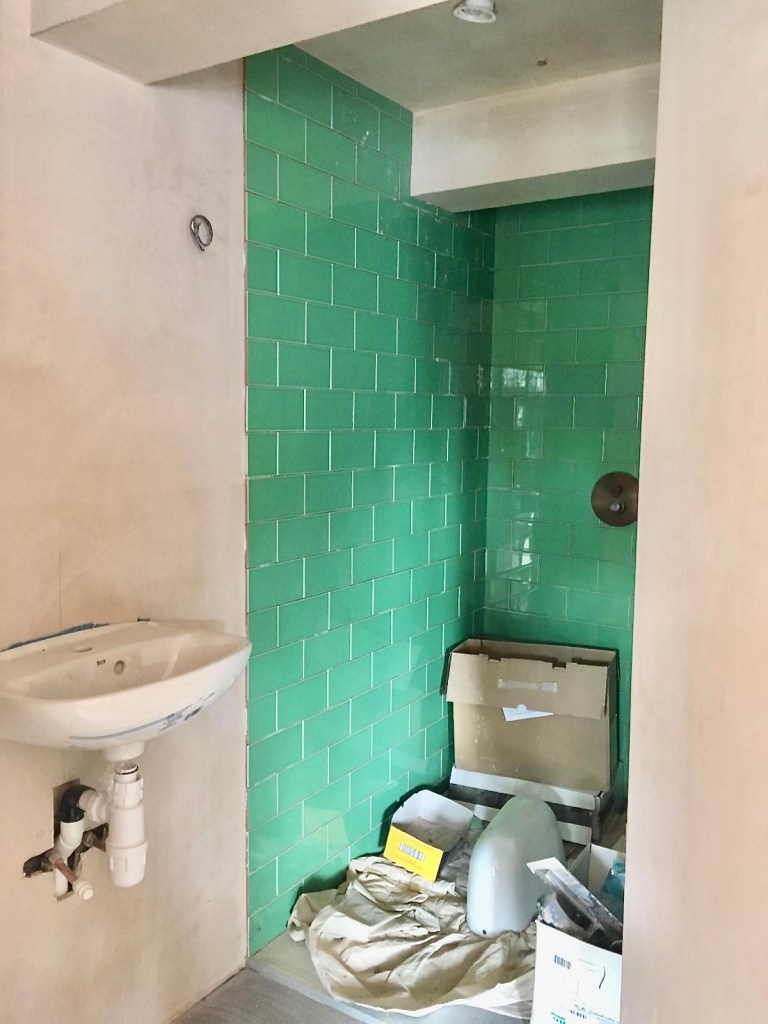
This range also includes different greys and a beautiful coppery version, which was laid to the shower room floor, behind the bedroom. Using the same size tiles in different colours/textures is a good way to zone areas.
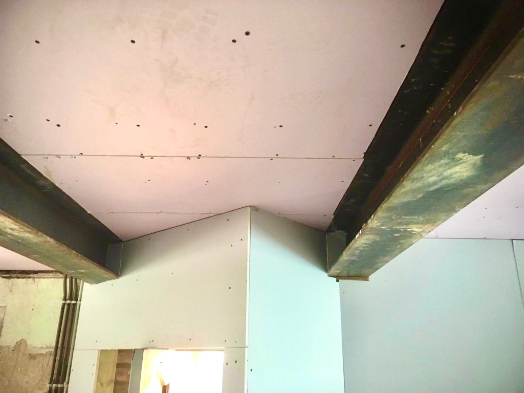
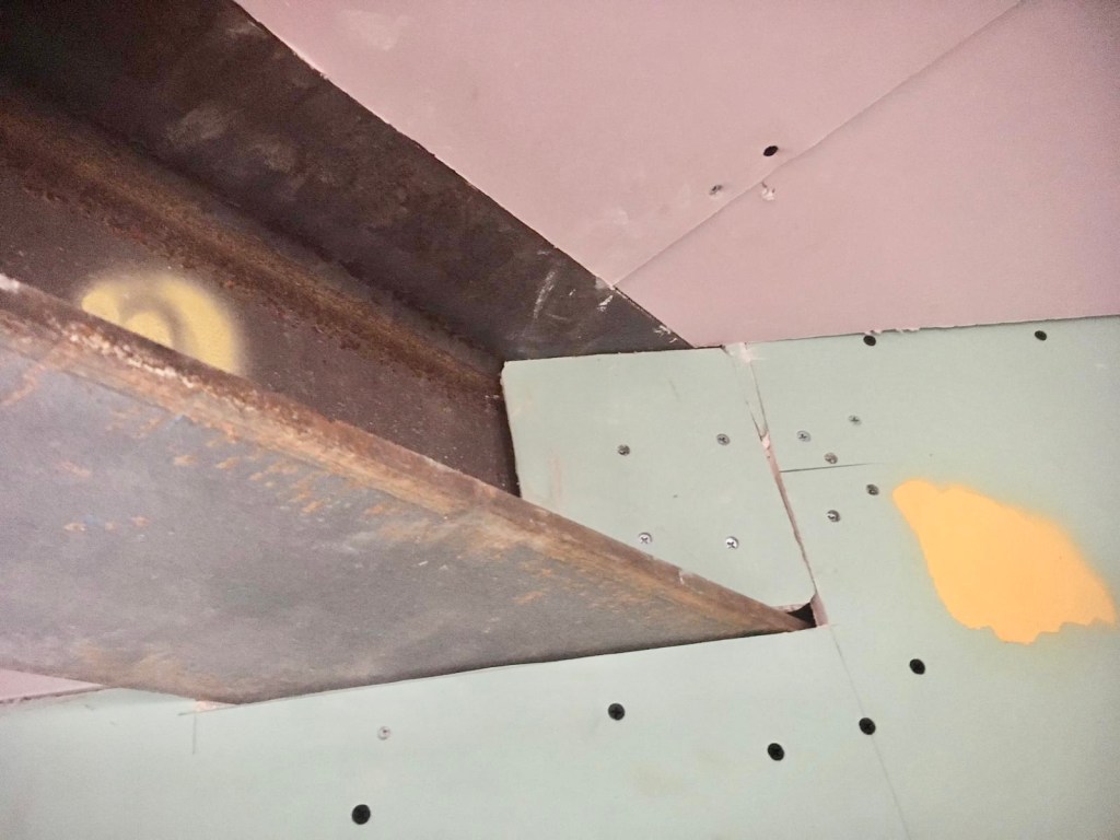
If you’re undertaking a large reno with lots of walls coming down then the supporting steels may well be ‘on show’ as above, simply because they can’t always be hidden in the ceiling void and it might not be desirable to lower the whole ceiling level. Building Regs now won’t allow you to simply leave them exposed if there are habitable rooms above – due to increasingly onerous fire regs – so having that industrial vibe isn’t as easy as it once was. The choice was to either paint them in intumescent (fire-resistant) paint or to plasterboard box them in. As you’ll have seen from the show, the latter was chosen. Would you have done the same?
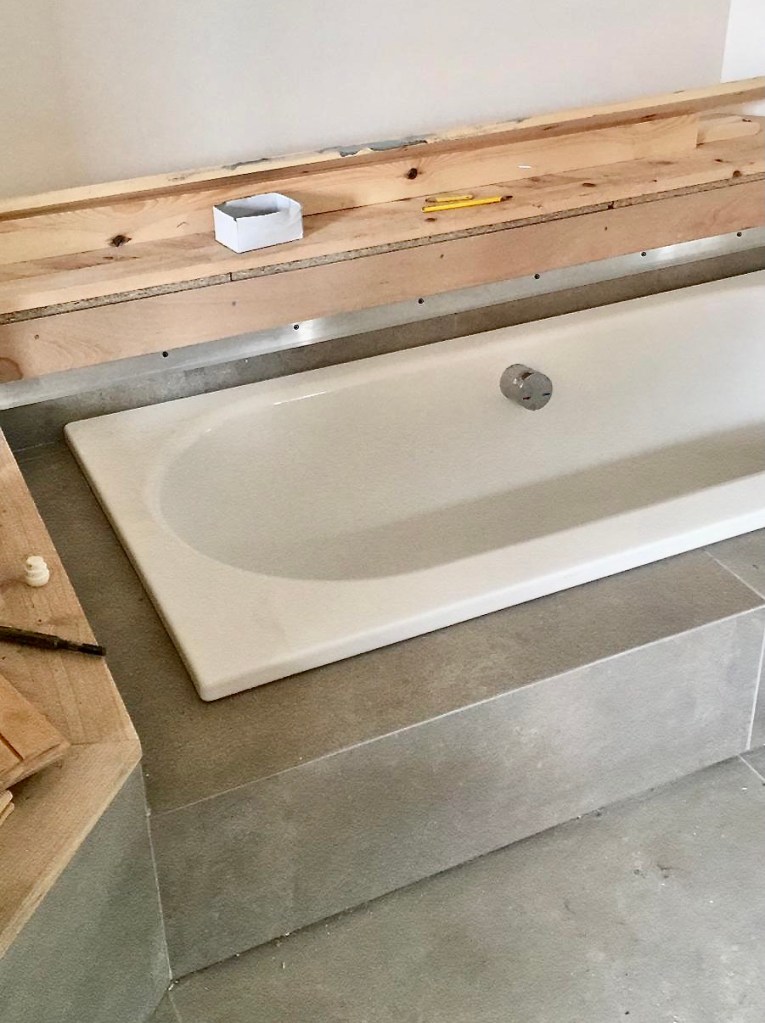

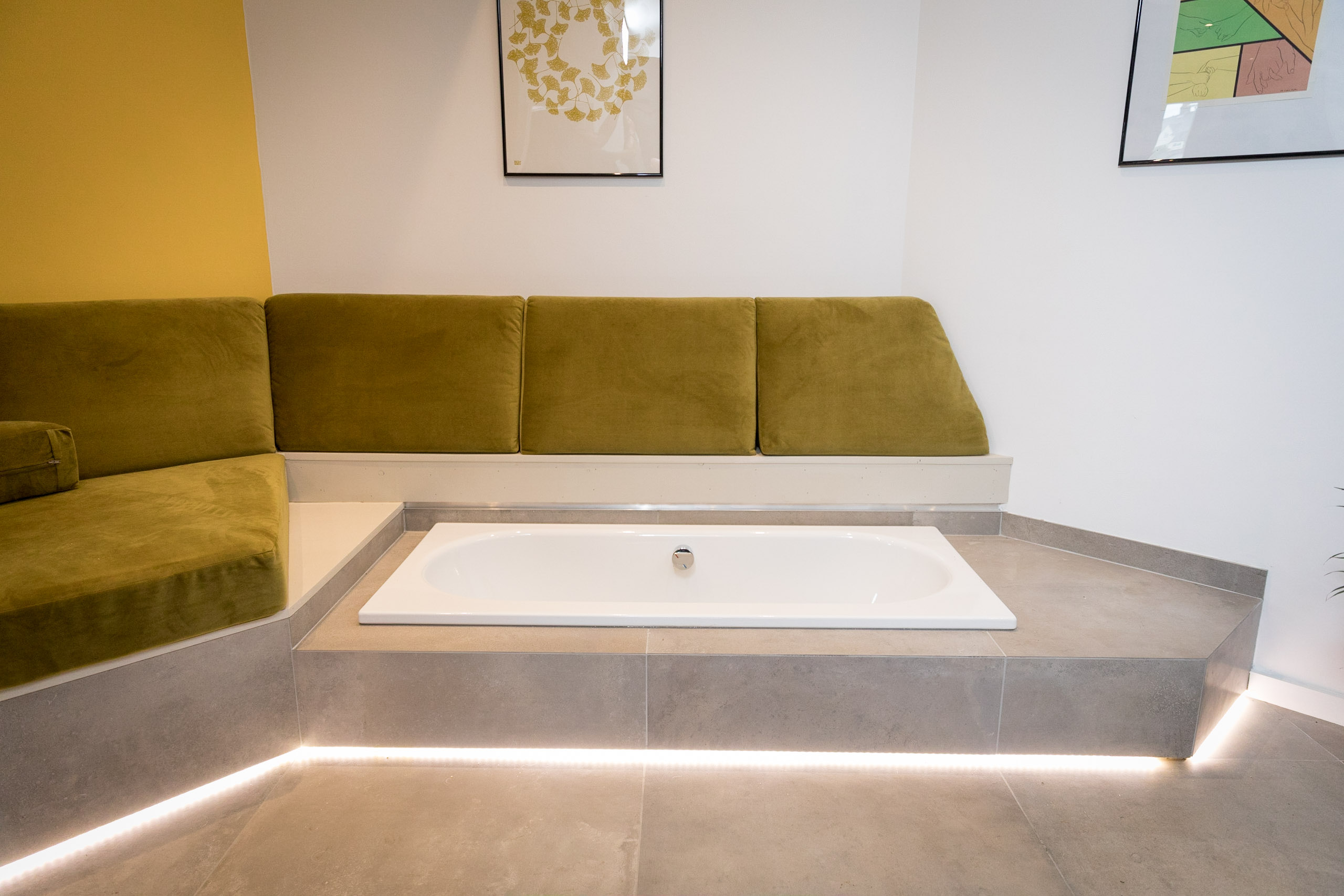
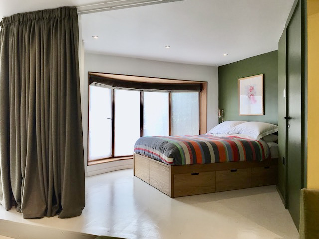
Let’s talk about the bath shall we, ’cause honestly, Twitter has bothered me – again! Silvia and Julian don’t have space for a bath upstairs in their bungalow’s narrow shower room. Like many women Silvia loves a bath, and also loves her garden. So why the hell not eh. Why the hell not have a bath positioned where she could relax after a hard day’s work and see the beautiful Brighton garden she’s lovingly created over many years. It’s not permanently on show, but cleverly hidden by Robert under seating, a decadent, special occasion reveal and a delightful addition to the design. I’m not sure Darren the builder described it as delightful when trying to get all the levels right, tile it perfectly and plumb it in 😉 Shout out to Bette baths who do the most incredible range of sizes for literally every drop-in bath aperture. This one was the cute little Starlet at 1570 x 700, perfectly sized for the bench seating and a sit up splash around 🙂 The tap is an overflow bath filler so the water flows from, yep you guessed it, the overflow, rendering a spout necessary and thus not impacting on the seating surrounding the bath.

So at what point does a renovator decide on colours? You know I’m going to say at the start don’t you?
A well considered, well planned scheme will take into account colour from the very beginning, such is the impact it has on other choices like flooring, kitchens and tiling. The sheer joy that colourful decisions can bring is something not to be under-estimated and if there’s one thing that Lockdown has proved to us, it’s that we need to be happy in our homes. Architects, in my experience, rarely include bold colours in their schemes, of course there are always exceptions and new young architects are starting to be more bold, but on the whole, they’re kinda known for neutrals and greys. Silvia and Julian really aren’t neutral people, so the introduction of colours like Bancha and Babouche elevated the scheme and ticked all their boxes. By ordering samples and painting them on the large piece of card you can see above, we could more easily choose fabrics for the bench seating (see above), tiles and accessories. Do it, please, order samples and look at them in your home, in different rooms, at different times of day. I actually specified Lime White for this project on all the walls which were not going to be green or yellow, but when I tested the sample it just looked far too limey so we swapped to Wevet. It’s an expensive mistake if you simply decide on a colour from a website, give the colour code to a decorator and they paint everywhere then you come back and don’t like it!


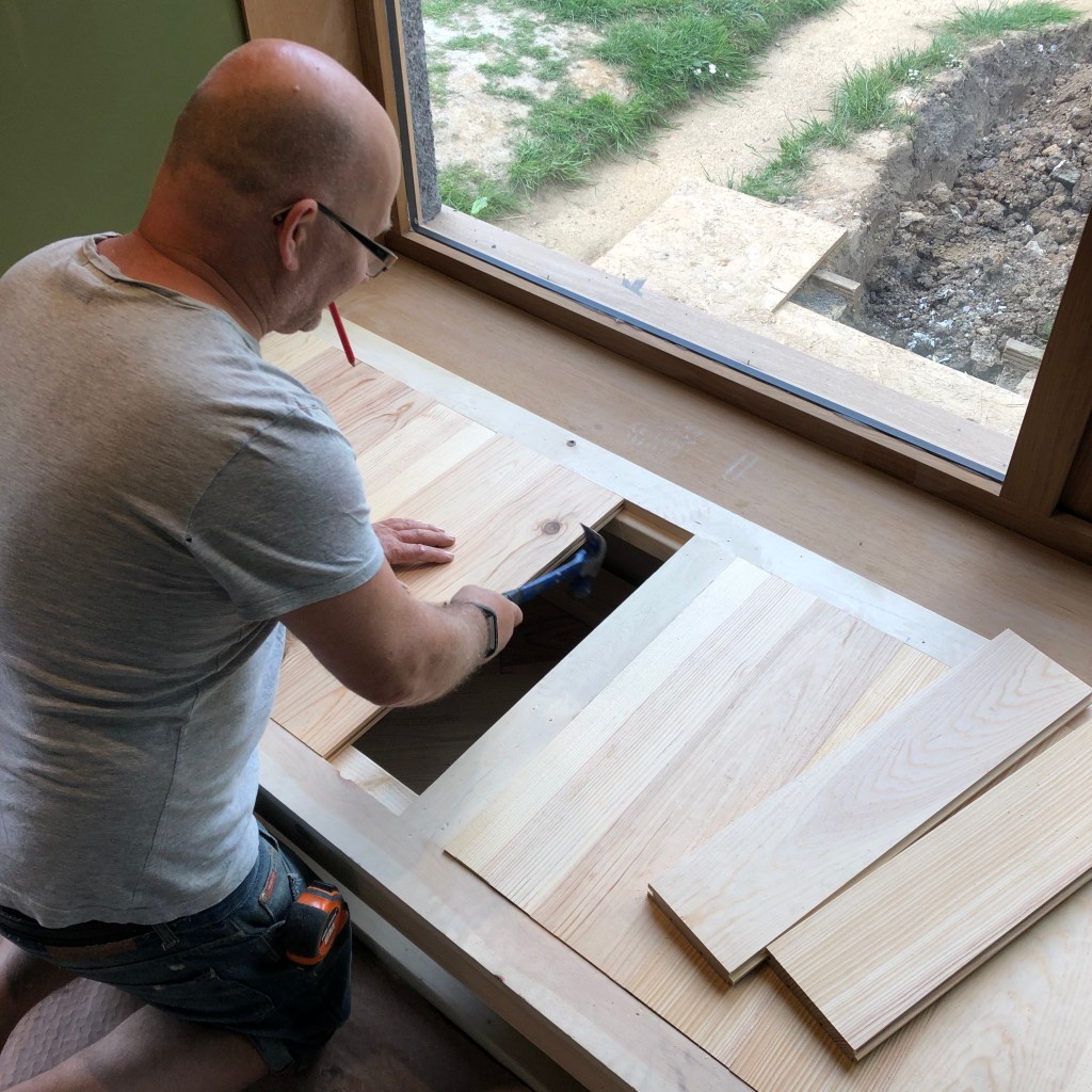
The flooring for the stepped and raised deck area is made from tongue and groove pine boards, which Darren edged super neatly as you can see above to give a crisp and considered finish. Pine is an extremely cost effective flooring solution and can be stained in any wood tone or dye colour, or painted, then lacquered with a water based finish to protect the surface. One of the downsides is that young or green pine does warp and move, especially with UFH, so it’s best to buy decent kiln dried quality and let it properly acclimatise, plus secret nail it down, not glue it. Don’t nail through your chipboard into water pipes though, for heavens sake!


Top tip : Keep on top of your waste! Try to filter out and sell or give away anything which can be re-used, one man’s trash is another man’s treasure dontcha know. Have separate piles for cardboard and slice it up with a Stanley knife neatly so it doesn’t take up lots of space in your skip – maybe even do a tip run just for the cardboard. Bag up rubble, and try to pack your skip as you would a suitcase – that way you’ll get more into a smaller skip – they are SO expensive these days. Grab yourself a Red Bull for energy like me & Silvia did 😉

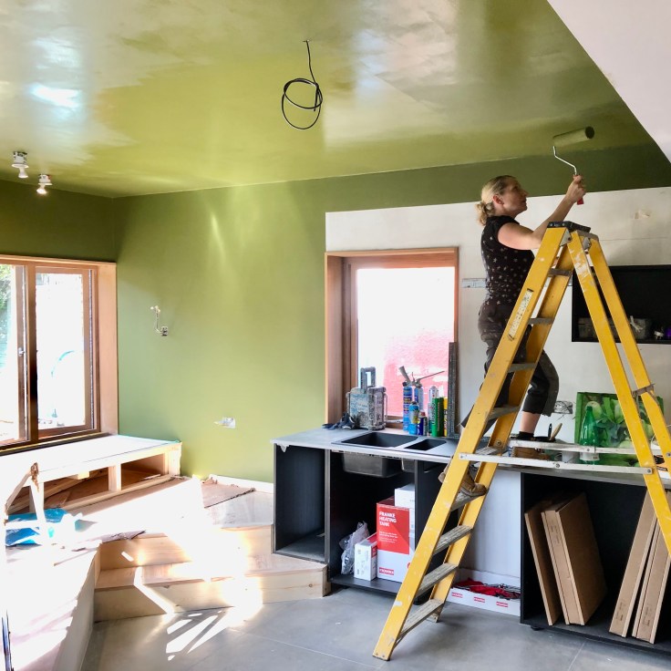
This was a bit scary, this bit. Using a strong, and I mean STRONG colour when painting is always a little bit of a gulp moment, and going Bancha on the ceiling across the dining area was a brave decor decision. Originally it had been white on the render, then Robert wanted it super dark, almost black, but our homeowners were reticent. I suggested a deep green and I’m so glad they went for it, it looked so gorgeous against the warm Iroko. Always mist coat new plaster first with a good quality proprietary paint to ensure your high quality top coat doesn’t peel off, this is such a critical painting tip! I did three coats of the Bancha, fyi.

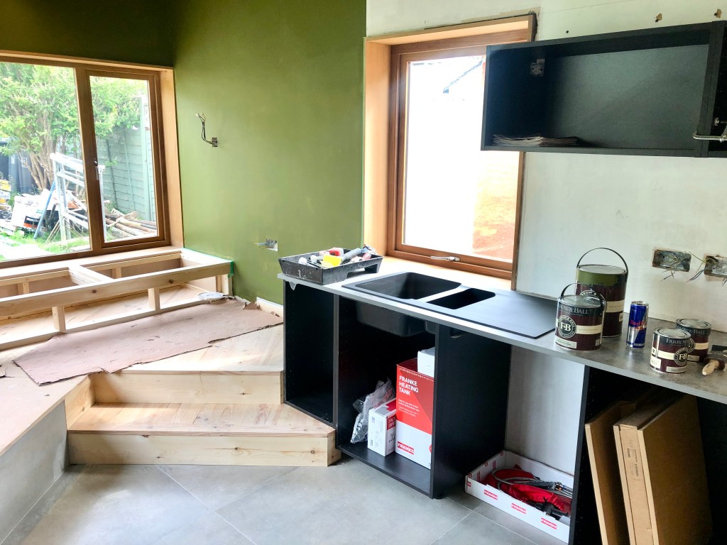
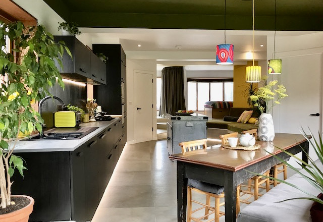
Re-winding back a little, the kitchen is Ikea, the black Kungsbacka range. I loved how Darren cleverly joined the end of the run with the steps up to the window seat. This type of detail can make or break a scheme and the types of changing levels which Robert incorporates require a builder / joiner who can execute detail to perfection. Note how the sink stops at the point the step starts. Nice. There are a tonne of kitchens on social media at the moment with absolutely no wall units, all very well if you have a 4m run of base units or a giant pantry. Most regular kitchen need at least some wall units, for a more contemporary feel opt for horizontal, elongated cabinets, rather than tall and high.

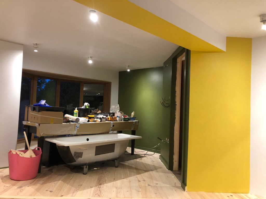
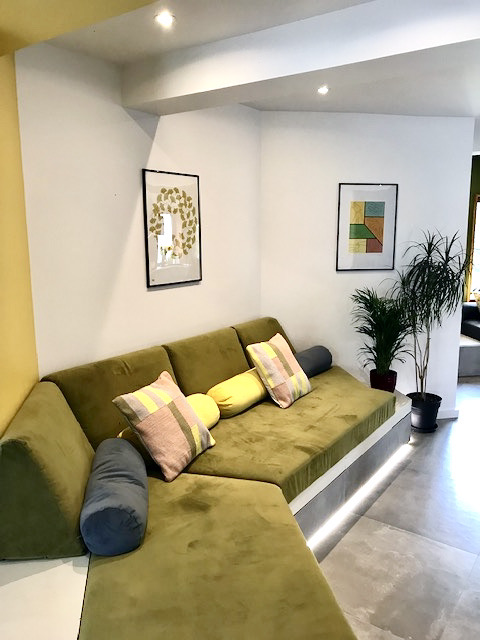
There’s a point when you start putting paint on a wall and you think, oh god, is this ok? Will this work? We didn’t want feature walls or continuous walls, but more the vibe of colour blocking and punchy areas. The same Bancha paint was used in the bed area but not on the ceiling, and the two spaces were clearly demarcated by the flash of Babouche overhead. Gotta be honest, I’d have gone a bit wilder with the stripes had I had time.
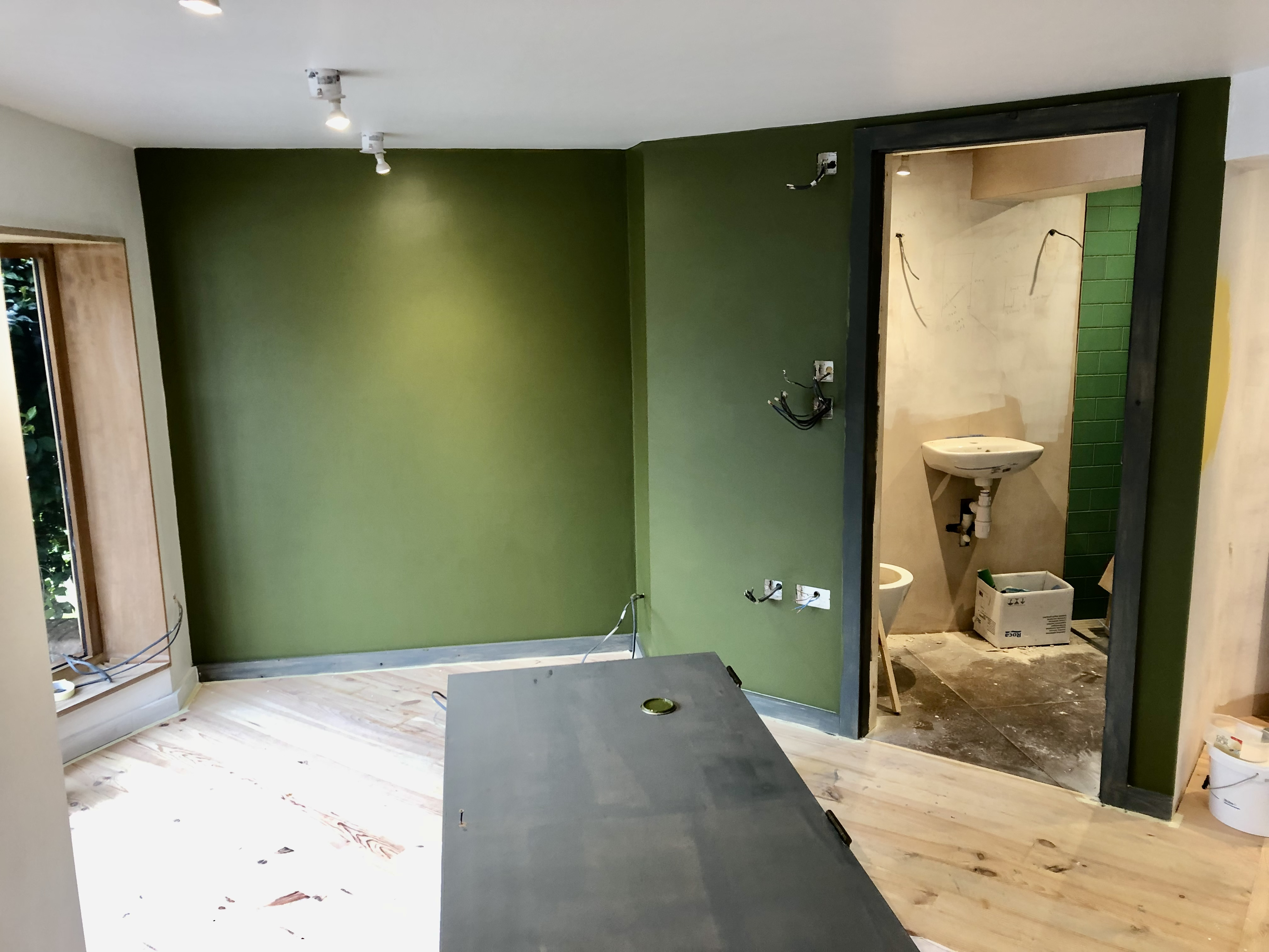
When painting rooms in dark shades, it’s very much the contemporary look to also paint skirtings, architraves and doors the same. You can see that happening above as we give the woodwork and door a dark grey undercoat. The green tiles on the shower room look ace don’t they? I wish I had a cool pic of the copper hued floor tiles too, must try and screen shot one from the show!

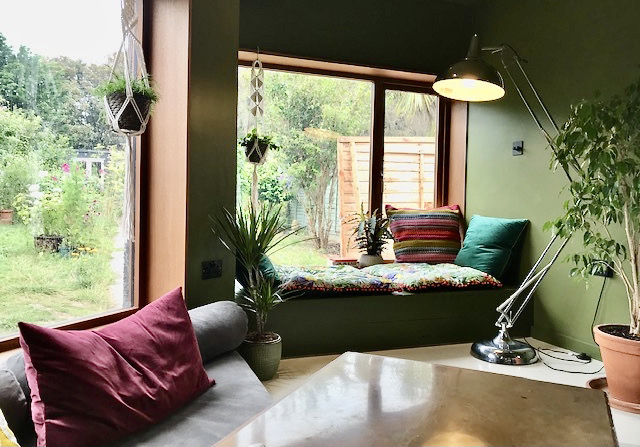
Robert not designed a raised area to the front of the house to create a bedroom, but also to the rear, creating deep seating for the dining table and an elevated window seat. All of this was in timber as you can see and Martin the joiner worked hard to deliver a seamless finish. In the final show Angela and Robert were perched on cushions here, it was almost a shame it was covered up! If you’re doing this, you’ll need toughened glass to the window and don’t forget to add some soft lighting for night-time nook reading.
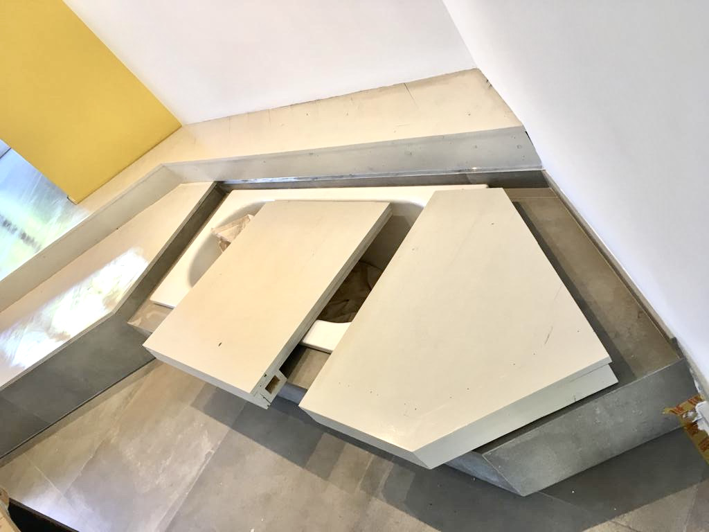

Two final practical shots before we have a little look at the final reveal! The bath is designed to sit under the seating, as you’ll know from watching the show, but how do you ensure the base of the seating is strong enough to take the weight of several bums?! Not that I’m suggesting Silvia and Julian are bums you understand… you know what I mean. Darren built these plywood frames, padded on the underside to protect the steel bath, which then lift on and off. The bath isn’t used every day so this is a special occasion situation, used more for seating than bathing. The pine floor of the bed area was painted in a pale grey satinwood, making it easily mopped and tying it into the soft Wevet painted walls.
Shall we have a look at some luscious photos of the final reveal??

A pretty spectacular design by Robert, wouldn’t you agree, and an incredible transformation, whether it’s to your taste or not. It’s certainly not for the faint-hearted that’s for darn sure. It is a stunning build to please even the most detail conscious; perfectly executed and loved by the owners.

Not everyone wants their bedroom on the ground floor with only a curtain, albeit luxuriously thick and heavy, separating them from the living space. Not everyone wants a bath in their kitchen with a view to the garden. Not everybody wants colour blocked walls. Not everyone wants a grey concrete style floor. But then again, this isn’t everyone’s home is it. This is Sylvia and Julian’s home. Made perfect for them.
And guess what guys… they bloomin’ love it.

The super thin Formica “Aria” worktop in Elemental Concrete (F8830) works brilliantly with the black Ikea units and concrete tiled floor. I specified the 20mm version which comes in 3.6m lengths at 650mm wide. There are now so many amazingly designed worktops with incredible textured finishes. It’s sometimes not practical or affordable to have ‘the real thing’ and actually sometimes clients prefer the reliability of a super durable, stain resistant surface. I was mega impressed with this worktop, liked it a lot.
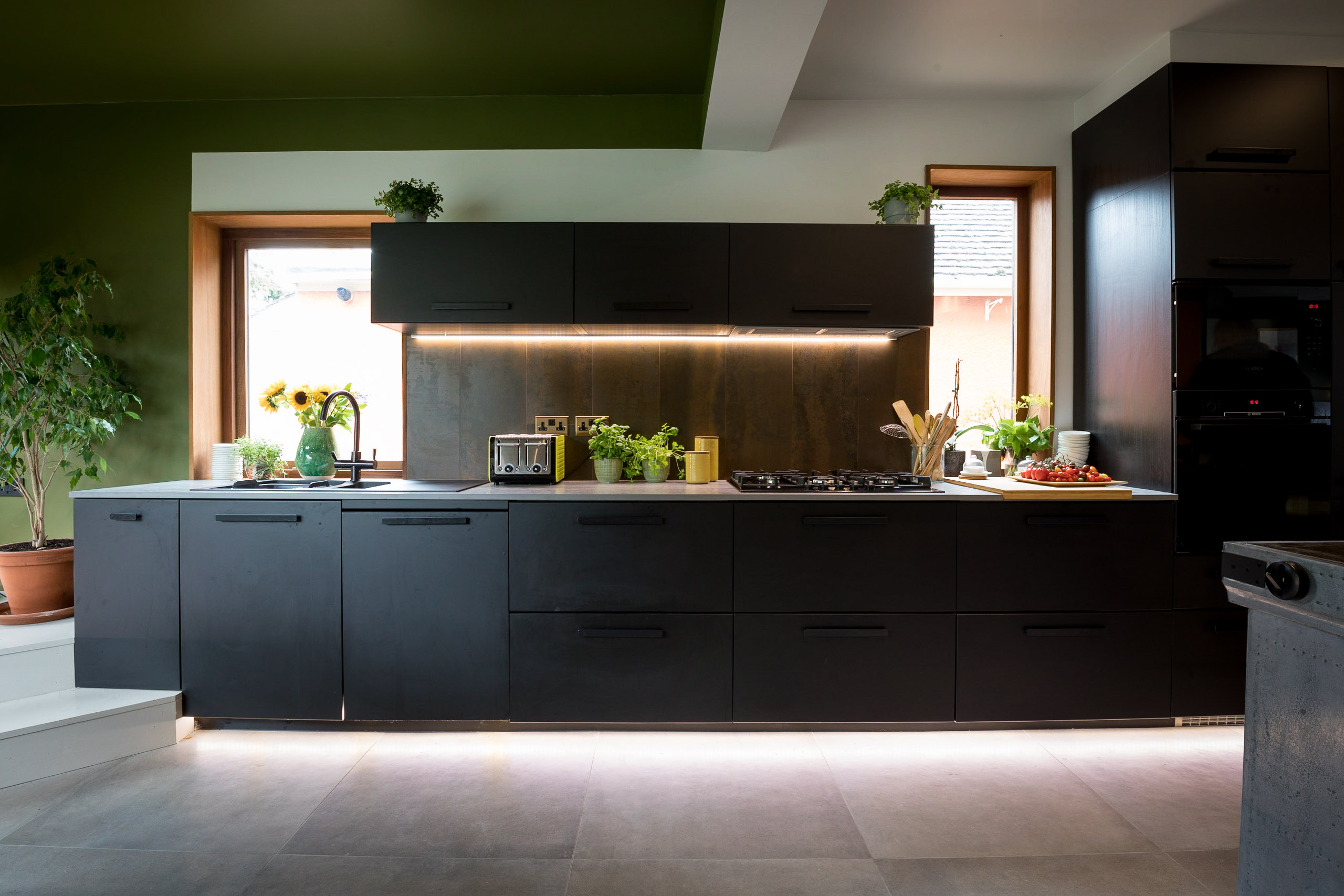
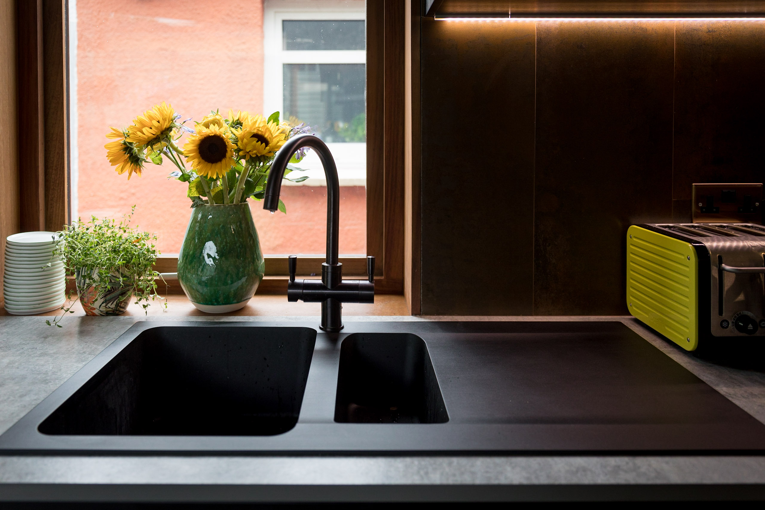
This sleek Orion OID651 gunmetal sink is from Franke, a company I’ve specified for clients many many times and have never let me down on quality or style. Likewise with the matching Omni 4 in 1 gunmetal tap. So many more clients are opting for coloured kitchen sinks now, it’s rare that anyone ever chooses a regular stainless steel version! It’s the same with the new 3 in 1 or 4 in 1 taps. Kettles schmettles, they’re so 2018 😉

I remember when Silvia and Julian found this copper topped table – absolute treasure! It’s perfect here in front of the Iroko lined picture window looking out to the garden, under the feature lights made by Silvia’s friend. And I only just noticed the lovely reclaimed chairs too, complete with church book backs – I’ve just cleaned and varnished one similar for my dressing table! There you can see just to the right the window seat with it’s cushions on top, mentioned earlier.
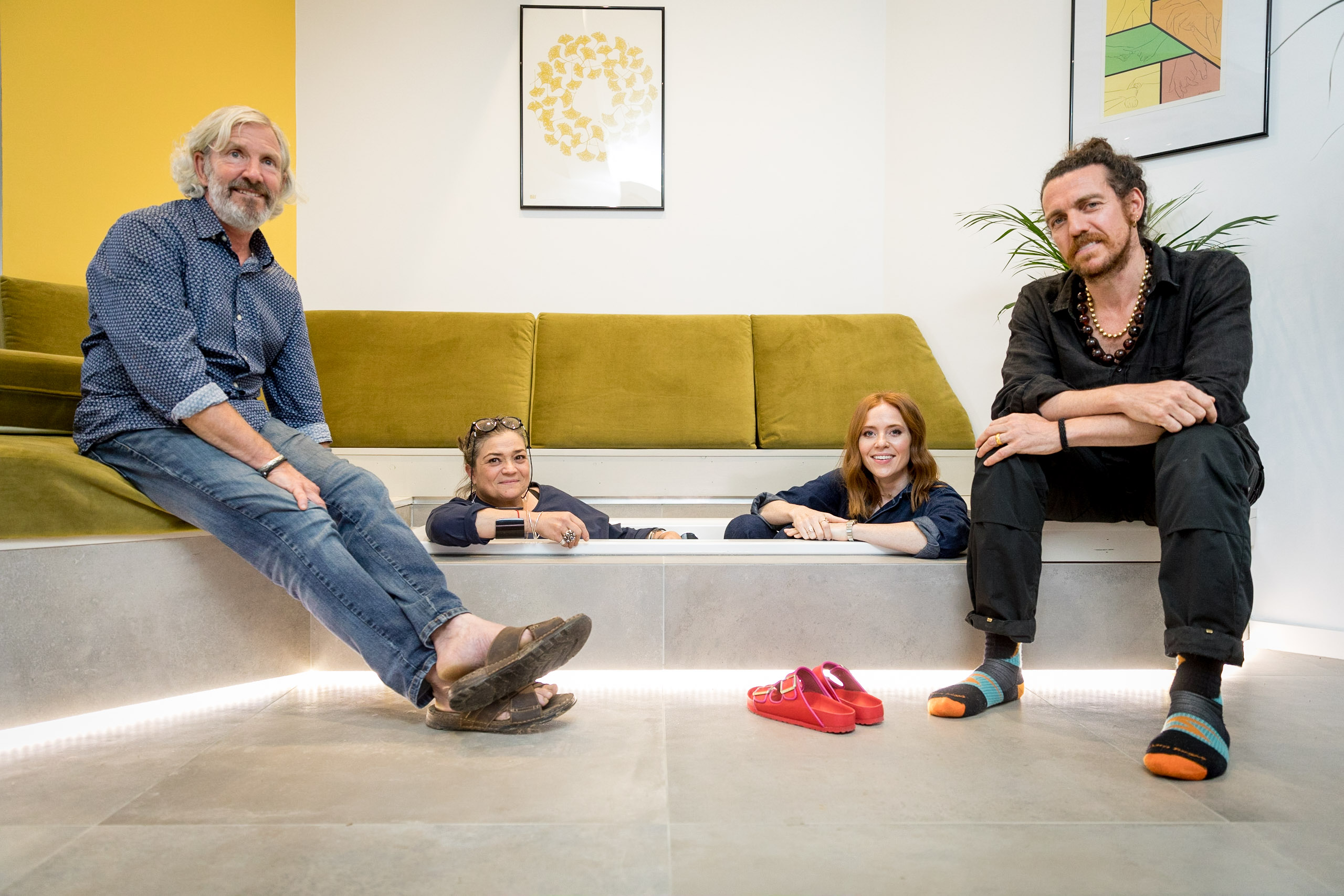
So there you go, plenty of my top tips when renovating and some insider build secrets from the stunning Brighton episode of Your Home Made Perfect, borne of the innovative architecture by Robert Jamison, built by Darren Manton, shot by the fab team at Remarkable TV, expertly and wonderfully presented by Angela Scanlon and lived in by Silvia and Julian. With a little help along the way from us here at Team Moregeous.
I hope you enjoyed the show and this has answered some of the burning Reno questions you may have – please feel free to ask away below if you want to know anything else, if I know the answer I’ll share it 🙂
CREDIT FOR REVEAL PHOTOS TO REMARKABLE TV
THANKS FOR TRADE INVOLVEMENT TO:
- Farrow and Ball
- Mandarin Stone
- Formica
- Franke
- Bette Baths
- Jackson’s Joinery
- Shiply
- Lampshades over table – Rob Hopper
- Kiki Voltaire Upholstery, Brighton


Leave a comment