
As I read the Twitter comments today about the imminent return of architect Robert Jamison to YHMP tonight – “So excited Robert is back next week!!!” “Excuse the pun..I thought Robert had been benched!” “Robert is back. That is bigger than the silent witness reveal” – I wondered what would be the parts of the build and finish which will set the internet abuzz. It’s a heck of a build. I don’t get to see the edit so will be watching along with you gang, curious to see what makes the cut and what doesn’t. When working on the 15 properties from the launch series I didn’t get to see the design which wasn’t chosen by the homeowners, only the one which was chosen, so whilst I’m intimately acquainted with the latter, my intrigue is aflutter to see the alternative architecture.
Spoiler Alert : If you’re reading this, the chances are you’ve already seen the episode, but if not then please look away now and don’t read any further until you’ve caught up on iPlayer 😉

Those who’ve watched know – it’s a Robert win. Bold and uncompromising, Robert’s architecture gets the whole room talking and the on site builders scratching their heads.
I’m not getting into what was changed and why here, you’ll have to watch the show for that, but rather will offer up some more info on the materials and finishes which were used and some of the challenges thrown up from a build perspective. Just in case you’re of a mind to attempt something similar!
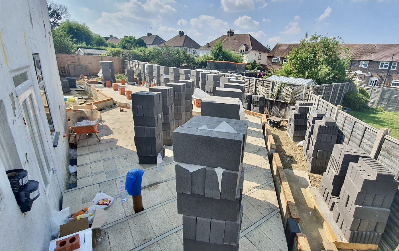
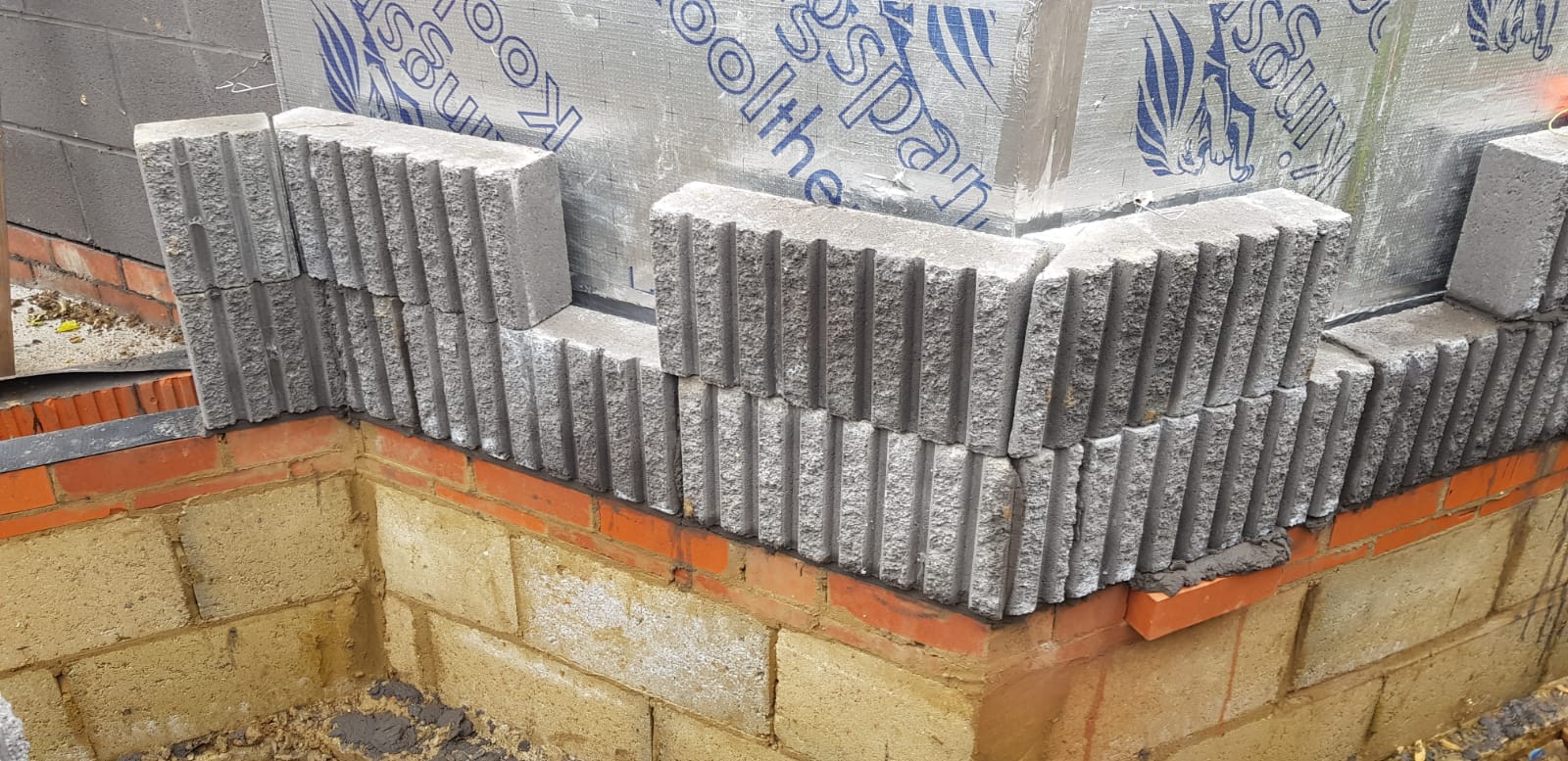
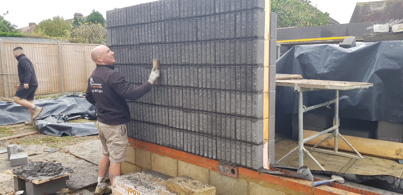
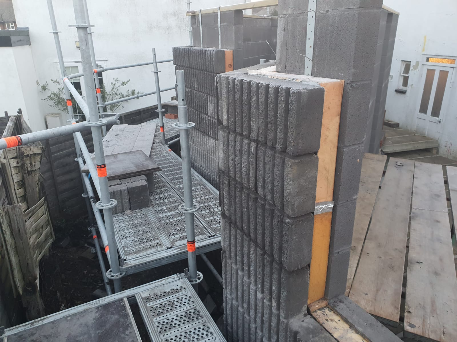
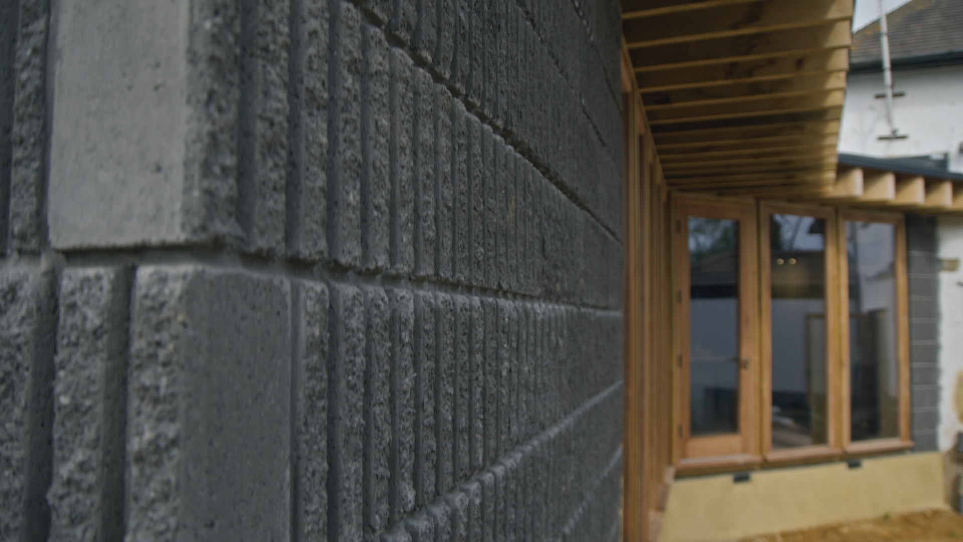
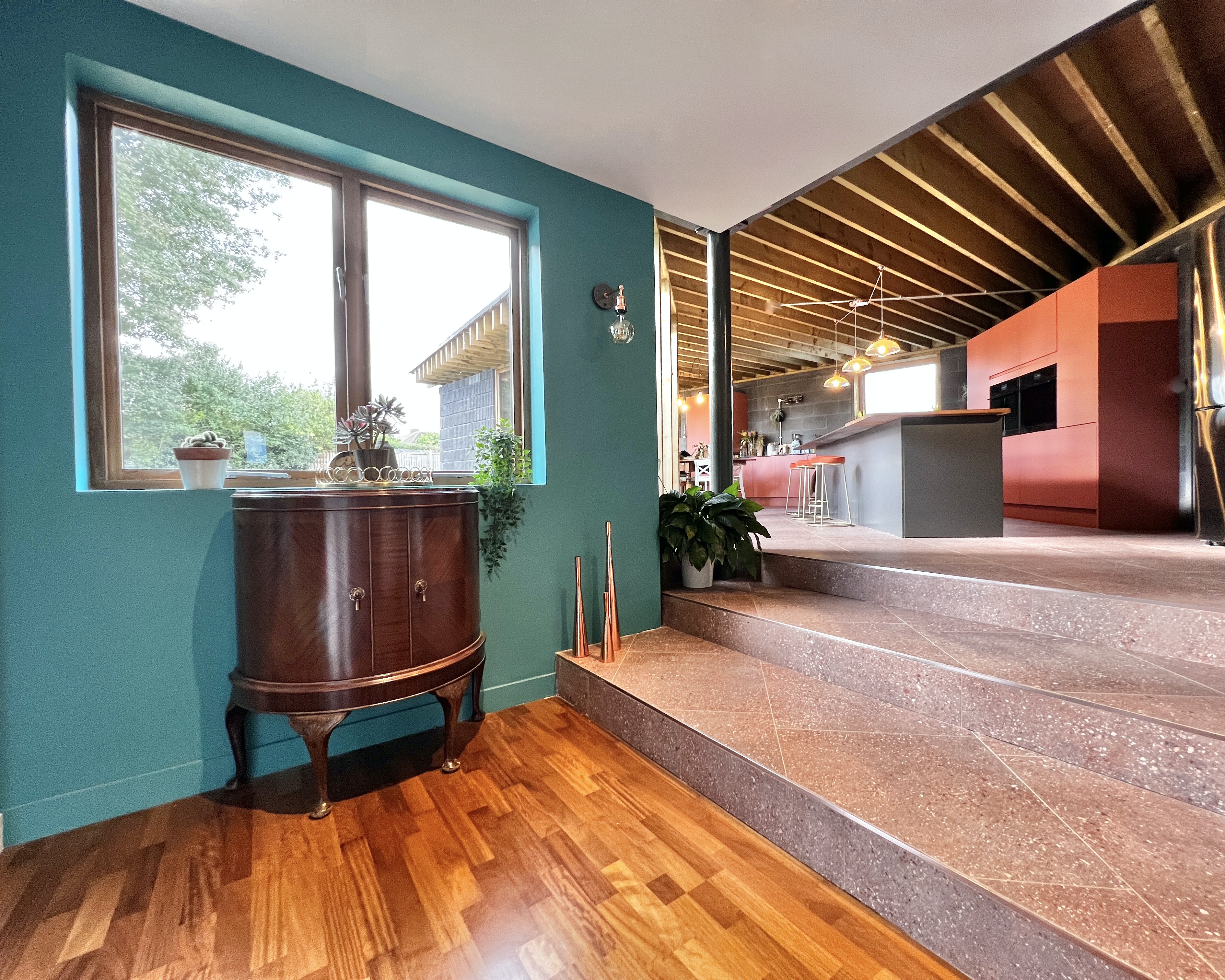
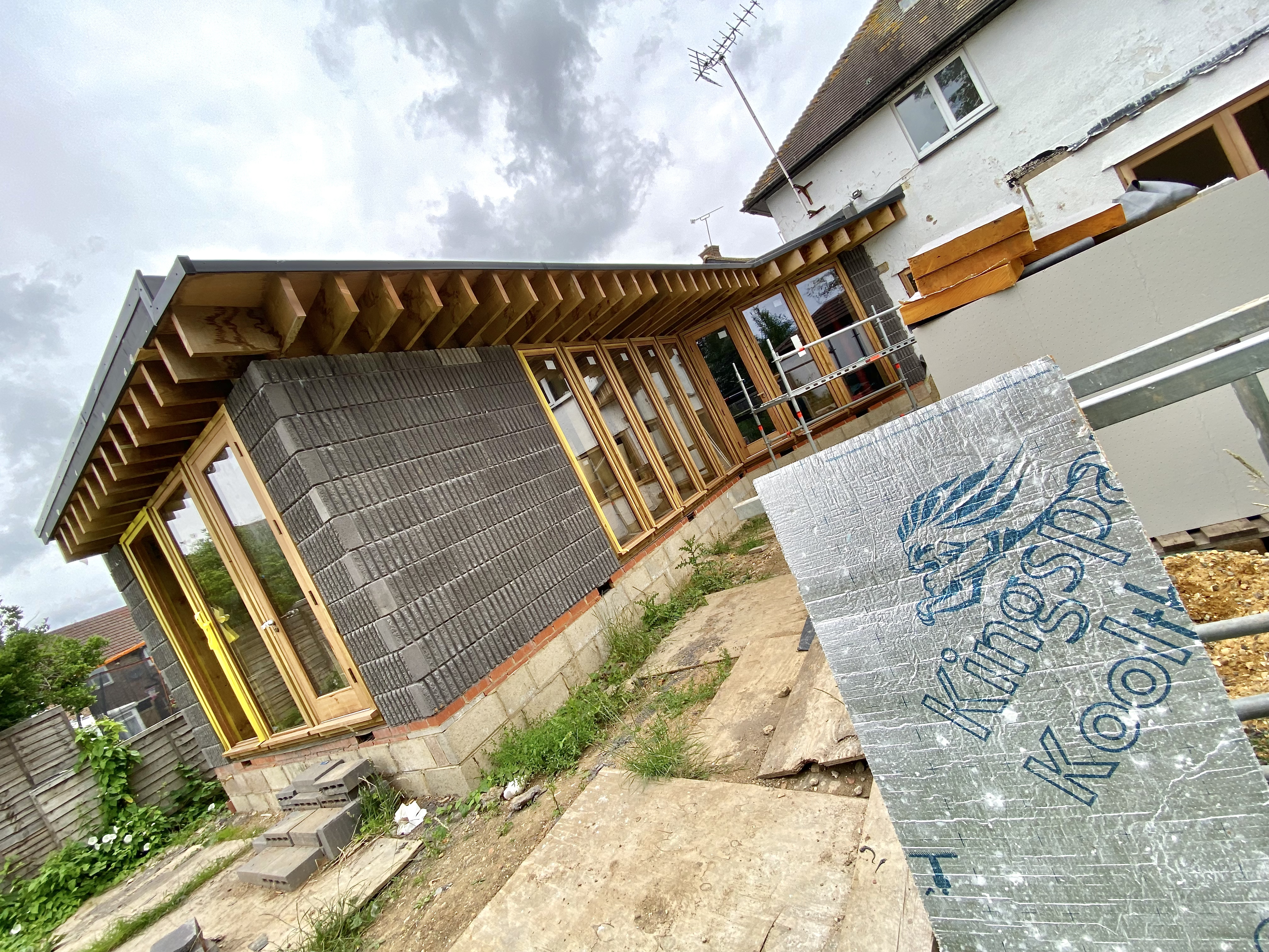
The Charcoal Fluted Blocks
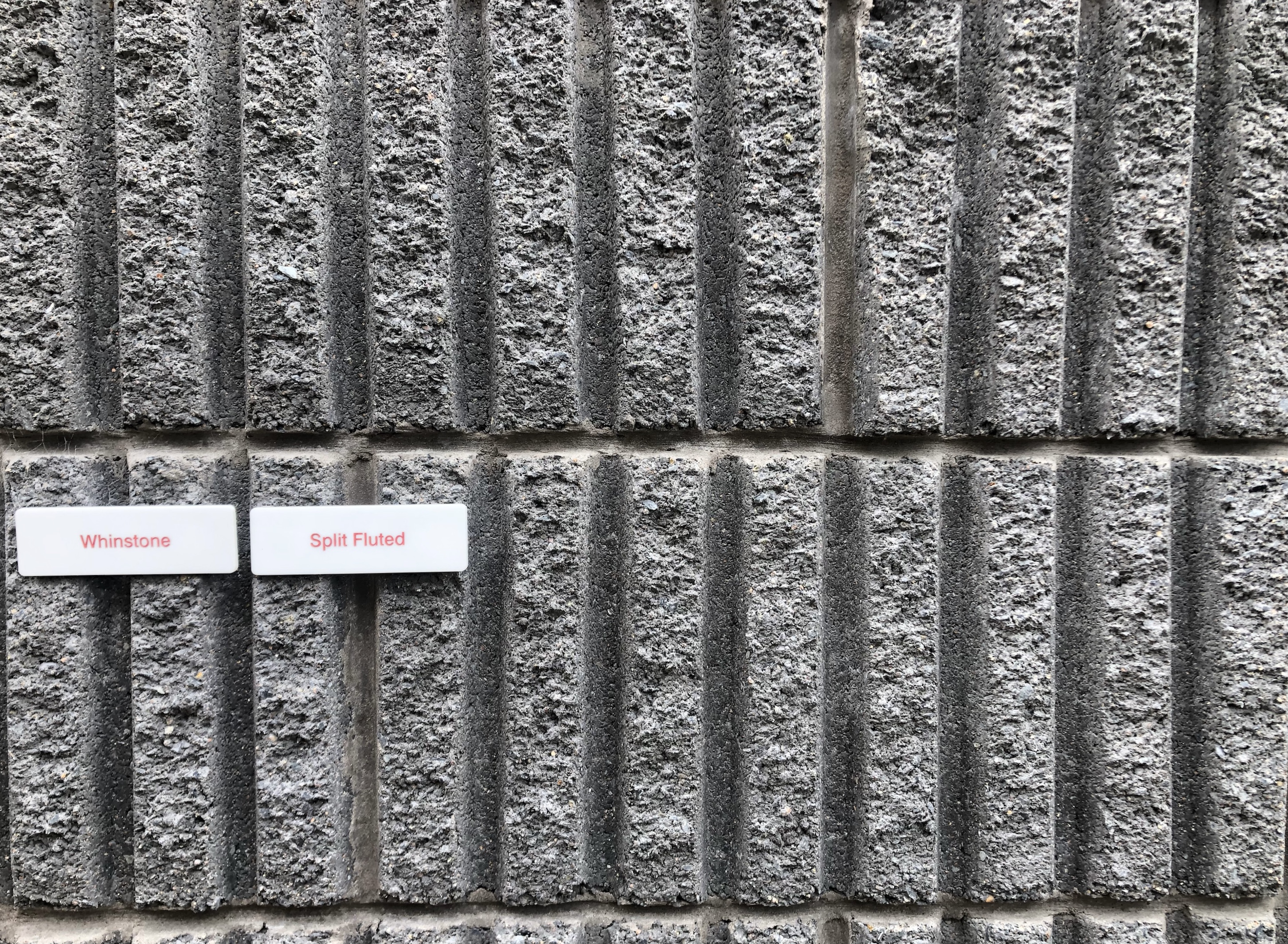
A part of me would have liked to see these fluted beauties used both inside and out as they are just so texturally interesting and visually wonderful. The compacted earth from the original VR wasn’t possible for the build, so Robert sourced these smooth and split faced blocks from a Northern Irish company called Colinwell – the ones used are called Whinstone. The brickies did a super job on the exterior, working out to full blocks all the edges of windows and doors. Often detailing like this will change the sizes of openings from what’s drawn on plans and it’s far better to be reactive and work with what you have practically if the plans haven’t been drawn up for specific measured materials.
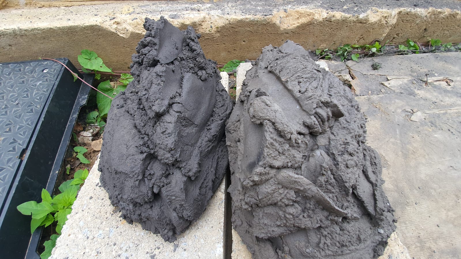
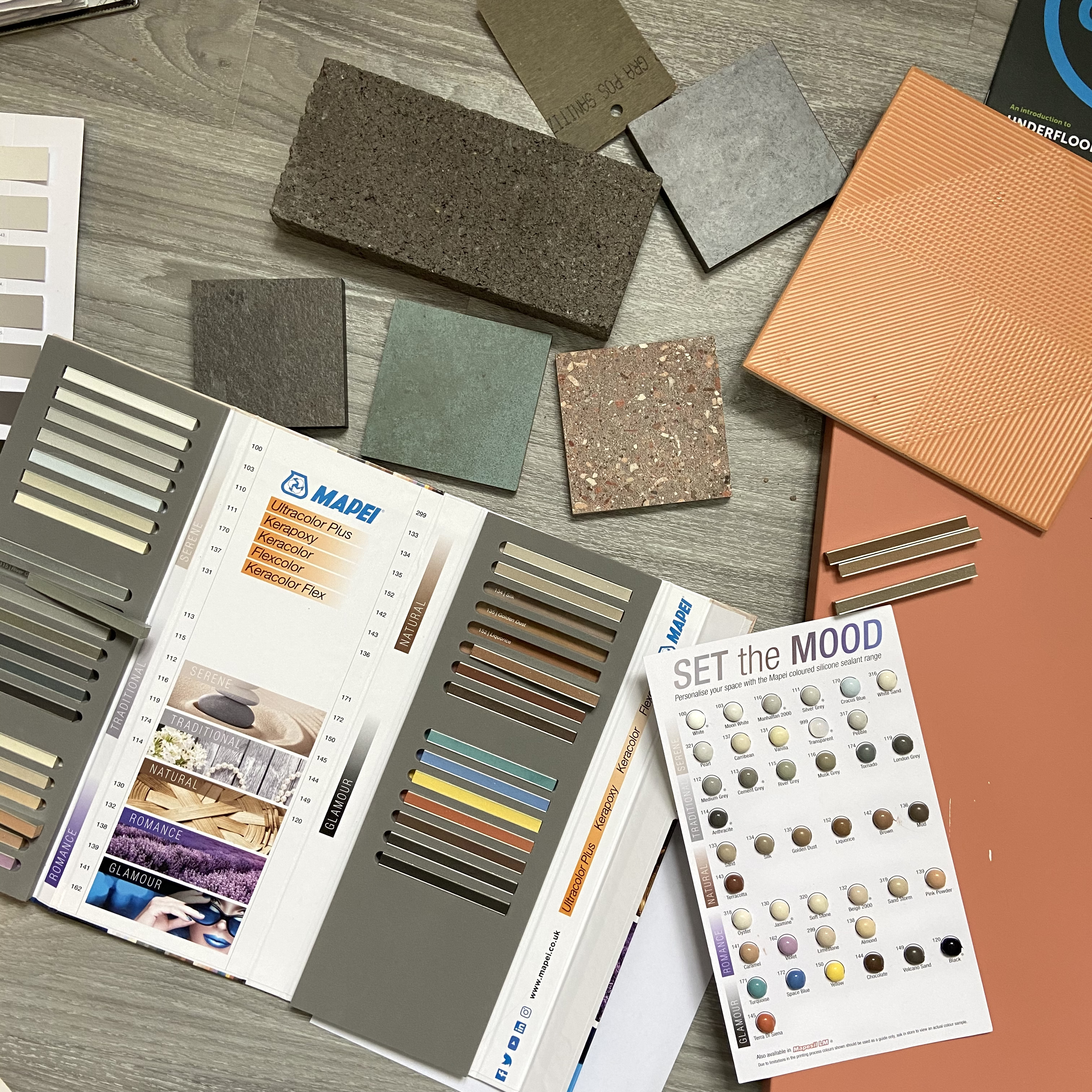
We spent a lot of time sourcing a good colour-matched mortar too, finding an ideal one from Tarmac in their Trutone range. This one was Y14, fyi. If you whizz through the slide-show below there’s a shot of two different greys mixed up, it’s amazing how different they looked against the block, Y14 just shouted out Pick Me! Never assume the mortar the builder choses ‘will do’ when you’re spending thousands on your build: get involved, get researching and get perfection.

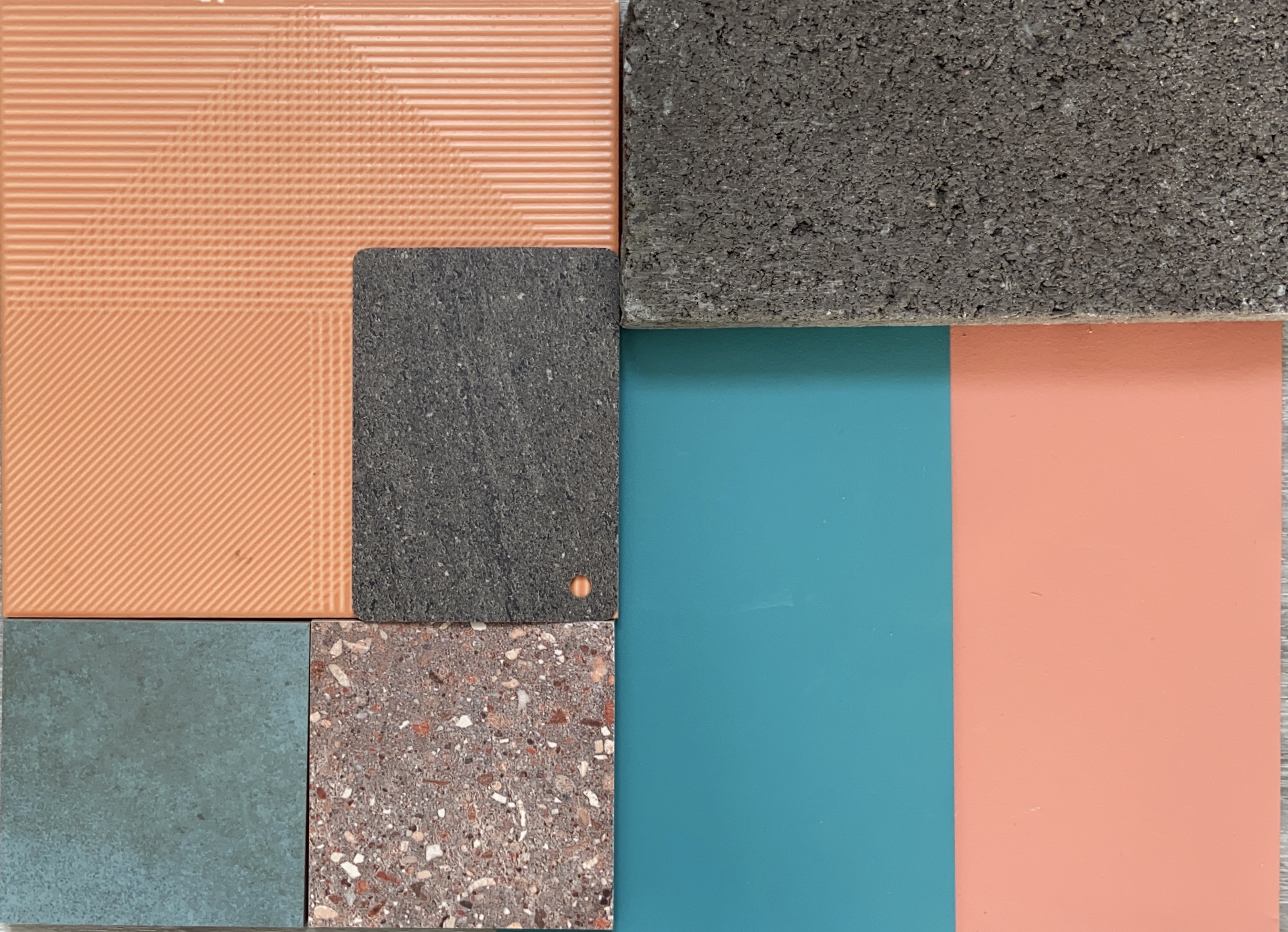
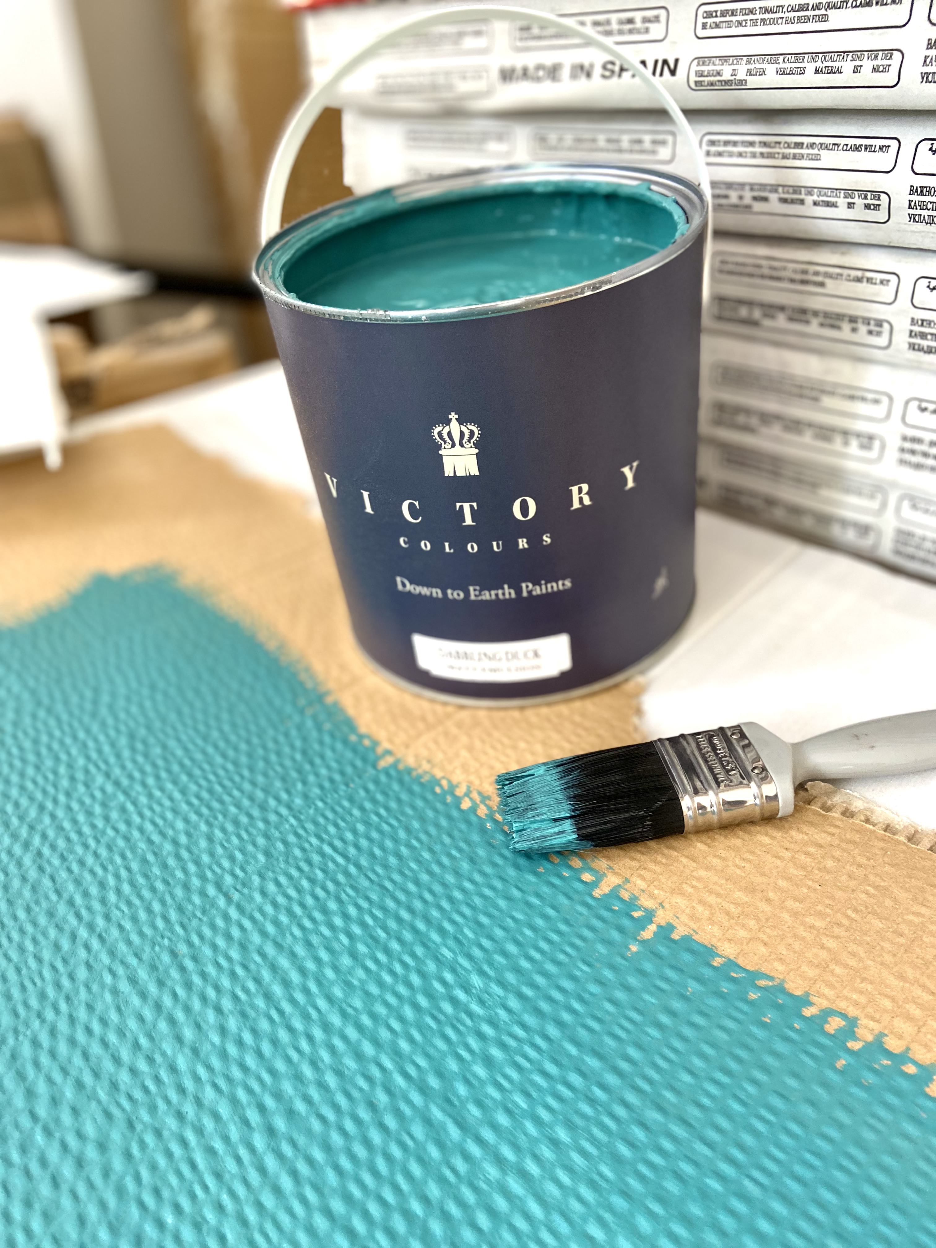
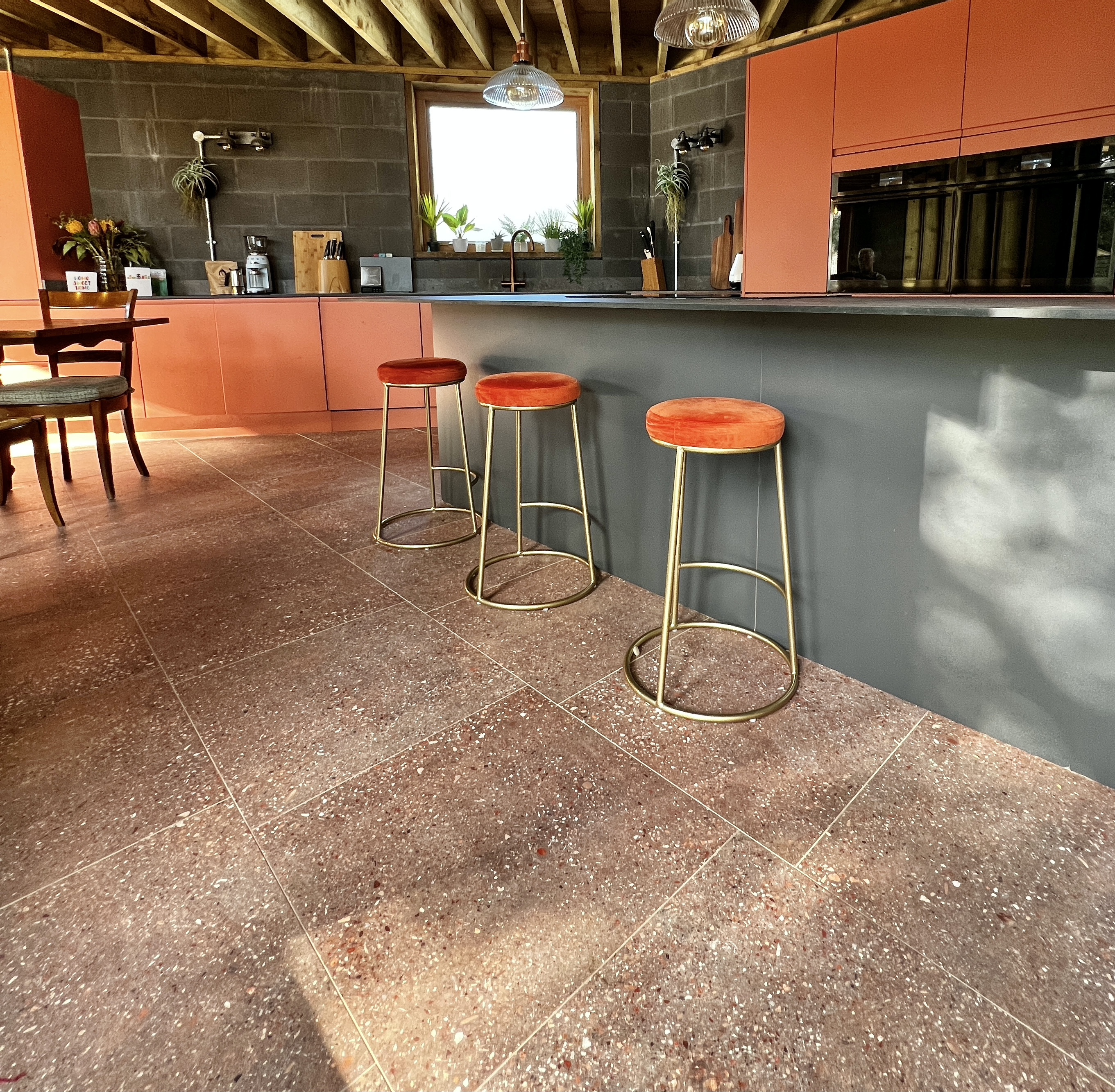
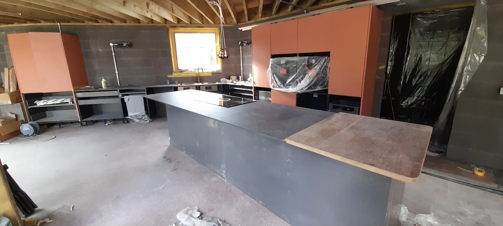
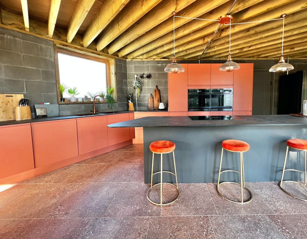
Colour Choices : Terrapotta and Dabbling Duck
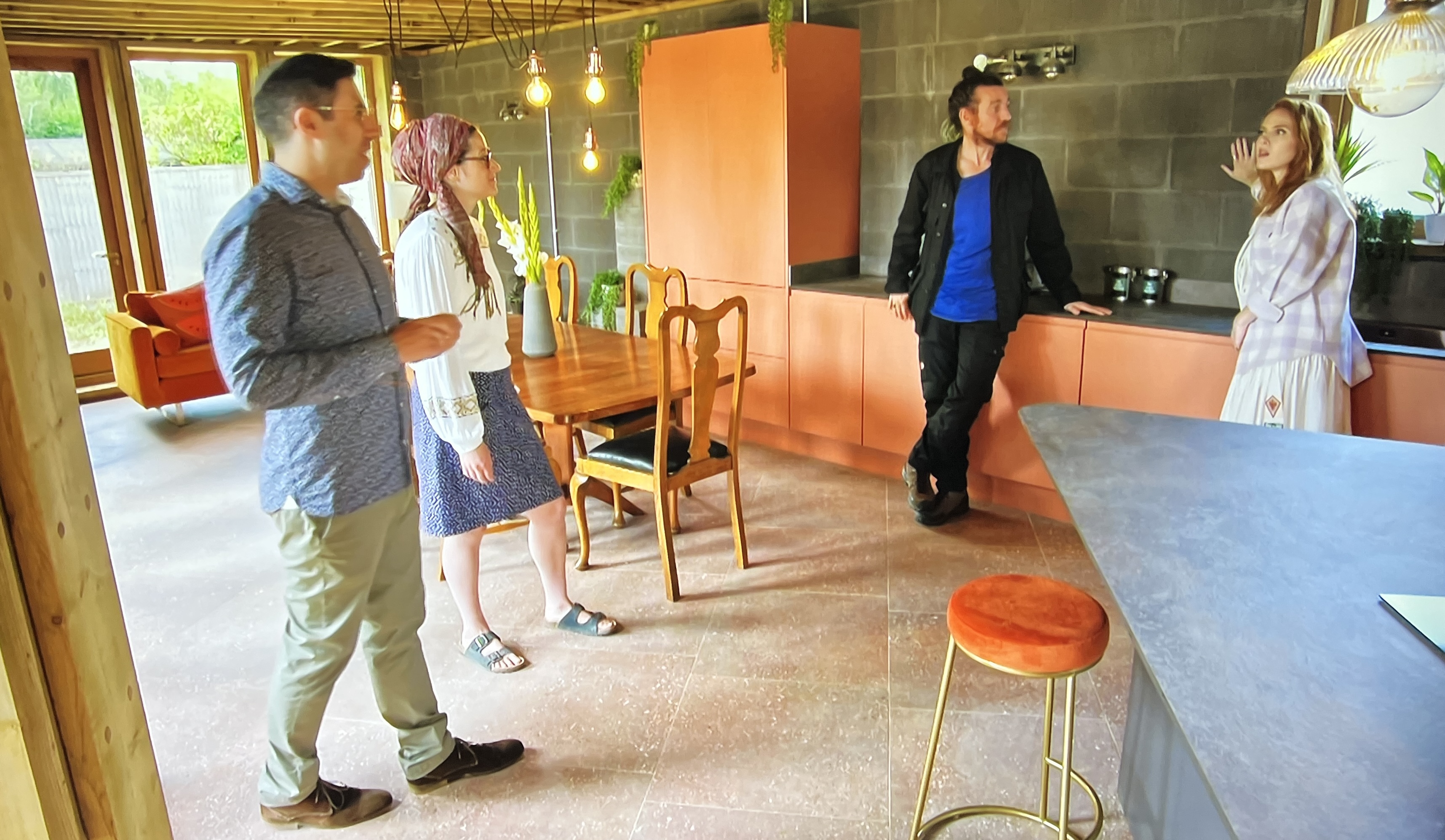
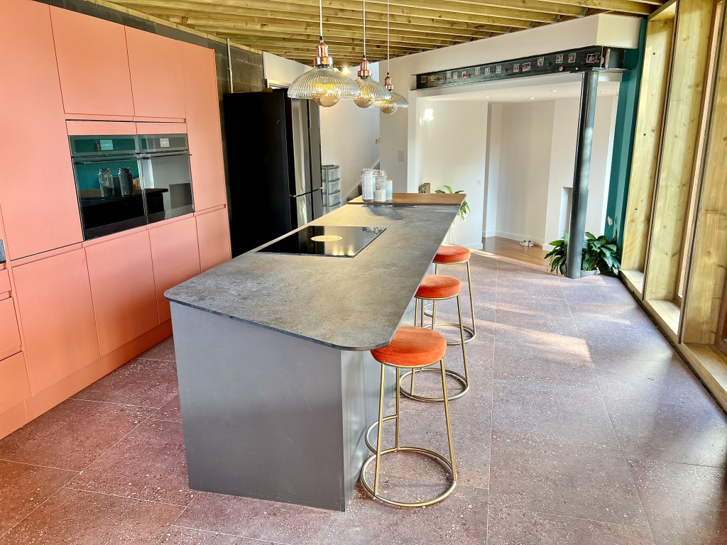
Once the walls shade-shifted to dark grey instead of earth toned, with the pine ceiling absorbing even more light, a whole new slant was needed for the kitchen cabinetry. What was required was a lift, a punch of colour, a surprise if you like, and what’s more punchy than a vibrant, sunset inspired hue. Warming up the room and creating a vivid contrast to the blockwork, the Terrapotta shade by Victory Colours was used as inspiration for the painting of sprayable kitchen doors and end panels. It’s becoming increasingly common for clients to want to add their own stamp to kitchens instead of buying ‘the same’ colour as other customers, with many ranges now being paintable, or sprayable for a smooth, more perfect finish. You can do this yourself or there are specialist companies who can do it for you.
Victory are quite a new company so don’t (yet) do a tough eggshell or paint which can have a hardener added making it suitable for spraying kitchen doors, so we had the spray shop copy their Terrapotta, hence me saying it was used as inspiration. They sell lovely wall paint and regular water based eggshell for interior woodwork though (not an ad, just a share!).
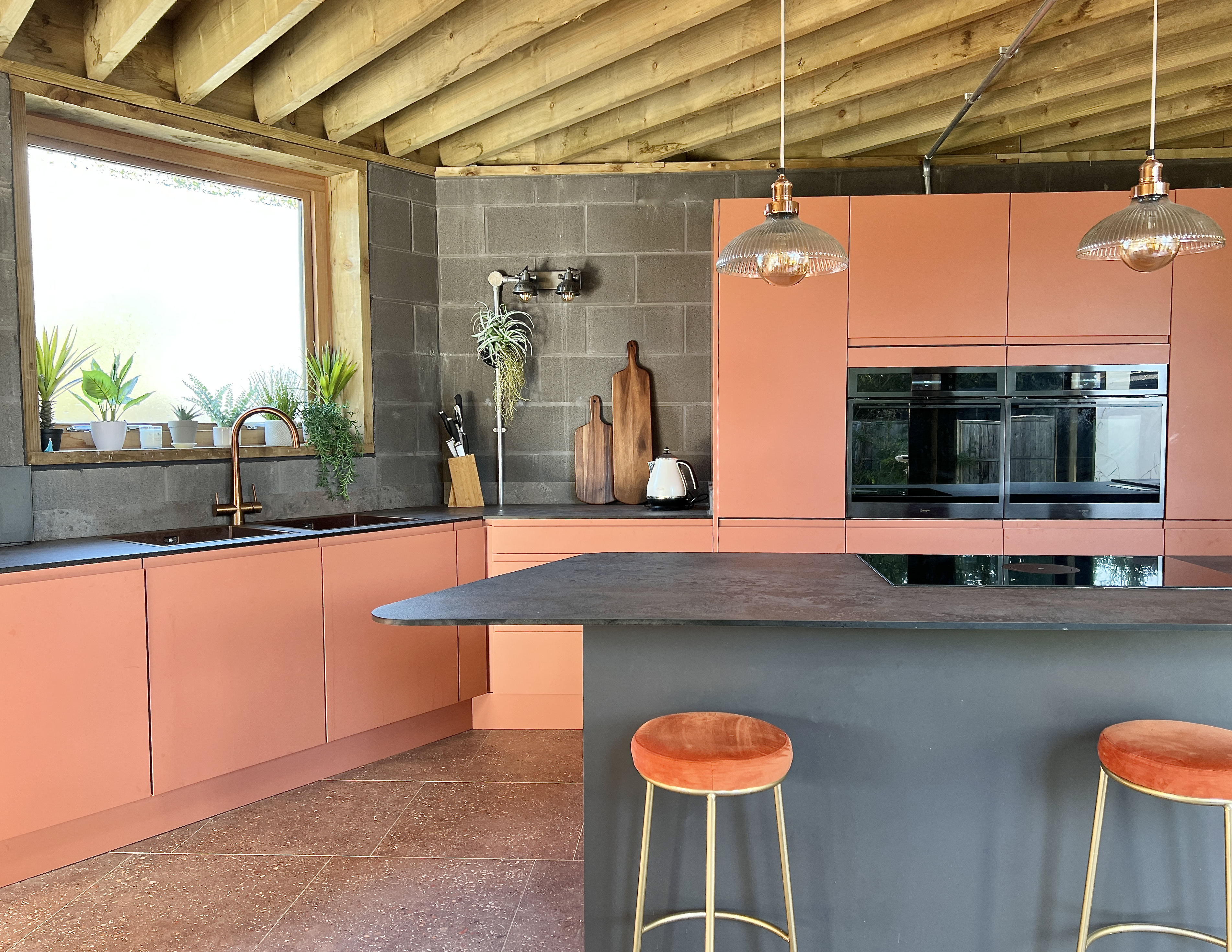
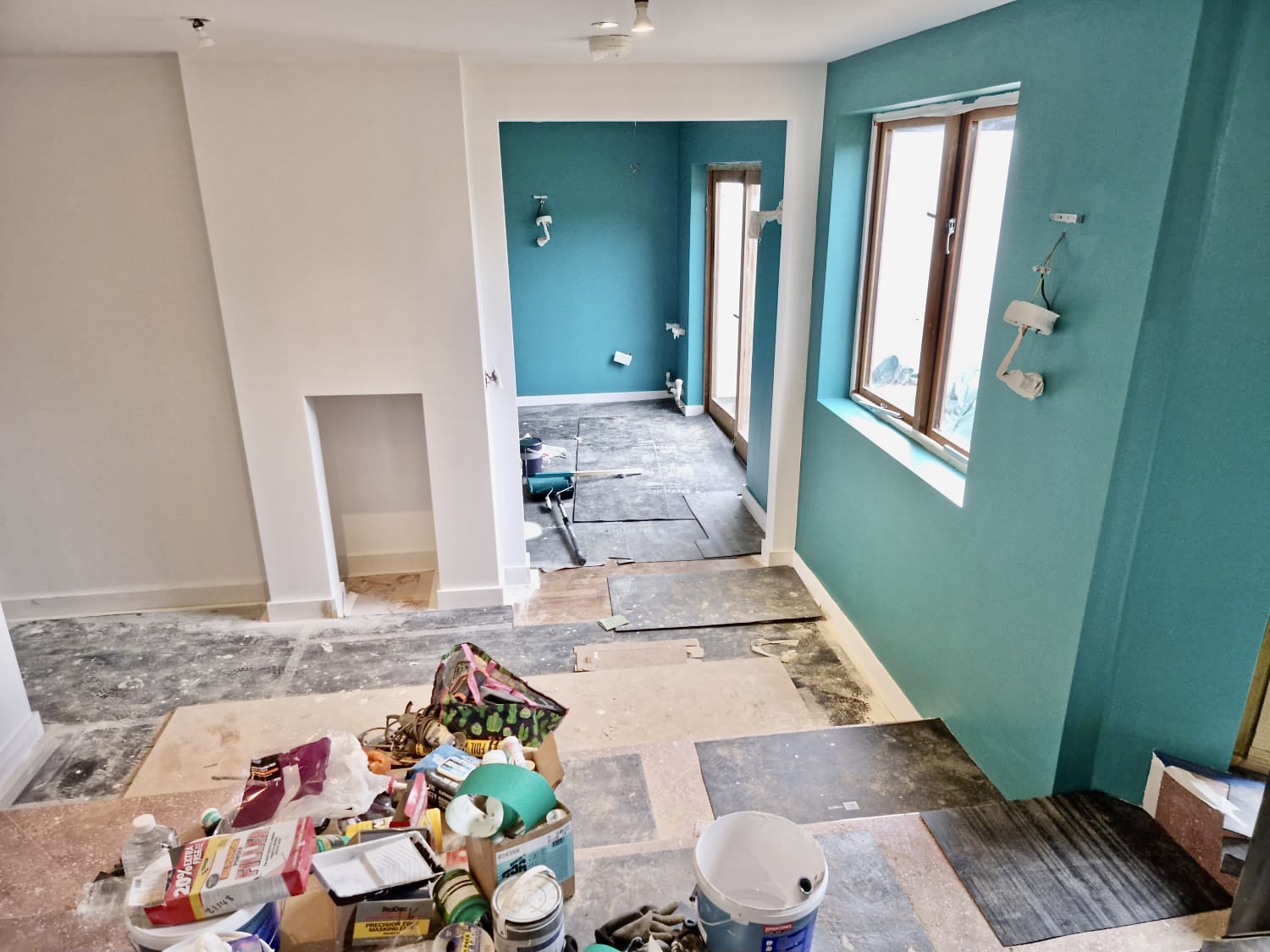
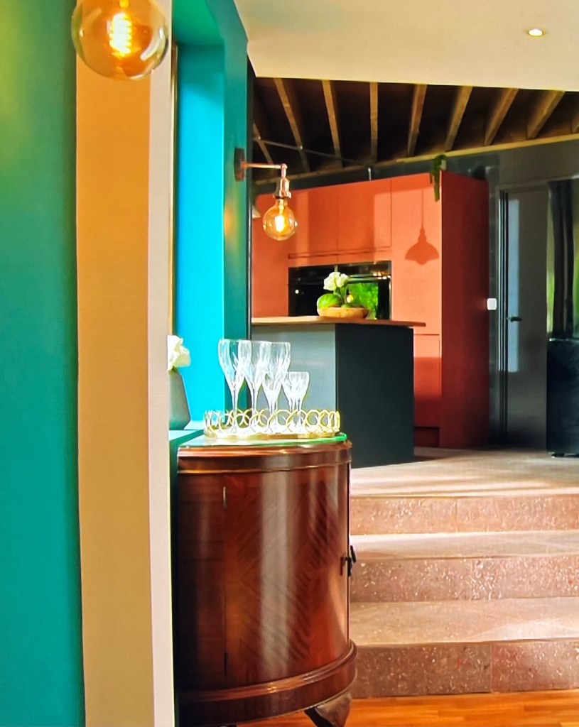
Talking of the Victory wall paint range, Yehuda and Naomi were captivated by the delightfully named Dabbling Duck for the withdrawing room walls, creating a cosy, family space. I absolutely adored it when we put these two colours together, the rust and the teal. Feels very contemporary yet still warm and inviting, you can see them next to each other on the paint swatches in the very first image in this post. It’s amazing how different the colour appears at night behind the filament lamps and then in daylight in the ‘during’ shot as the build was coming to completion. Nice coverage too!


Terrific Tiling
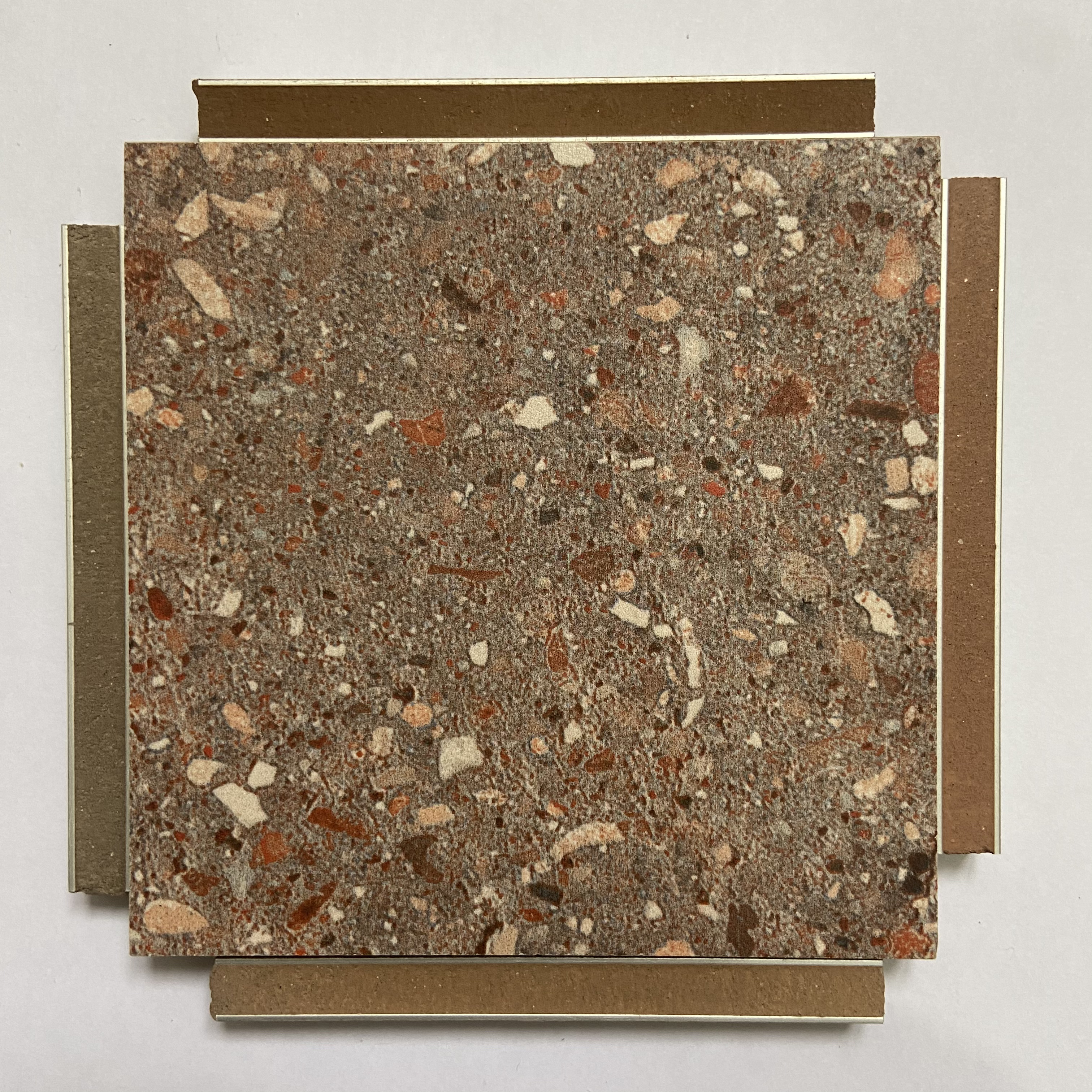
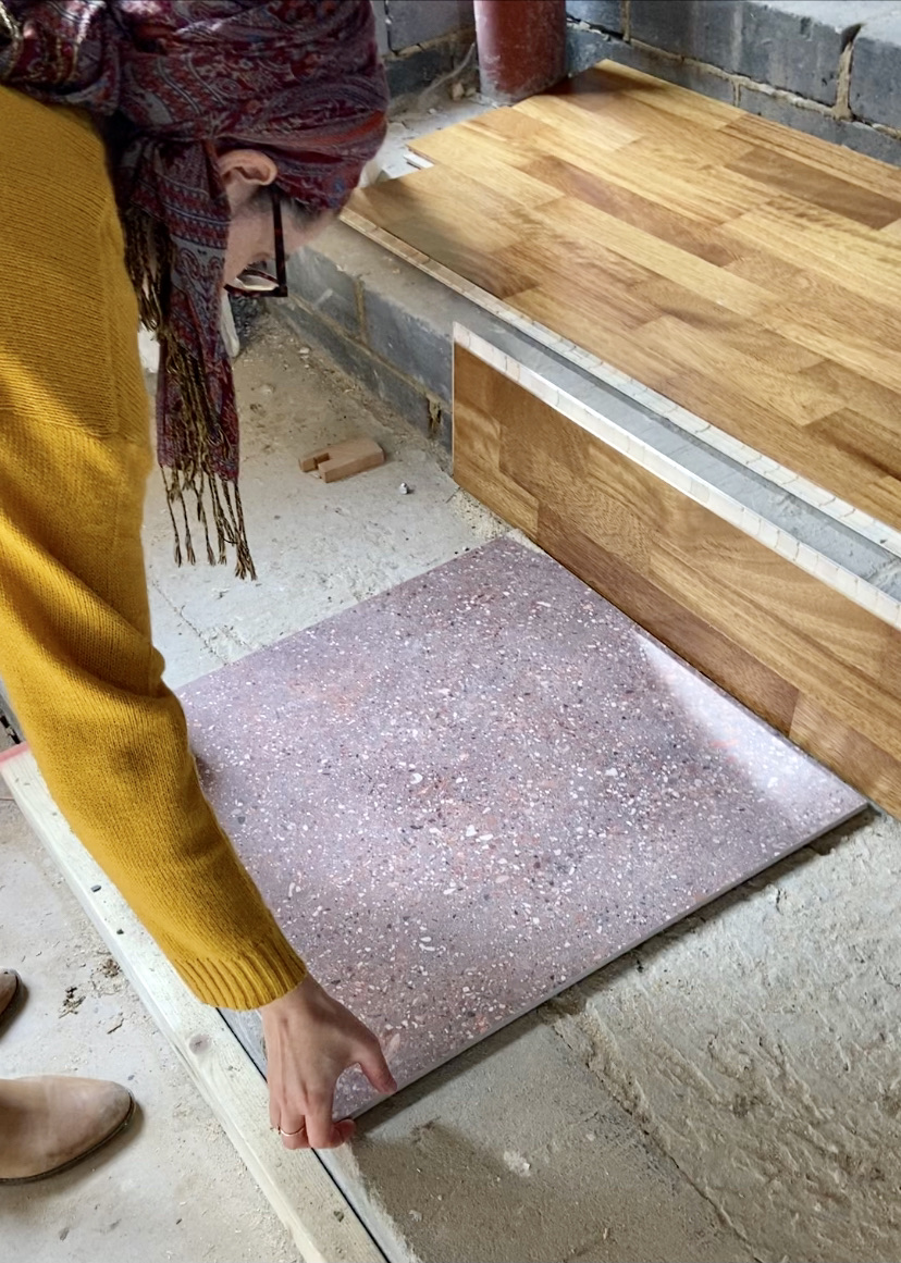
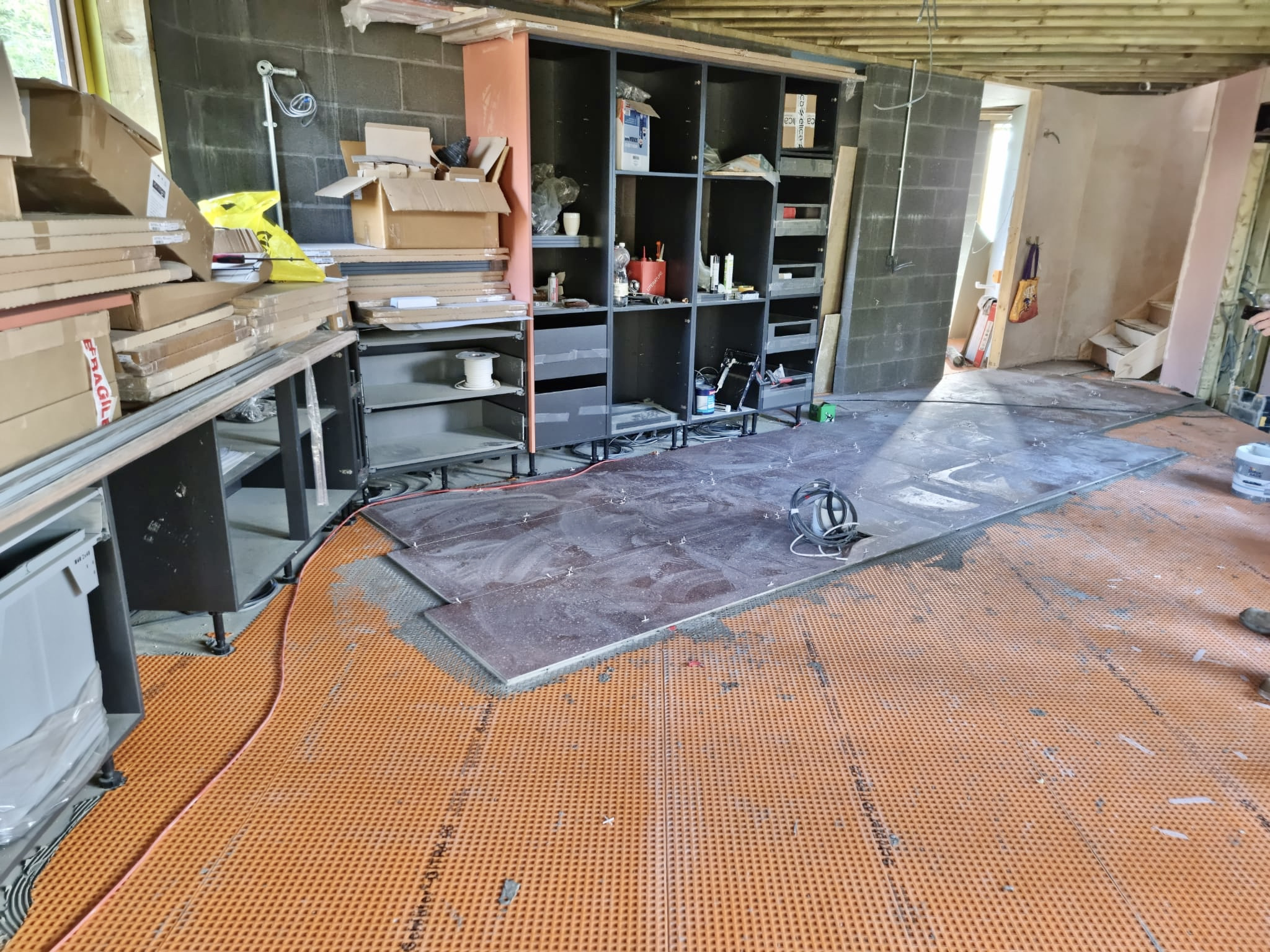
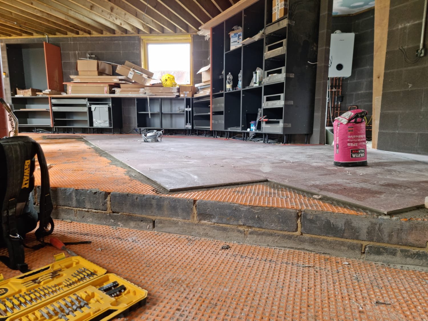
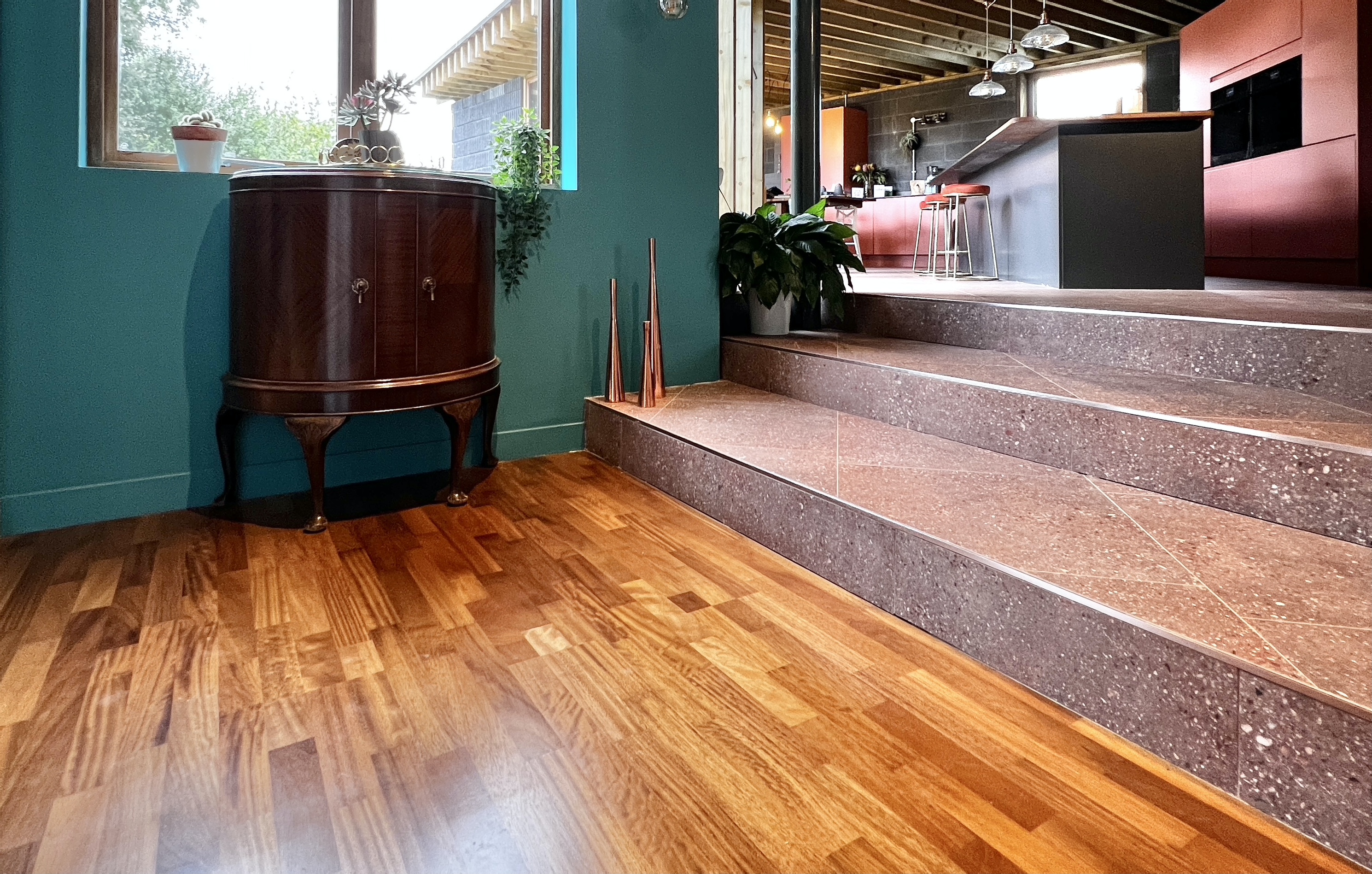
On Robert’s original VR warm toned herringbone walnut flooring flowed through the kitchen, down the huge steps and into the original property, however changes were made due to the practicality of kitchen use and lots of external doors – wood scratches very easily when people are in and out of a garden and can become very damaged by kitchen spills. The updated design shifted to a fabulous terrazzo/concrete porcelain tile by a company I’ve specified many times, Mandarin Stone, called Hendrix Red, laid on the diagonal. We actually took around 10 tiles out of the boxes and physically laid them out on the floor to work out the best pattern as the extension is such an unusual shapes, with no right angles or simple lines to follow. A real head scratcher. We decided to come off the oven wall above at 90* which meant they hit the steps on the diagonal. Always get your tiles out and have a play to ascertain the perfect way to lay them #toptip

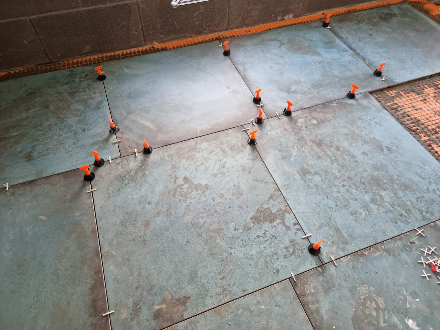
Porcelain tiles work perfectly with UFH and are super practical for such a large extension. This is a 600 x 600 tile (they do a 1000×1000 too) which needs to be laid staggered. Is it a DIY job? Probably not, large format tiles require skill to get perfectly level and spaced. The terrazzo pattern is very realistic and wonderfully character filled, a really goof quality tile. Check out Yehuda and Naomi deliberating between tiled steps and timber – decisions decisions eh – as every renovator knows, they blow your mind!

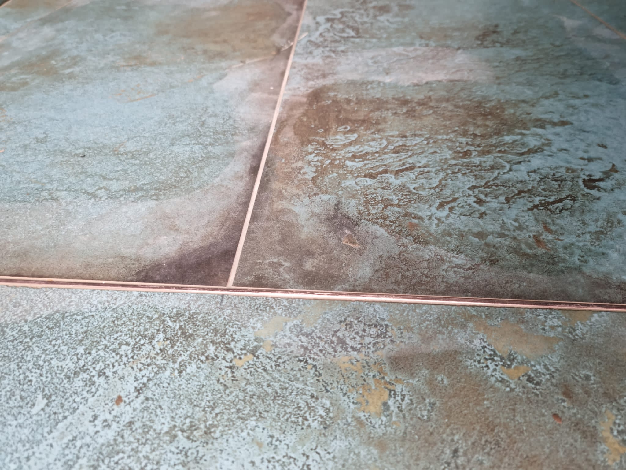
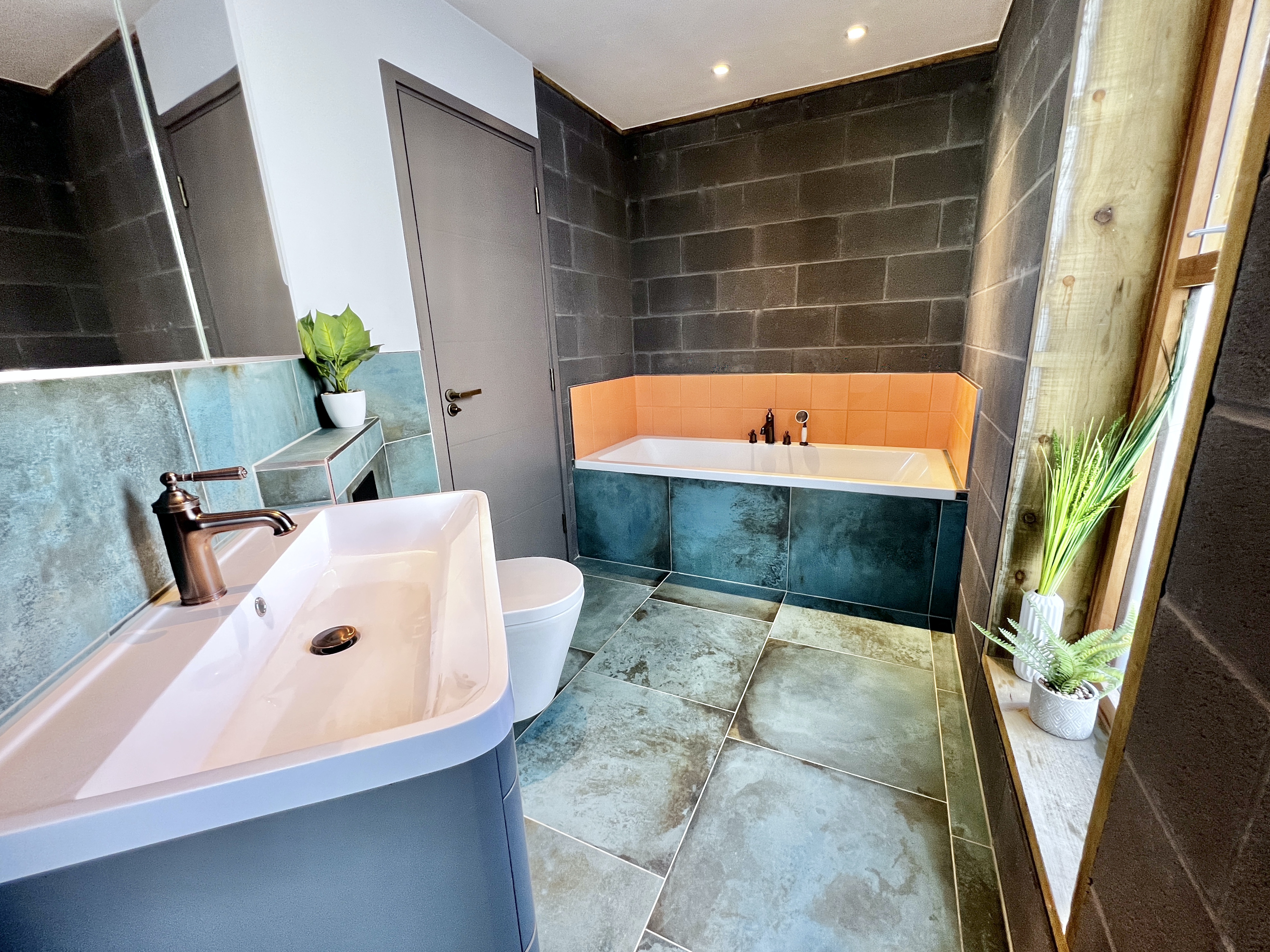
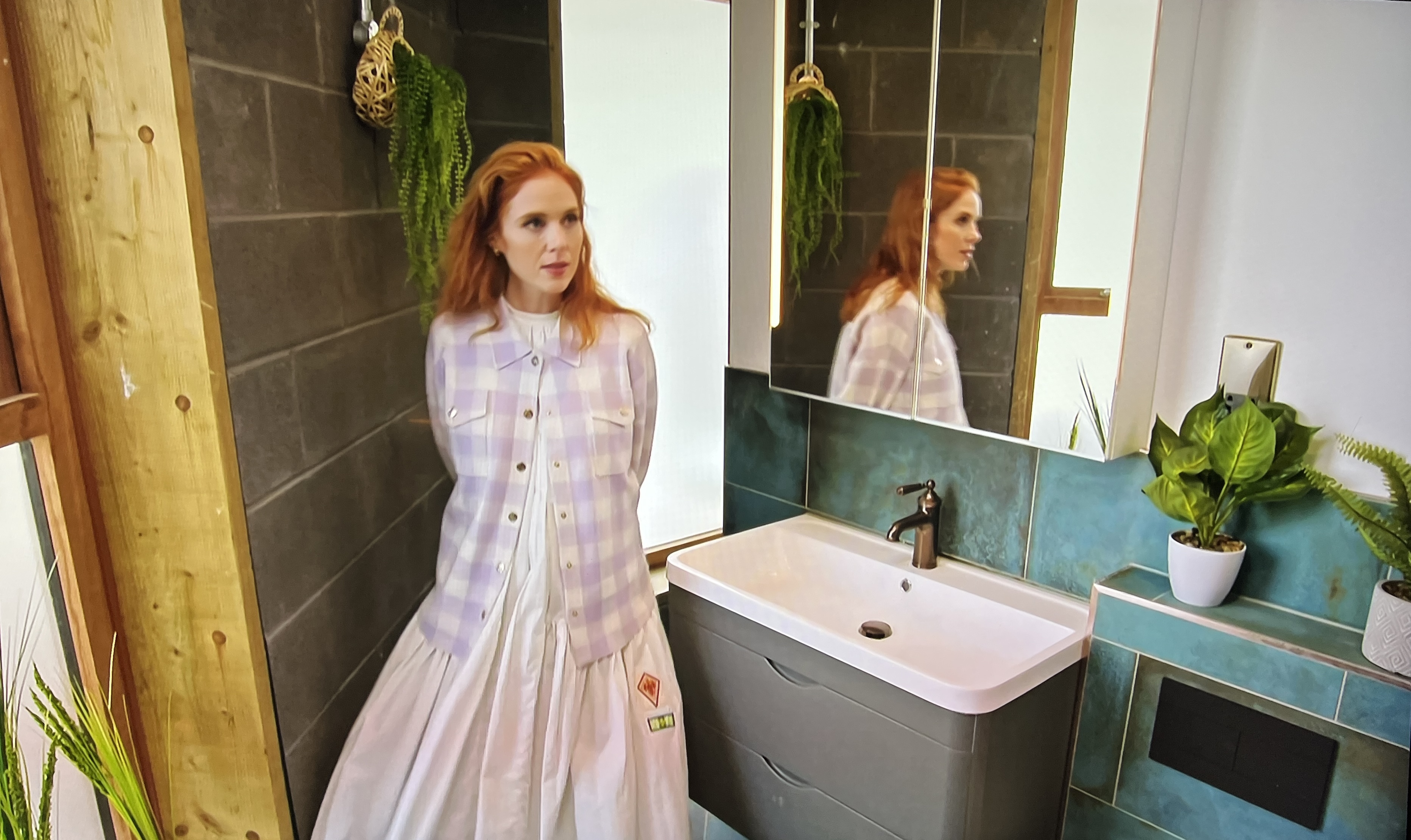
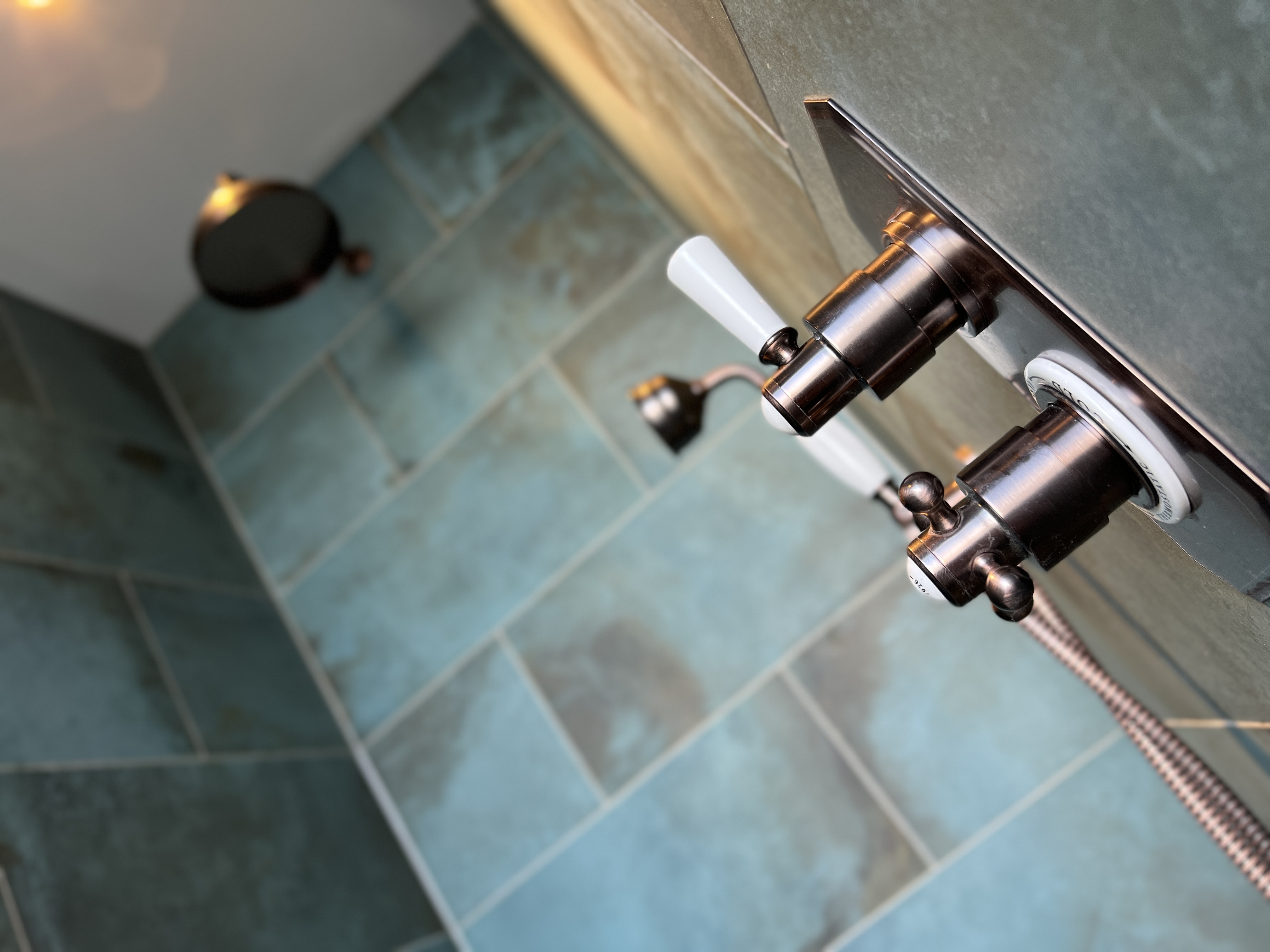
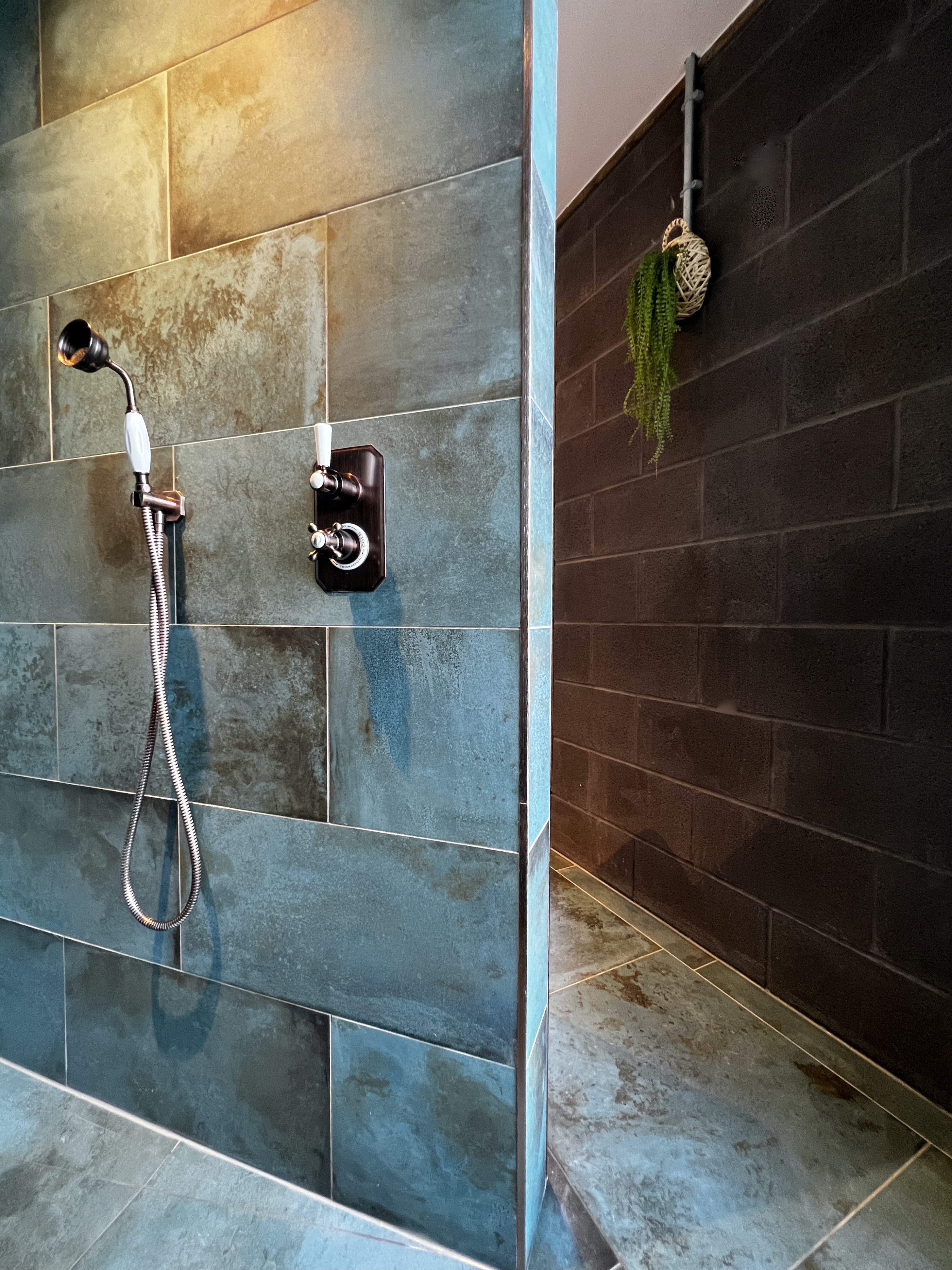
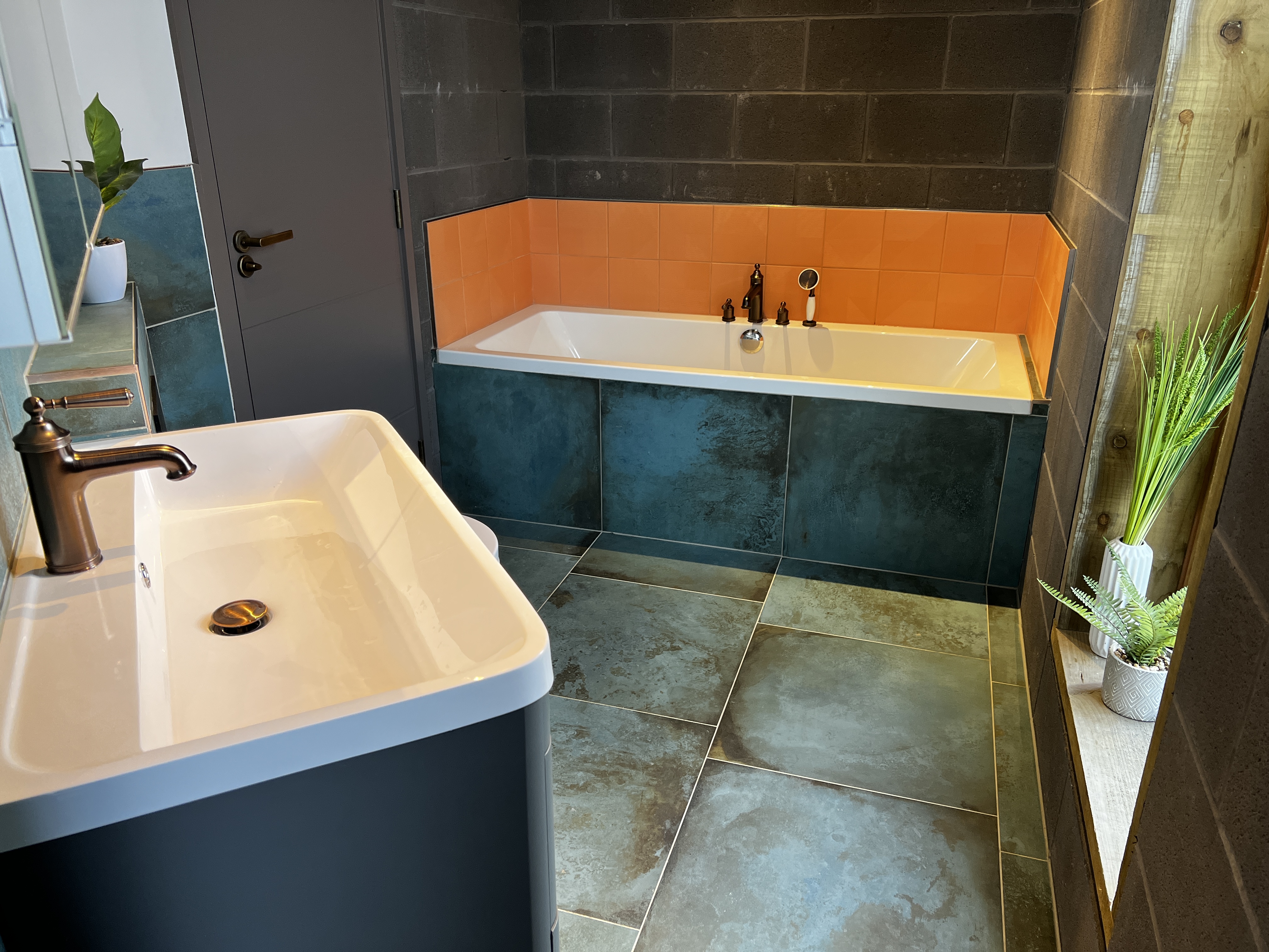
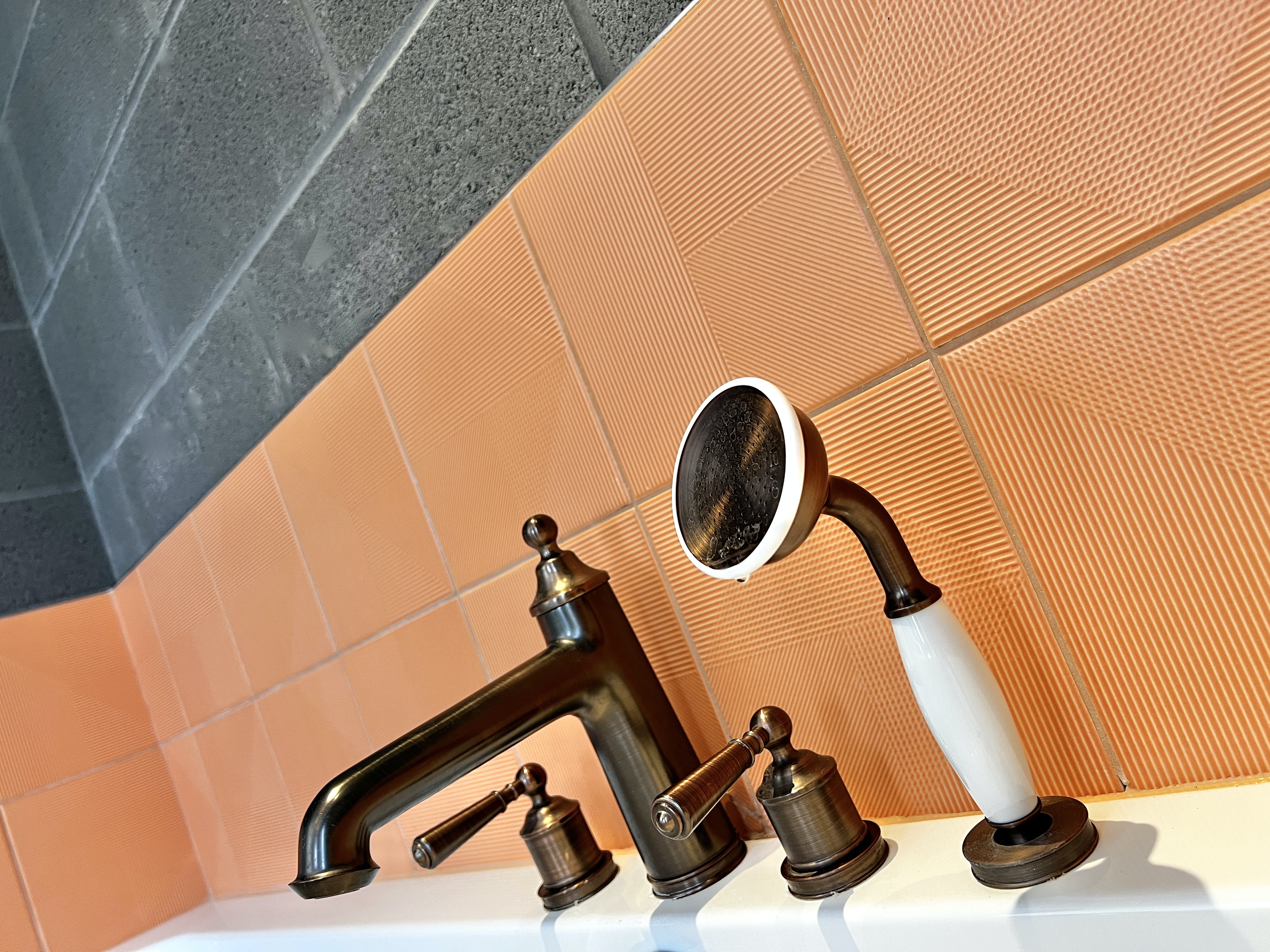
From the very beginning Yehuda wanted to introduce warm metallics into the palette of materials in the family home. so when it came to choosing tiles for the bathroom, the idea of copper and the Dabbling Duck paint colour already chosen were added into the design mix. This fabulous 300 x 600 porcelain called Verdigris came into play for both the bathroom floor and shower walls, providing a perfect backdrop for the brushed bronze fittings. For those who don’t know, verdigris is the colour which copper goes when it oxidises, making a design connection between the materials chosen.

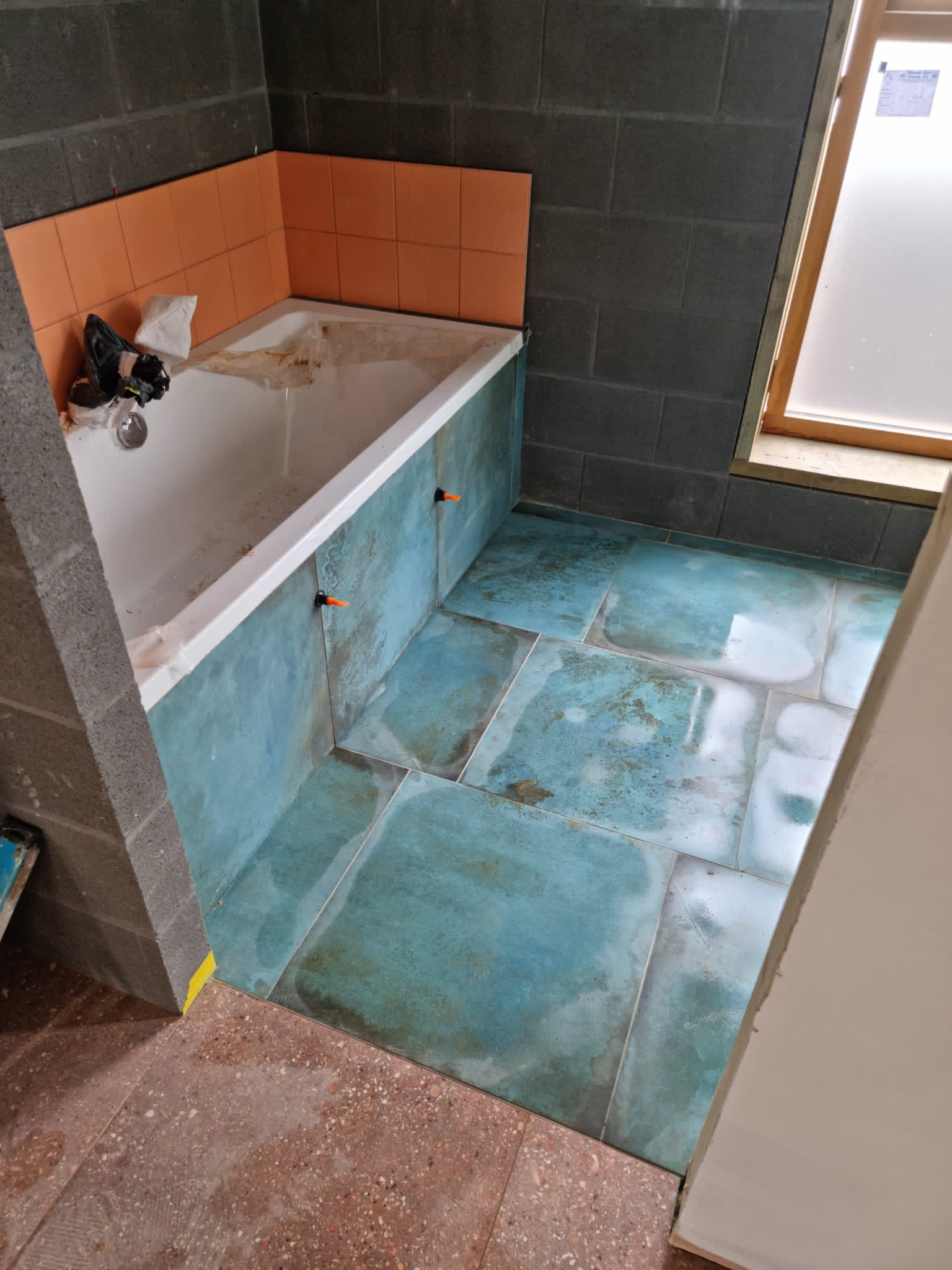

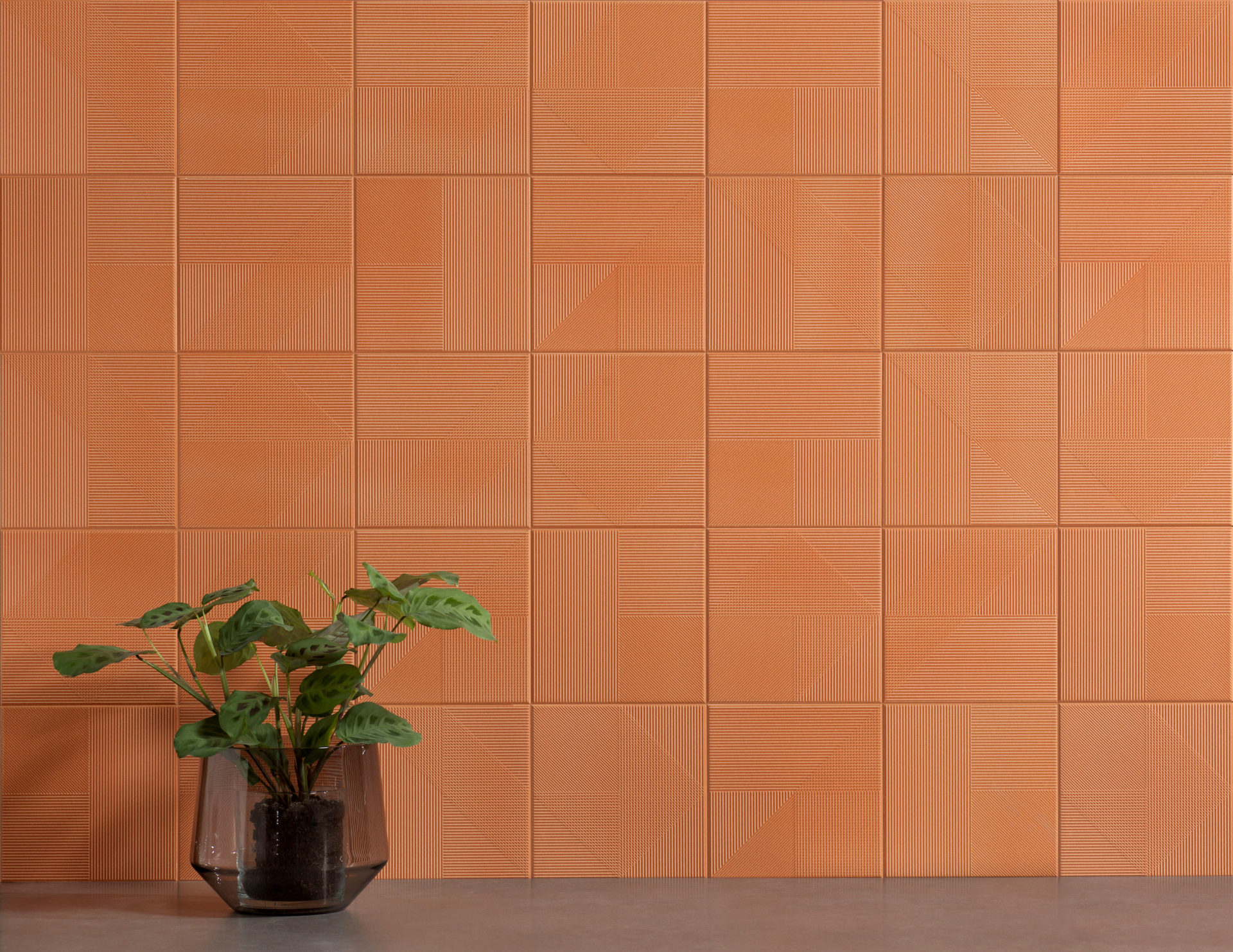
Theirs is a young family, so for the area around the bath the grey blocks needed to be protected from playtime bathroom splashes. A band of colour in the form of a fabulous 20×20 tile called Carnaby Sunset was introduced, picking up the terracotta vibes from the kitchen and carrying on this design red thread into the bathroom.
Rich Iroko Timber
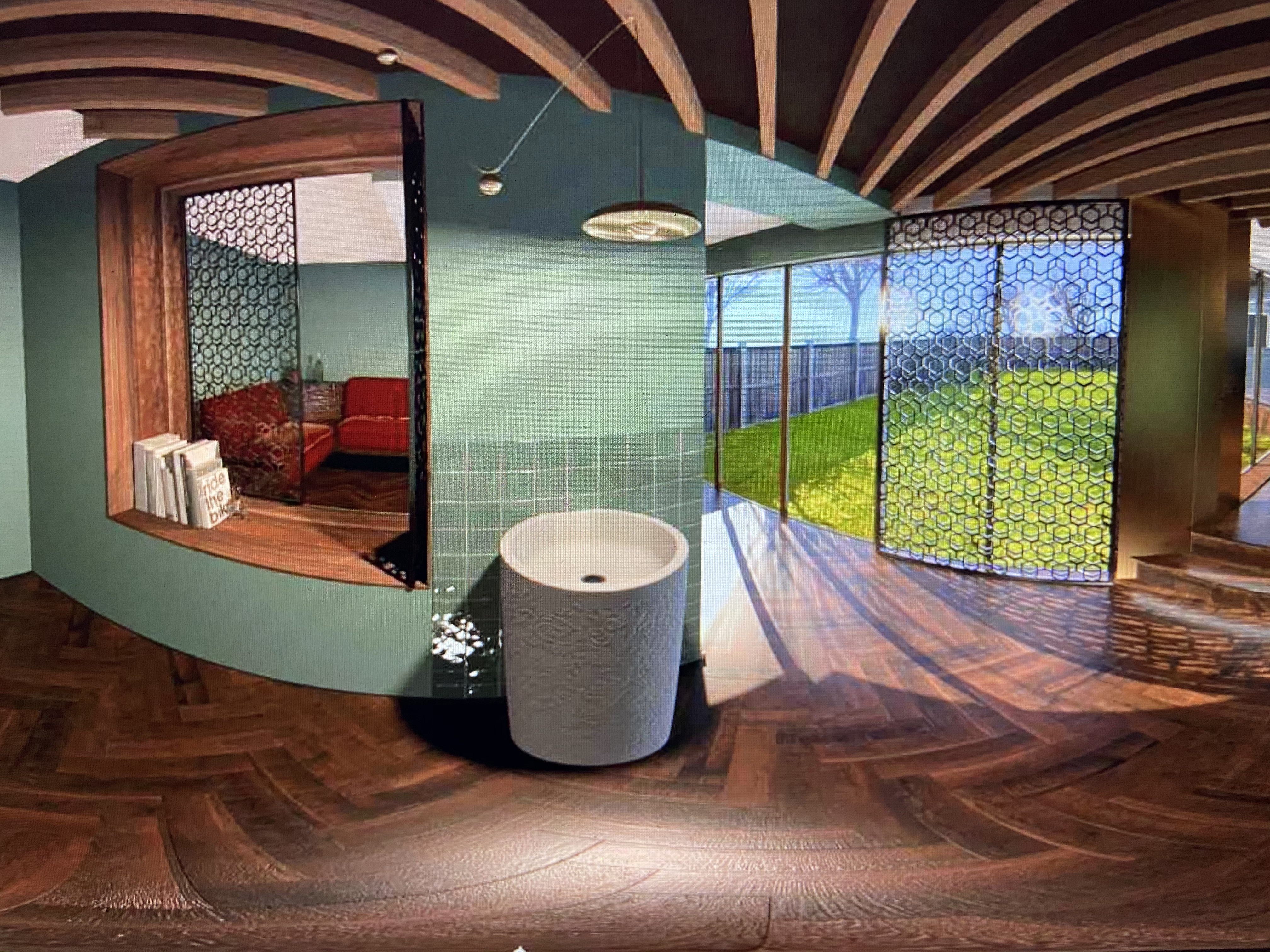
The original VR, seen below, featured lots of warm toned timber, which Yehuda and Naomi were keen to bring into the final finishes chosen. Builds are Very Expensive Things and often what is first desired as a finish can’t always be afforded when all the elements are totted up and the build is progressing, with all it’s hiccups and variations. They are inevitable. On every build.
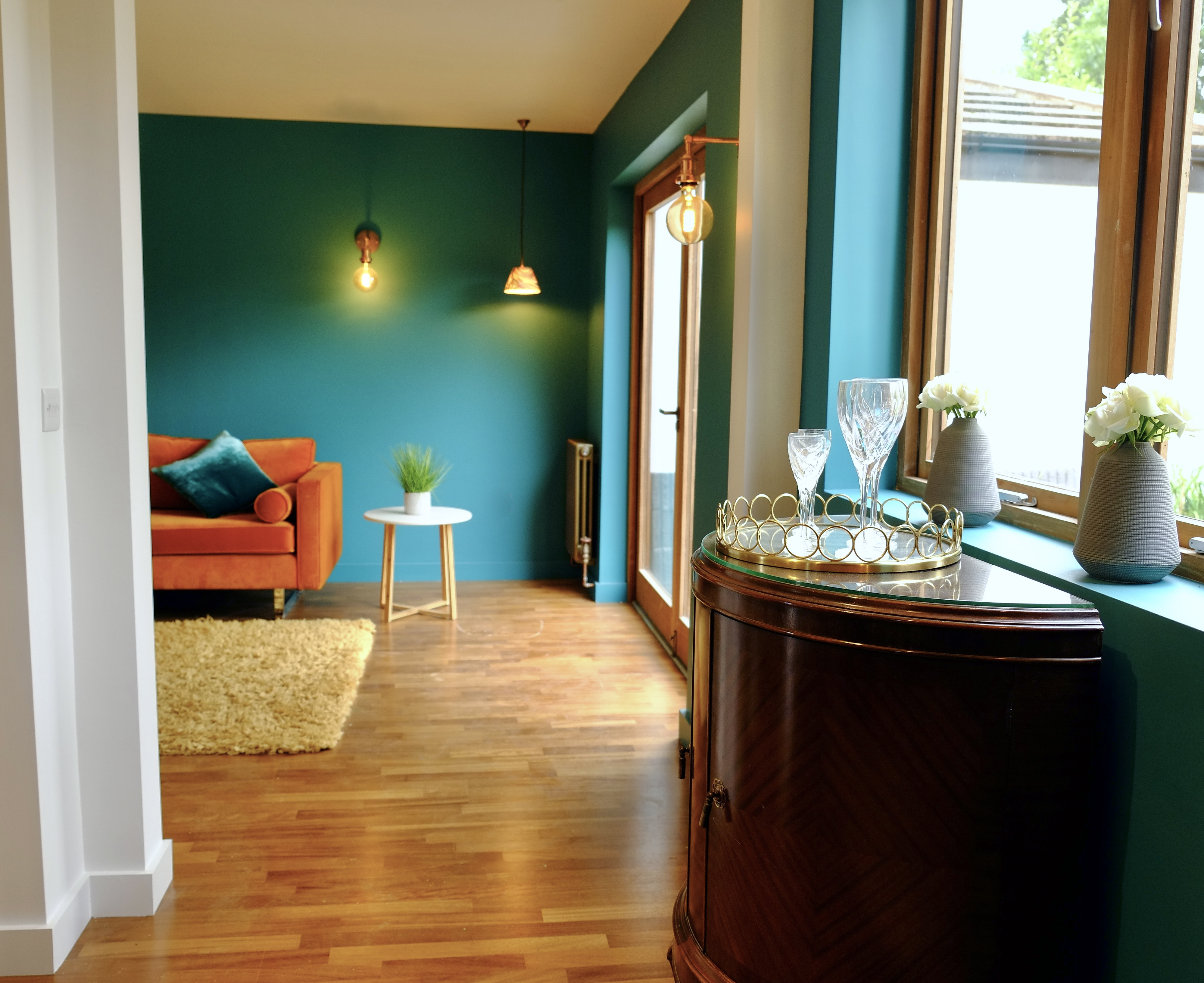
Iroko is a rich tropical wood, able to be used both indoors and out due to it’s high oil content. The actual timber can vary widely in shade and tone, and from almost yellow to deep brown. We sourced a good quality Kahrs engineered wood floor for whole of the original house which you can see it in the withdrawing room below. Top tip – contact companies for end of line bargains, you can often get top quality floors for a fraction of their original price. We found this floor at Flooring Supplies, who gave us great advice throughout and stored the floor ’til we needed it – thanks guys!!
The external doors and windows were also made bespoke in Iroko by a fantastic joinery firm in Manchester called Jackson’s Joinery. Speak to Tommy if you call them and tell him Si sent you 😉 I don’t have any fantastic images of the iroko frames here as they’ve yet to be oiled and protected but if you look on our Brighton build HERE there are some clearer shots of more of Tommy’s work.
(PS He doesn’t give me any kickbacks, he’s just a pal!)

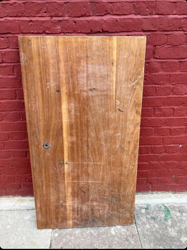
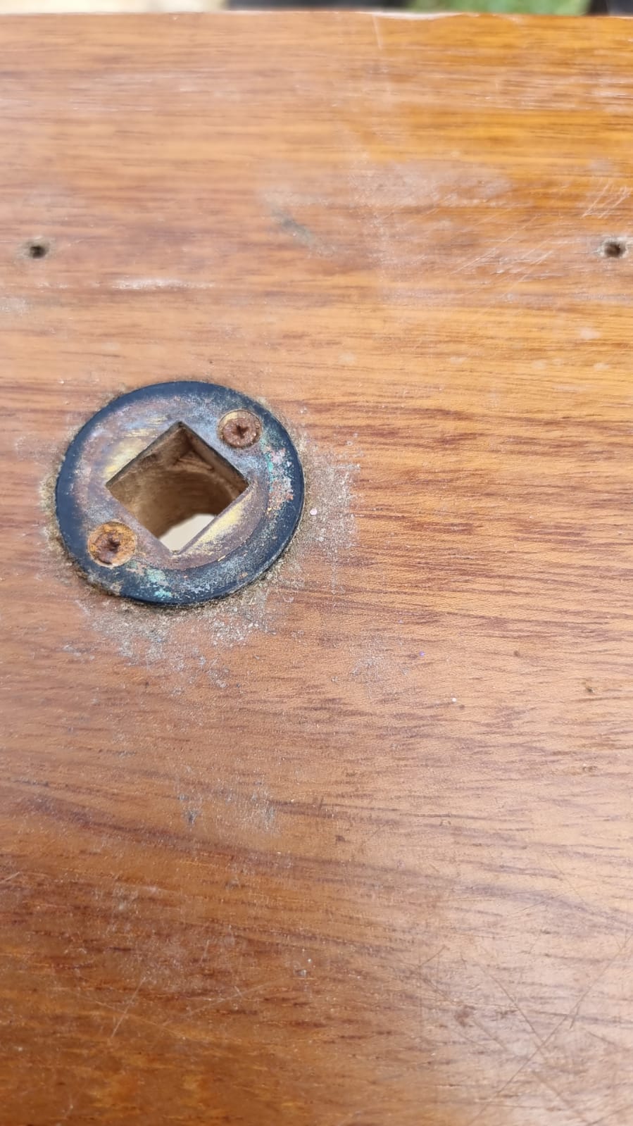
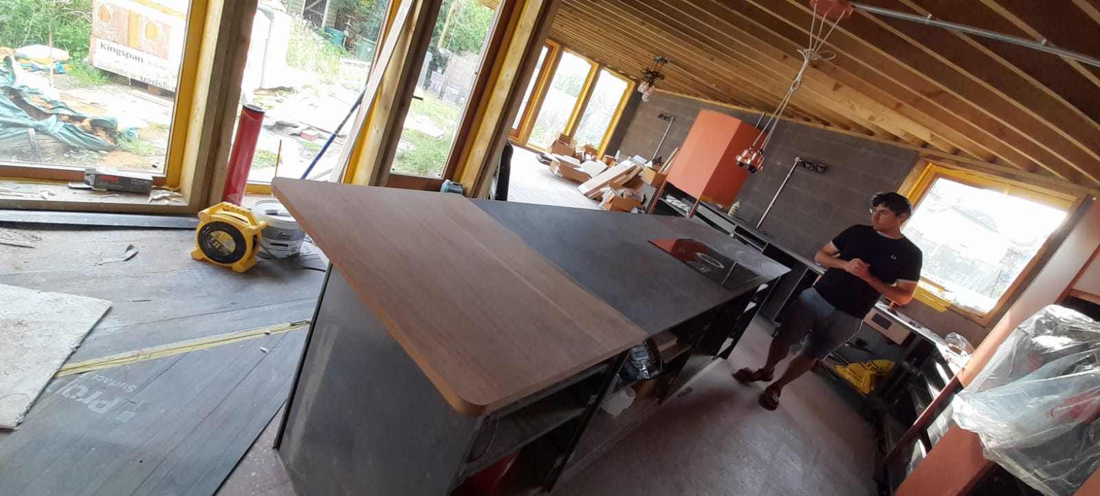
There was also another rather wonderful place where some Iroko sneaked in, did you spot it? At the end of the huge island, and we’ll get onto that in a second, sits a beautiful piece of solid Iroko reclaimed from an old school chemistry lab, found on Ebay and cut to size on site. It doesn’t matter if you have worktop sections at different heights these days, it’s quite the thing now.
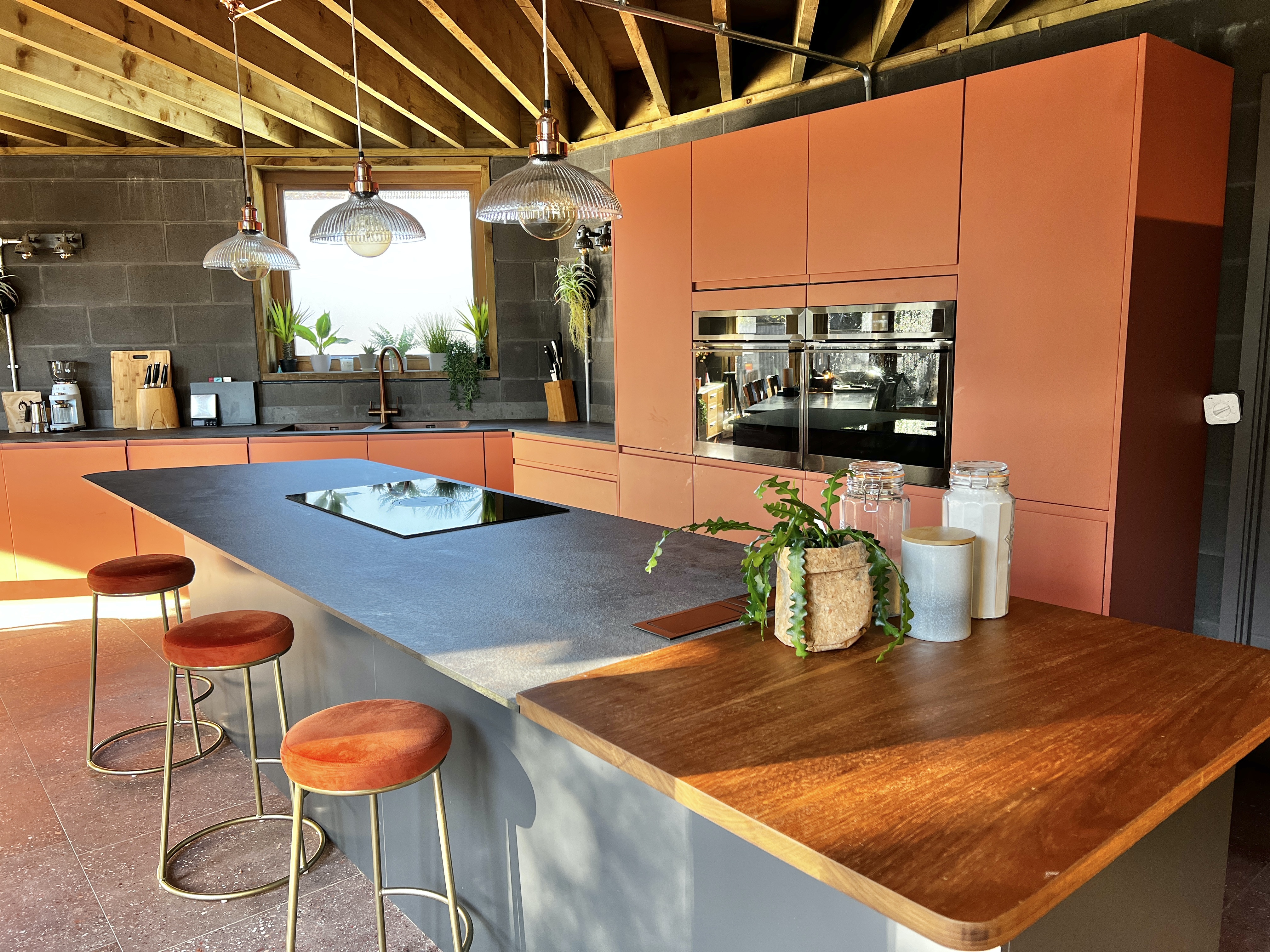
Designing in salvaged pieces like this to your build adds a sense of soul and character, a uniqueness which can’t be replicated when buying new. Look at how it looked on Ebay compared to the finished worktop – incredible!
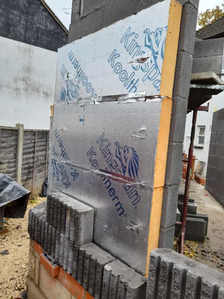
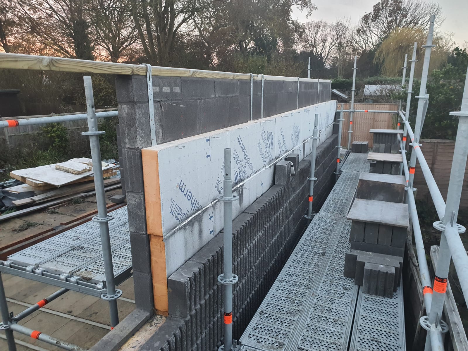
Wonderfully Warm Insulation
Can we just have a moment for something super practical please? Look I know Building Regs say we all have to buy a zillion quids worth of insulation to our Renos now but honestly, would we be without it? Especially as all our fuel bills are soon going to be quadrupling or whatever the latest ‘rupling is. Yehuda and Naomi’s house was absolutely freezing before this work, an uninsulated concrete 1950’s freezer box ensuring blue toes and shivering children. There’s Kingspan in the walls, under the floor and in the ceiling, there’s double glazing to every door and window, insulated floor panels under the iroko engineered board and new loft insulation. If this family don’t strip naked every time they walk through the front door, there’s no justice in the world!


Worktop Goals
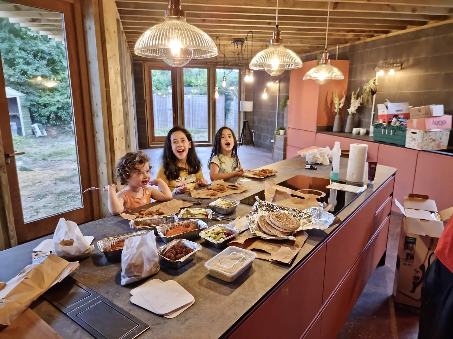
You have no idea how many worktop samples were cast aside before we arrive at the perfect one: the one which worked with the grey blocks and terrapotta doors, the one which had texture, the one which wasn’t too shiny, the one which could be 3m long, the one which wasn’t 40mm deep – crikey, so many variables. I could show you a super slick image of a clear and brochure ready worktop but this, this is a kitchen. This is life happening right here on a worktop and I’m here for it. A trio of gorgeous girls, a takeaway and pure joy at being in their home.
I’d actually specified the Zenith before, a superb compact laminate worktop by Wilson Art which is as strong as an ox, super slim, beautifully textured and cuts on site – that’s a lot of boxes ticked right there. But we still went through the process of looking at lots of samples on the market to find the best one with the Colinwood blocks. Look below – which one would you have chosen?
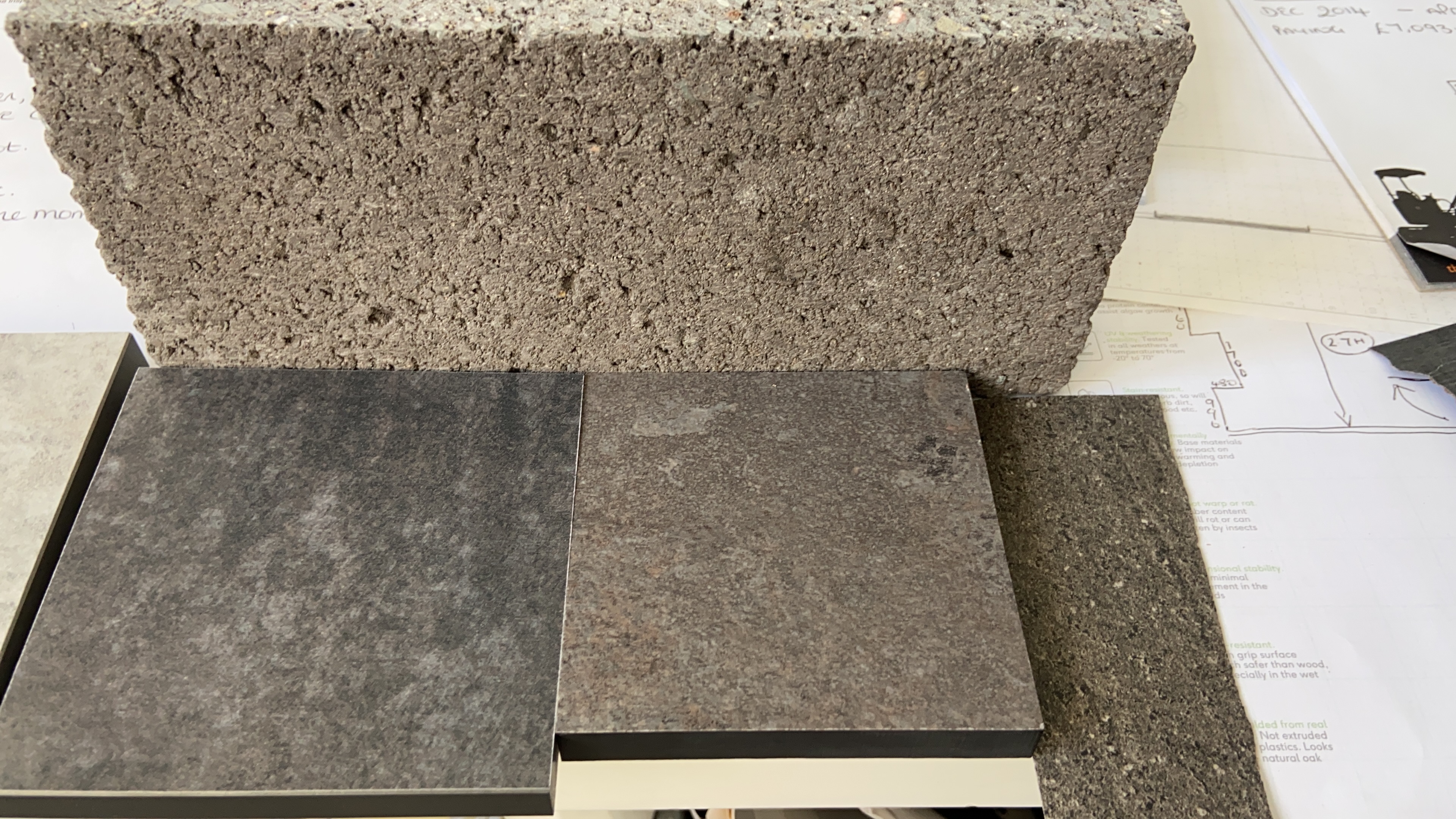

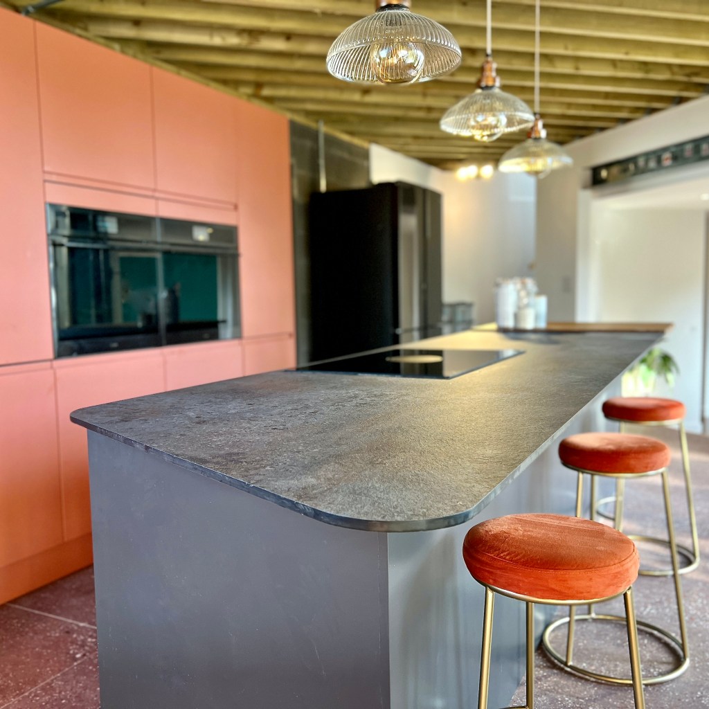
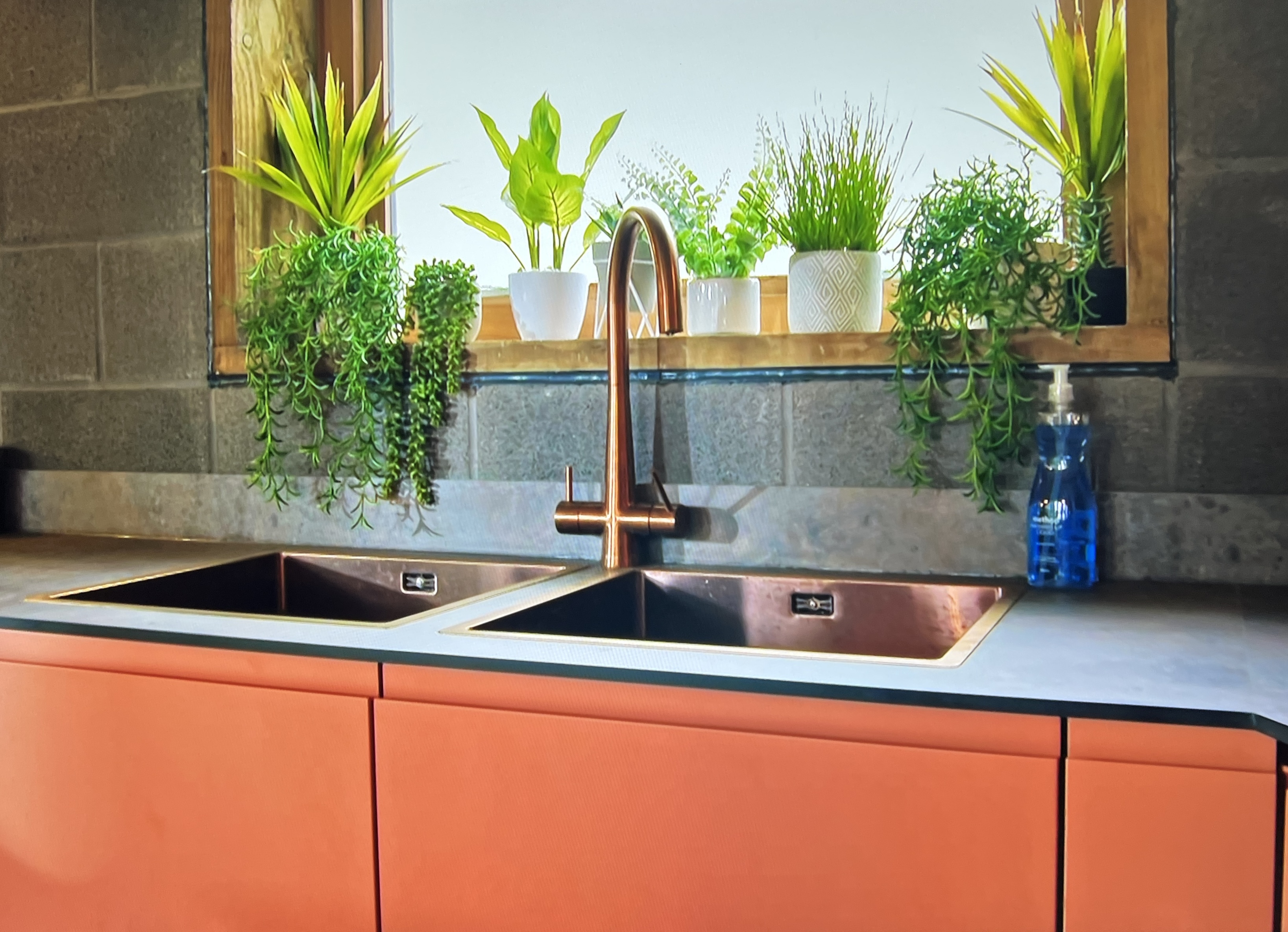
Not only did the Caldeira fly like a dream against the grey but it’s also superb with copper so the drop in sinks and Puriti filter tap from Caple (called MODE45 if you’re looking for one) just fell into place design wise. Yehuda wanted copper, and copper he got! Looks wicked with the wooden chopping boards and washing up #keepingitreal
The Hob of Dreams
I want this hob. I’m not even kidding. I want this hob. Robert’s pine C24 beamed ceiling meant a suspended extractor was just not an option so a ducting hob needed to be specified for the island, which is where the family want to cook.

Ducting hobs can be recirculated or vented to outside and these new one ones are just SO much better than ever before. Ducting in the middle works better than the rise up ones you can get at the rear of hobs, kinda makes sense really doesn’t it? Be mindful that Building Regs says 10m of ducting to get outside, & you lose 1m for every sweeping bend. A good kitchen fitter will see you right.
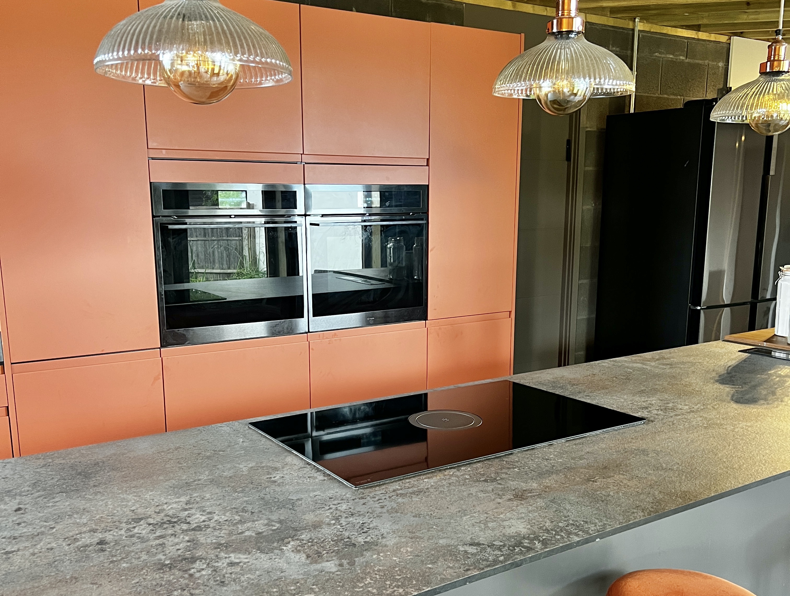
It’s the Elica Nikolastesla Switch and is it something to save up for kids. I am doing just that right now for my kitchen. Mind you, when you factor in buying a fancy hob and separate extractor, it does mount up, so for the clean lines of no overhead sight line blockage from ugly boxing off or an unwanted extraction units… some things are just worth paying for.
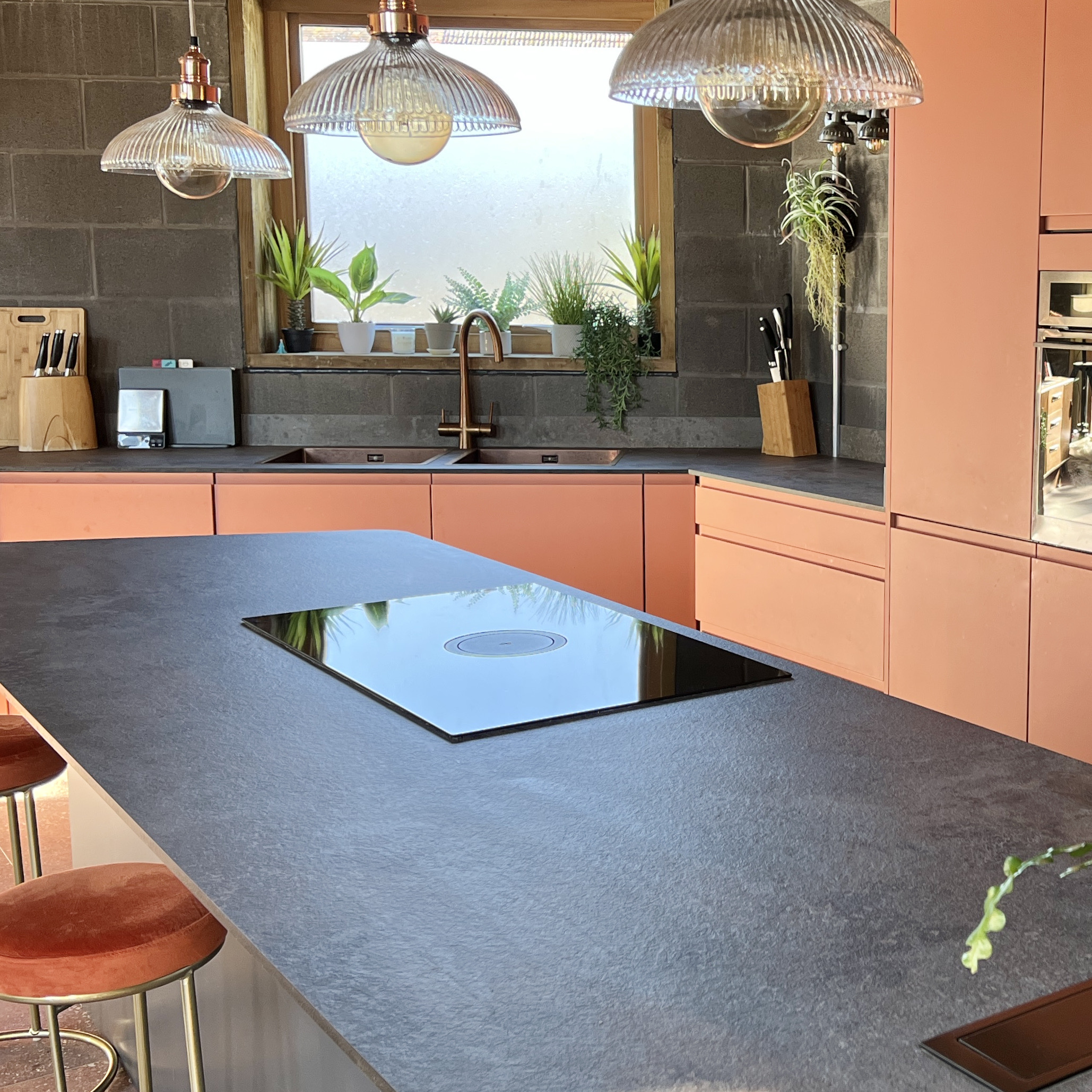
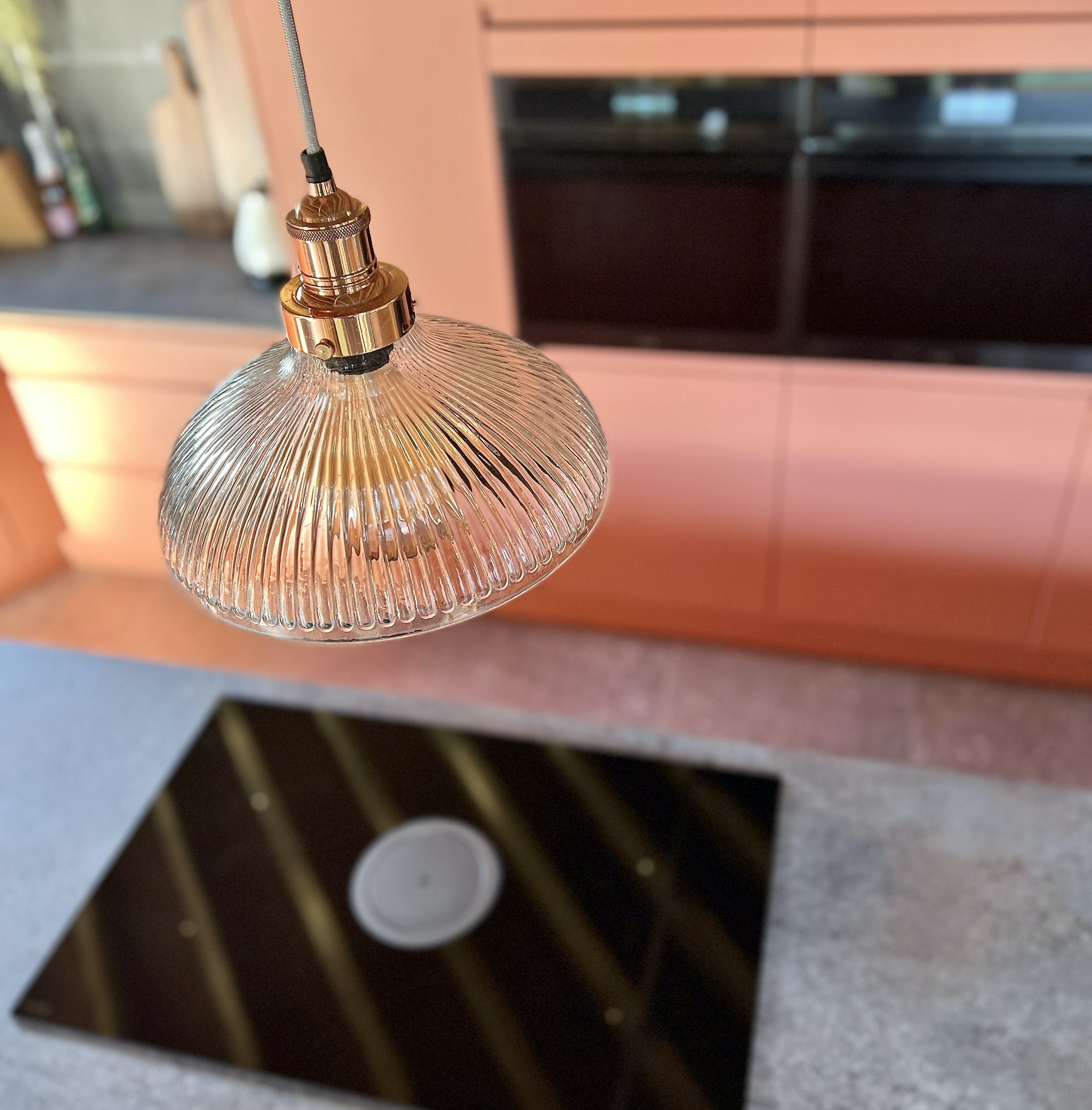
Industrial Lighting
Long time readers of the Moregeous blog will know I’ve specified Industville lighting many times before over the years and have never been disappointed in the quality or service provided by this company specialising in the kind of soft industrial lighting perfect for Yehuda and Naomi’s new home.
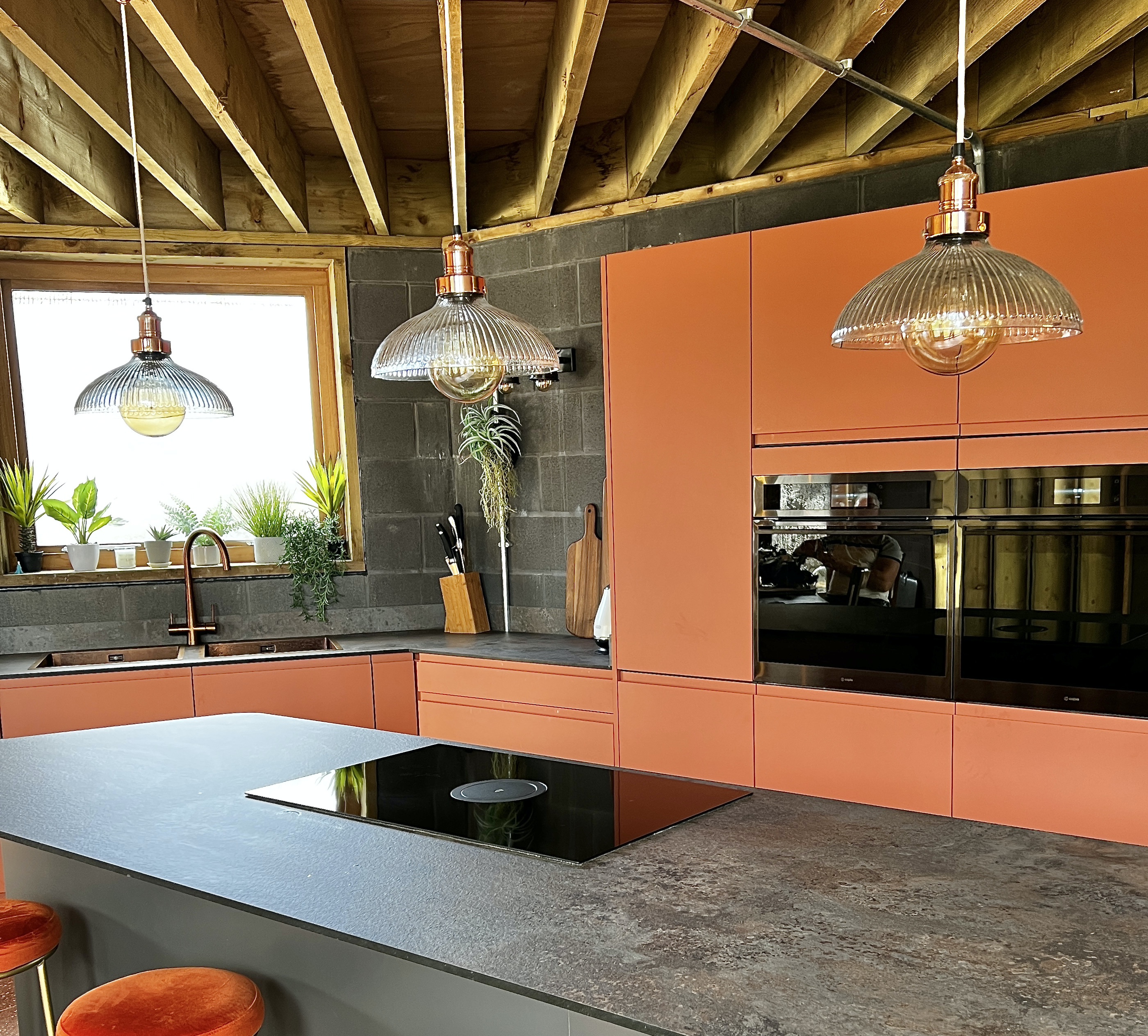
They wanted the lighting to soften the potentially ‘hard’ feeling scheme, choosing prismatic glass shades over the island, a large spider light for the dining area, double headed pewter walls lights for the kitchen and three exposed lamp copper fittings in the withdrawing room. I wasn’t a big fan of the overly prominent galvanised trunking and the way the electricians ran is across the beams instead of tucked up between them, this missed a design trick for me, and is what I would recommend to others with the same style of ceiling.

It’s a super tricky thing – “the build is the finish” – and though it sounds like it should be cheap and easy, it really isn’t and don’t let anyone tell you otherwise. Maybe it is if you are the architect doing your own build, or are massively hands on and very design savvy, but most homeowners simply aren’t. They have to trust their trades to execute drawings which may be short on detail or to execute designs modified due to surprises on site. When this happens, if there isn’t a practically minded, design-brain on site then decisions get made by trades which can make or break a scheme.
Bronzelicious Bathroom and Radiators
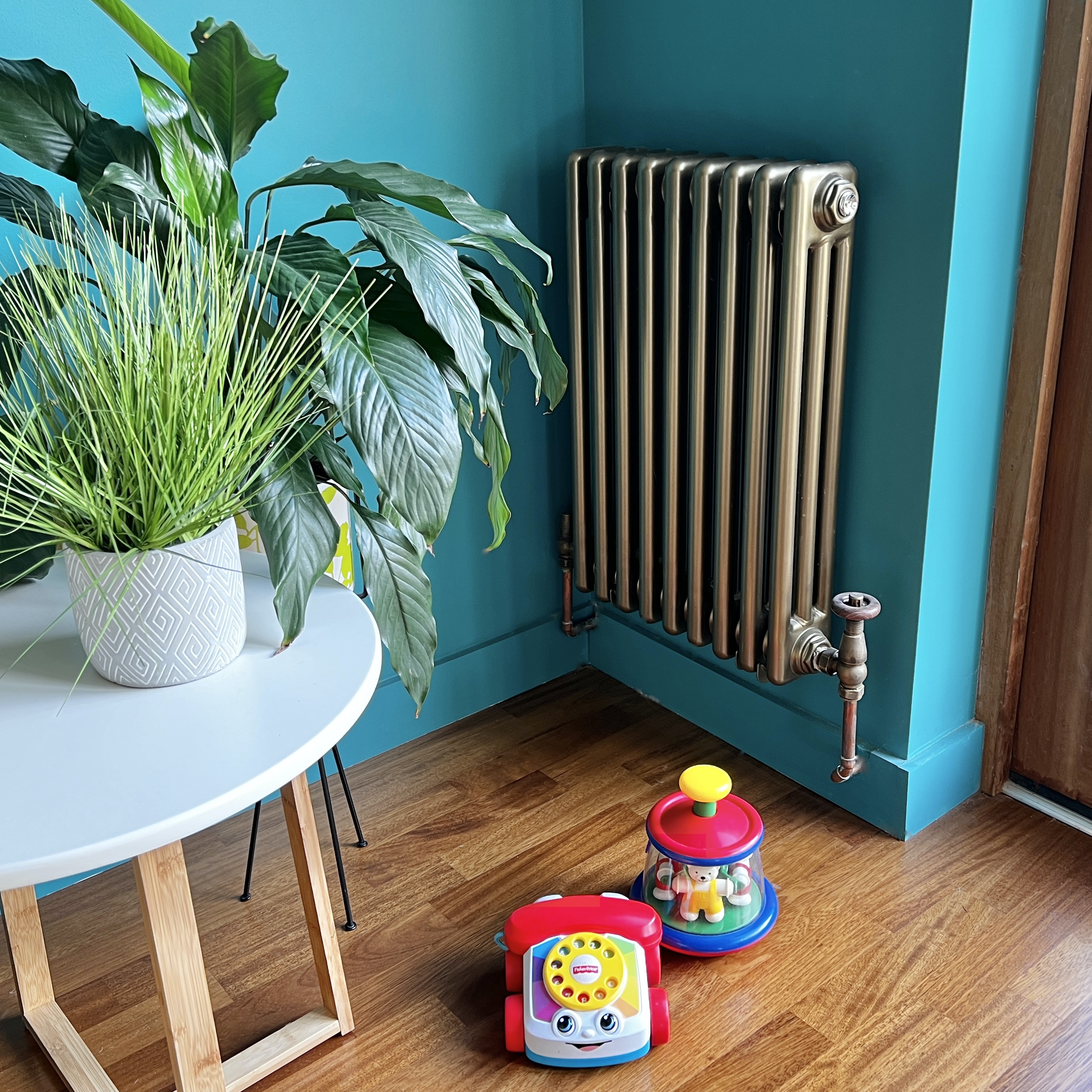
These items shouldn’t really be last on the list at all, but unfortunately something has to be so let’s go with we’re saving the best til shall we?! Any build is only ever as good as the finishes overlaid onto it’s bones, whether it’s ‘the build is the finish’ with oodles of raw materials or ‘isn’t the finish spectacular’ with lots of wonderful products covering the building materials. Although Yehuda and Naomi have UFH throughout the kitchen extension, radiators are still needed in both the existing house and at the transitional areas – plain white rads just didn’t cut the mustard. We sourced some Windsor metallic bronze radiators from the Best Heating UK and they work brilliantly. I’ve used these on other client jobs too and everyone has always been delighted with them.
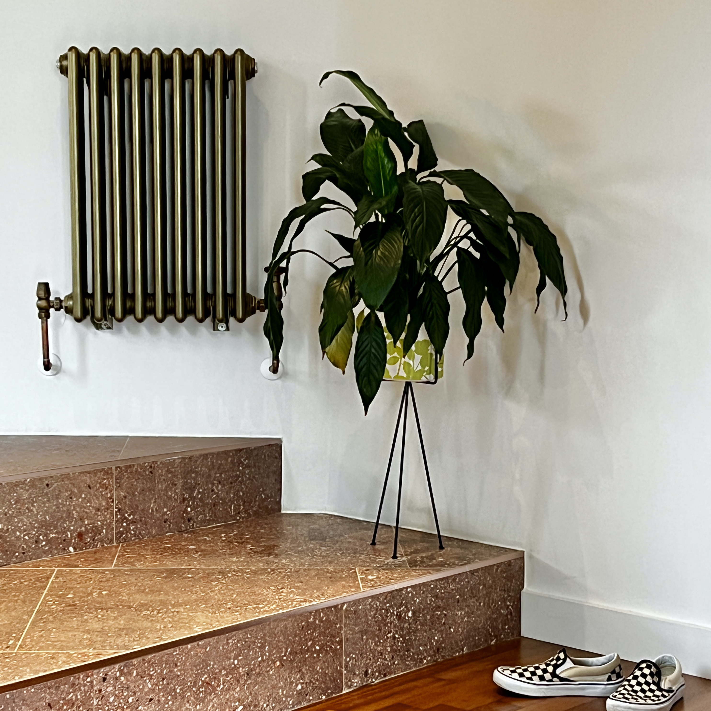
Lots of different sizes, ranging from extra skinny to super high, something for every radiator requirement.
Not only did the rads wing their way to us from the Best Heating but their sister site The Big Bathroom Shop came up trumps with bronze bathroom fittings, shower and taps, a range called Milano Elizabeth. The brushed metallic finish is just lovely against the Verdigris and Carnaby Sunset tiles. Affordable design, well priced and good quality. Super job Big Bathroom Shop!

So there we go, a little run down of some of the finishes used on Yehuda and Naomi’s build / renovation. Marvellous companies and products, super helpful whenever we needed assistance to help to create a home which this family adore. Thanks so much to everyone who helped on this complex and challenging project, for me it was a constant learning curve and one which will keep sparking those Ah-Remember-When moments for years to come. Every day is a lesson, every renovation brings something new to get to grips with, but great relationships with professional suppliers make the process easier every single time. You know who you are, big love, Sian x

Super project and an awesome article!
Hey, this is awesome work. Loved all of it – split faced blocks, rust and the teal color combination, bathroom tiles, everything.