An email from Global Colour popped up in my in-box last night, making me smile as just yesterday I was salivating over a new Ikea kitchen door in a metallic copper finish…..
Article : Justine Fox, colour expert at Global Color Research™, presents the colour of the month, helping you to understand how colour psychology affects trends. This month she looks at the undeniable potential of copper. ‘I have a feeling we will be seeing a great deal of copper as a replacement for all things gold over the coming months. We previewed this warm metal in Midas (Mix Trends Spring/Summer 2010) and talked about the way copper tempered the ostentation of its 24 carat sibling, giving a richness in a more subtle, low key way that works well for the current mood in the market.
Copper of course is a chemical element; a ductile metal much favoured in building and decorative design over the centuries. For our purposes here we are talking about copper in its freshly mined state; a pinky orange that is soft and seductive. When exposed to the elements, oxidization causes the metal to go a distinctive green-blue, co-incidentally another favourite shade for this summer. In terms of colour psychology, it makes sense to group responses to copper under the banner of orange, which, especially with hints of peach, is soothing and friendly. While this colour still denotes energy, there is less aggression than with its sister colour red, but it remains a stimulant, making it perfect for communal spaces.
We are already seeing copper on the market; Bestlite has used it to reappraise one of its classic designs, while cult Story hotel in Stockholm (pictured) is ahead of the pack with its copper washroom fittings. Copper, it seems, is going to be big news. End article
Well, I’m quite delighted, because these are a few of the items dotted around my house at the moment, just waiting for the big refurb this summer:
My copper clock, waiting patiently as the minutes tick away until our house is finished….

My little Ikea light, twinkling away against a wall which is so NOT designed for such a splendid metallic, but she knows that soon her prints will come – feel free to groan at very bad joke 🙂

One of the slender copper candlesticks Habitat featured a couple of years ago – I snapped up several in the half price sale, reduced ’cause copper wasn’t trending yet 😉

And last but by no means least my lovely little copper priting block picked up for just £3 at this weekends Vintage Fabric and Antiques Fair in Manchester, how cute is he?

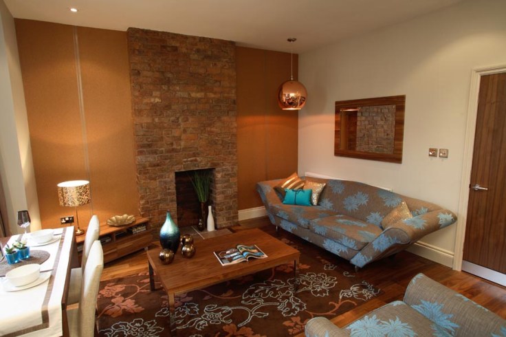
OK guys, I’m going to show off now and post a couple of images of a scheme of rental apartments I finished early in 2008, using a scheme of limestone, walnut and yes, you guessed it, copper.
The living room below featured the Tom Dixon copper ball light, you may think this is rather excessive at £280 for a rental, but it was picked up in Heals for £80 as it didn’t have a flex (got one in B&Q!). The copper metallic cushion was B&Q and the baroque patterned light Habitat. It’s hard to see the texture on the wallpaper but it’s absolutely gorgeous, like a flat glitter which catches the light, by Brian Yates and called Ulf Pearl 76859 range.

The bedroom below was quite compact and the Victorian property had been stripped of all of it’s original features. I stripped back some of the walls back to the bare brick and used the Brain Yates Ulf Pearl 76809 baroque style copper paper, with glass beading forming the pattern, to add glamour.


So, never mind colour of the month, back in 2007/08 I was a bit of a copper freak, and nothing’s changed, on reflection, copper might be my colour of the decade! And now the rest of the world’s catching up 🙂
I am DYING to use the Ikea copper kitchen in a kitchen this summer, I’m thinking white gloss units, copper doors and zebrano or walnut tops, bring it on!!

Beautiful! Love the Tom Dixon light, looks great in that colour scheme. Though personally I much prefer his mirror balls.
http://www.chaplins.co.uk/modern-furniture-product-search.html
Thanks so much, I love it too! I also am rather partial to Tom’s mirrored balls 🙂