
I had a completely brilliant time at London Design Festival 2016, sourcing, exploring and getting inspiration for both work and for the final decisions on our interior design here at home. Three solid days of non-stop design is a brain overload of fabulousness in anyone’s book, but then again, don’t I say that every year?
Several ‘trends’ were noticeable and if I’ve gained something from past experience, it’s that what’s spotted at LDF will soon be the focus of interiors magazines and the high street. A clear front runner on the ‘seen everywhere’ list was blue of every hue. From cobalts to navy, cerulean to sapphire, this was most certainly the colour of the week, in terms of amount of use anyway.
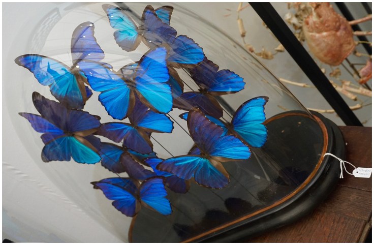
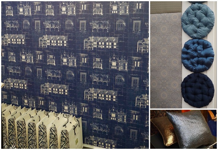
Everyone’s waxing lyrical about navy with white marble / kitchen cabinetry right now, but the LDF16 instructions are that every shade is A-OK. On everything from wallpaper to butterflies, you simply can’t go wrong….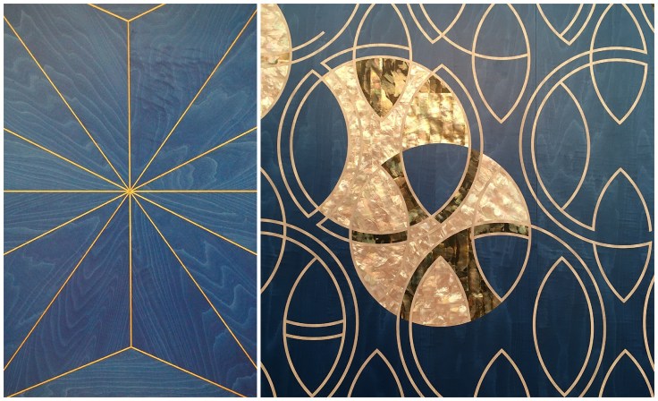 Stunning marquetry inlaid with brass caught my eye and whether the material is elegantly stained timber as above or unapologetically dramatic wallpaper like the Blackpop design below, there’s a perfection in marrying blues with golden tones.
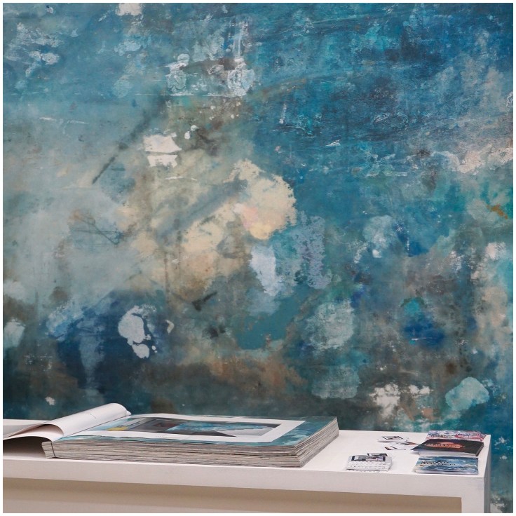 Watercolour effects and washes of seascape shades look amazing when applied boldly on both large wall areas and individually upholstered pieces, above and below.


Hmmmm, interesting…. could mahogany / rosewood timbers be making a comeback? Looked rather marvellous when teamed by Bert & Frank with blue and brass, a clear fav designer combo this year.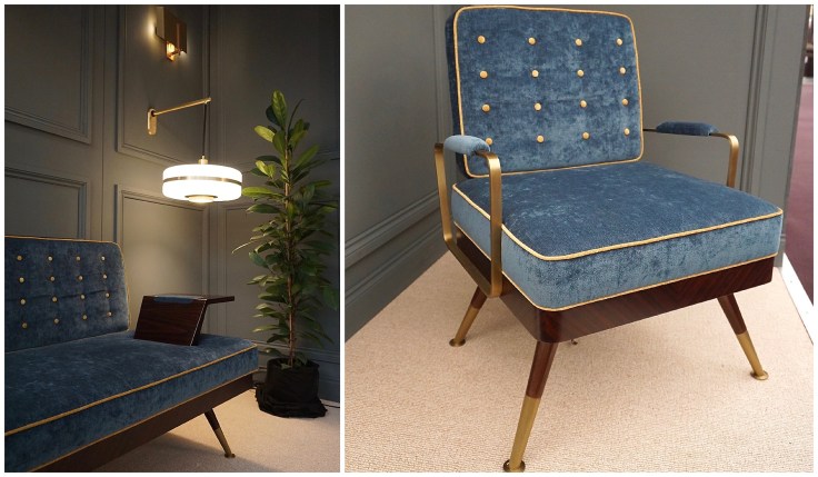 A pale shades of blue was given a 2016 twist by Kirkby Design, luxuriously quilted with hexagons. I need this fabric in my life. Need.
 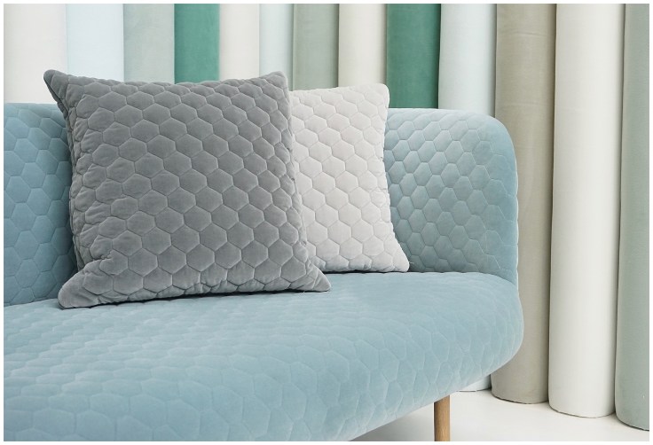 Even the more inspirational and less practical pieces like the two installations below, one a fabric weave as wall art and one a mosaic tile expanse, dived headlong into the most popular colour of this season.


I adore these fold boxes, snappily different and as Winter 2016 as all the crisply pleated skirts worn by the bright young PR things milling around the press hubs.
 More blue, and more blue, and more blue!
I love the new season quirky polar bear Andrew Martin fabric, though on close inspection it is a little unsettling. All those eyes, staring at you…..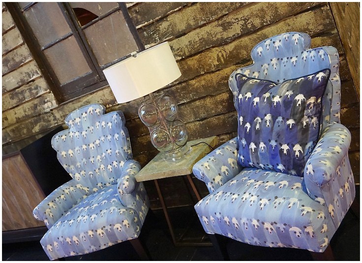 Sebastian Cox and Pinch Designs had their own superlatively crafted take on the theme. How spectacular is the timber work on this bench seating and the distressed elegance of the fabric on the Pinch sofa? To die for.


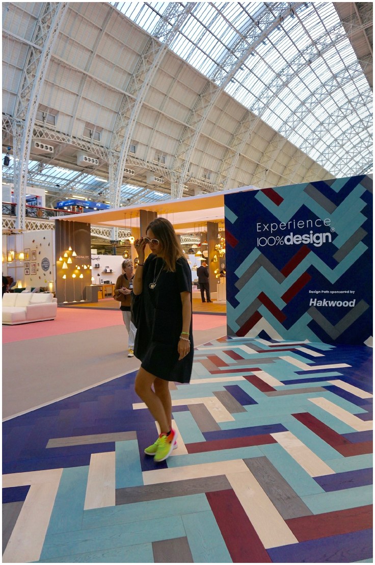
From simple office style to mid-century modern, no chair was complete if it didn’t make a splash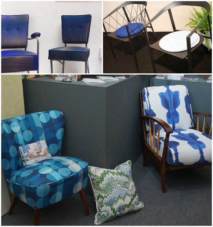 Listen, if you still don’t believe me, check out the 100% Design entrance and chill out installations….. yep you guess it, they’re all googling how to decorate using blue.
Or maybe they’re checking their Tinder, so they won’t ever be sad and lonely and er, yep, you’re way ahead of me.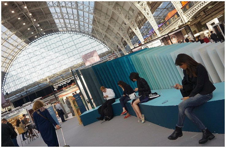
 Of course, no-one chooses a colour just because it’s ‘on trend’. That would be slavish and sad, but with so many shades across the spectrum, blue is an amazing colour to work with and it seems you can make it your own by mixing it with, well, almost anything.
I’m tempted, I really am. Maybe a naughty navy… or a tempting teal. Watch this space 😉
