
Oh, the dilemmas cause by the combination of a reno to finish and the love of a damn good paint colour. You know the score if you’re an interiors addict who’s embarked upon a renovation of your own or let’s face it, just a simple room makeover. Costs spiral and budgets shoot up faster than a Friday night Prosecco cork. Anyone in the know is yearning for Stiffly Blue and Yeabridge Green but here’s the painful truth: Farrow & Ball paint is more expensive than other brands like Valspar or Dulux. The questions I see popping up over and over again on Instagram, in forums and in blogs – “Is it worth it?” and “Can it be copied?” As background for you, I’ve been decorating properties for over 20yrs, both for myself and clients, and for those with regular budgets and higher than average ones. The Moregeous paint brushes have been dipped into most high street paint brands, plus into Farrow & Ball and also into ‘copies’ of the aforementioned. You know what I’m talking about right? It’s not a secret anymore that independent and DIY store paint-mixing services will ‘copy’ F&B colours into their brand of paint et voila! – who needs to buy F&B if the budget won’t stretch to it. Why buy Alaskan Dead Salmon when you can have Farmed Dead Salmon eh?
Only that’s just it. They’re not identical. In the same way that the rich, muscular red of icy sea salmon doesn’t really compare to the slightly greasy and flaccid pink farmed stuff, the deep pigments of F&B cannot be cheaply, easily or exactly copied. The simple fact is that this brand of paint is very good quality, with less water and more pigments in it than cheaper paint on the market.
This past few weeks we’ve been decorating a guest bedroom and the main bathroom here at Moregeous Mansions. As the house will be used for events and location shoots, I’m keen to make the interior something special but I don’t have an endless pot of money. I haven’t been able to grow one of the Government’s magic Money Trees. Many of our walls are Dulux Super Matt white offset by outrageously lush wallpaper, but where there is colour (well, I say colour, but mostly I mean black and grey), it’s deep and dramatic. Much of the outside is F&B’s Railings, with Pitch Black for some of the internal window frames and main bathroom, and a splash of Pavilion Grey in the guest bedroom. So far so costly. Mr M went mad when we estimated the final amounts as it’s a Edwardian house with high ceilings and large rooms! To save a bit of cash, I decided to do some cheatin’ and have copies as the undercoats.
On the exterior fence woodwork I used a grey primer & undercoat, then the F&B copy colour, then the F&B ‘real’ colour. For anyone only doing a small amount of painting and wanting the real McCoy, it’s far better to use two coats of the real thing, but I have metres and metres and metres to do here. I simply cannot afford F&B all the way. This top coat method is a way of getting F&B colour on a large reno without breaking my budget. Who am I kidding, my budget is already smashed to smithereens but you know what I mean. Breaking it *even* more.
This sort-of-cheating has worked well for us outside with all the fence panels and garden trellis.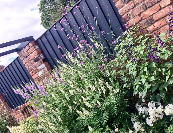 And so to inside. On the guest bedroom ceiling, coving and walls, I first used a white, water based, bare plaster paint, then a coat of the F&B Pavilion Grey copy. The original is a classic mid-grey described as “reminiscent of an elegant 18th century Swedish colour” and perfect with my Designers Guild wallpaper. I decided to do a little experiment and painted about 1/3 of the ceiling with a second coat of the copy and the rest with the real stuff, wandering off to do something else whilst it dried.
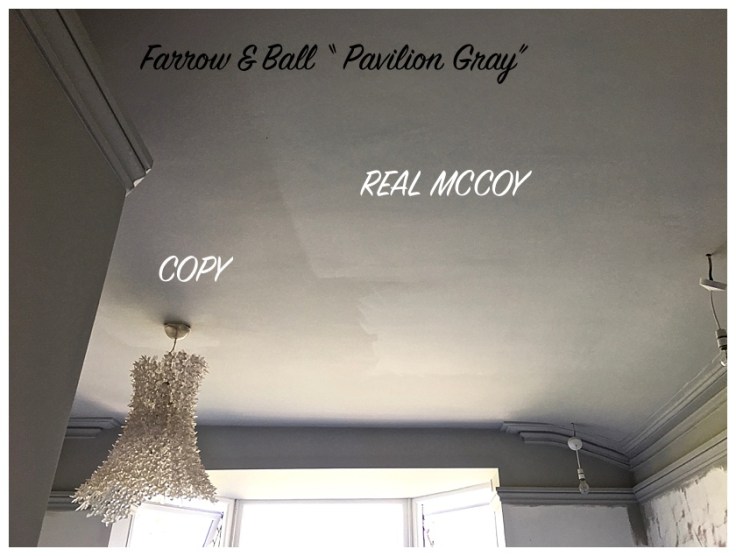 Blimey, what a surprise when I returned. I didn’t actually expect there to be much of difference on such a neutral colour and assumed the contrast would be much more subtle. In the image above both paints are dry, even though the F&B on the right looks wet. It wasn’t ‘shiny’ in real life, just much more luminescent, bouncing the light around beautifully. Whereas the copy, well, didn’t. It was flat and unappealing when compared to the real thing, even though beforehand it’d looked perfectly acceptable, quite nice even. Like farmed salmon does, before you taste wild.
Plus, I made a little video which sums up my findings:
I was genuinely taken aback. That there was such a huge difference in the real stuff and the copies, with the copies looking so washed out in comparison.
Nothing changes the fact that Farrow & Ball is more costly than regular paint but there is a huge difference between the genuine article and the copies available through mixing services. Please don’t let anyone tell you otherwise. I’ve read some very arsey forums posts from decorators saying Dulux and Crown copies are just as good as the real thing. Nonsense. They might be good paints, but they will not be ‘copies’, either in colour or finish. Some people say F&B isn’t as durable as other paints designed specifically to be hard wearing, Dulux Endurance for eg., and that’s as maybe. If you need that finish, I’d suggest buying a Dulux Endurance paint and associated colour. Mylands are also a smashing brand for tough paint, they use it on film sets, dontcha know.
In conclusion, if you know you can’t afford this brand, my advice would be…
- Don’t get a sad pastiche.
- Choose a fabulous colour from a different, more affordable range and love it for what it is.
- Or save up some pennies.
- Or cut your budget elsewhere to afford the real thing.
Would you wear a saddo snidey Rolex or a pair of fake Choo’s? No, course you wouldn’t, so don’t do it with paint.
Upside of The Copies:
- Cheaper.
- Overall similar colour.
- You can tell your pals you’ve used a F&B colour and most won’t know the difference.
- You could use a copy as the base coat if you’ve a large area to do. F&B probably won’t like me saying that, but I don’t work for them and this isn’t a sponsored post!
Downside of The Copies:
- They are not the same colour: less rich, less pigmented and less vibrancy.
- Cheaper paints are more prone to fade and change colour over time.
- Try paint matching to a F&B copy in a couple of years – good luck with that.
- It’s almost impossible to get an identical wood paint if you’re going for a complete floor to ceiling look.
- They’re just that, copies. And who wants copies right?
I hope that’s been helpful if you’re in a paint dilemma as to what to do and please feel free to fire any questions my way x

Thankyou for this post. It confirms my own “research” and is more evidence for my husband that F&B is the way to go. I fell in love with Shaded White for our hallway, so my husband to save money had it colour matched. I then painted the wall with half of each and the difference was huge in our sometimes bright, sometimes gloomy hall. The paint match looked an entirely different colour at different times in the day and definitely lacked the luminosity of F&B.
Thanks for commenting Sara, that’s so interesting to read. Even the ‘Whites’ are different. I’m not trying to persuade everyone to buy F&B, just show copies aren’t, well, copies! X
My decorator (he has 20+ years of experience and 10years with my family in one way or another) tried to encourage me away from F&B for my living room and I didn’t want to due to the pigment level in the colours. He has used it over the years and every time comments how he doesn’t like the way it goes on. I’m pleased with the F&B colours I chose for my living room (Peignoir and Stiffkey Blue) and the Peignoir in particular is a lovely soft grey-pink colour that I’m not sure could have been replicated. However, the struggles he had applying and the amount of times he cursed me(!) it has convinced me to go with different products for the rest of my house. It took 3 coats of Peignoir over a freshly miscoated wall, and 4 of the Stiffkey and every little bump or knock or cutting in would show up. I was disappointed with the way I saw it go up and the marks I could see even after 3 coats of the blue. I’m happy with the colours but equally happy to move away from the being part of the trendy F&B crowd 🙂 and go back to good old Dulux. I do love your idea for a cheaper, darker undercoat for the darker F&B colours, I wish I’d thought of that, it might have saved us some hassle!
Sorry, bit late reading this but it’s really interesting to see the difference. I like the idea of using a copy as the first coat with F&B on top if you’ve got a large area. F&B always seem particular about using their undercoats, primers etc (obviously) but I think for the average house painting it would surely be hard to tell the difference? I’ve only painted our bathroom so far in Blackened and Dimpse and I love the way they look different at different times of the day, maybe you don’t get that with the copies? I would love to see more photos of your renovations, the ceiling in the bathroom looks amazing!
Hi Jill, thanks for reading and your input. F&B do excellent undercoats and primers and of course if the budget can take it, it’s always best to follow their guidance but it is a way to cope with a large area, especially on a deep colour. Their colours do look so very different at different times of the day, I like that too. More photos coming up as we get more done! Sian 🙂
Very interesting test and I completely agree that there is nothing quite like the real thing. That being said, if I walked into a room that didn’t have both a copy and the real thing on the same surface, I highly doubt I’d be able to tell a difference or care.
I think if you’re kidding yourself, and trying to kid your friends, that you have F&B when you don’t then you’ll never be happy with a copy but … if you simply like the colour and don’t mind a little variance either way then a copy makes financial sense for an average guy like me.
Hi Dave, most people wouldn’t be able to tell the difference, that’s true. It’s all down to budget at the end of the day. I’ve used copies in rentals and been happy with the result, but some copies are definitely better than others. Plus some colours are ‘easier’ to copy. However, no copy is better than the original – isn’t that true of everything in life? 😉
With a colour such as Cromarty do you think I could get away with the copy as a first coat? It is for my dining room which is 15′ x 11′. Paying for two tins of F&B breaks my heart (bank balance) xx
Hi there Rebecca. I see no reason on internal walls, when the budget is a factor, not to use a more affordable base coat. And I have done this myself. Cromarty is a very subtle colour and I’d warrant that it’s nuances when one uses the ‘real deal’ mean it’s worth buying Farrow & Ball, but using a copy to cheat the first coat is something lots of people do. Tag me in on a picture of your finished room on Instagram! x
Thanks for the advice and yes will do!! xx
Hi ,it has been interesting reading the comments on F&B paint, taking a couple of comment’s on board.
My current project involves going away from paper to bare walls. We have some reasonably expensive embossed wallpaper on at present (with only the odd corner lifting). My question, (as I like the paper) is do I strip or paint over?.The house is 30 years old and the walls are the dry lined sort, so I’m aware I could need a plasterer.I usually do my own P&D as I can be very particular, (Mrs H would say peculier). We are getting on a bit now, so I think Sue ( my wife ) is thinking of me. Love any advice.
I don’t know why your comment has only just shown up Rod, I apologise. How did you get on? I’d probably have said paint over! Sue sounds very sensible 😉
You make a good case, I’ve gone through a very similar process of consideration. As a visual artist colour is really important to me, when I paint pictures the colour needs to be vibrant and have depth, it needs to be clean and crisp. Sometimes when I can’t find the colour I need in the low cost ranges I will have to pay as much as 5x more to get the colour that I need and it’s worth it. When decorating you are living with that colour every day, it effects your mood and state of mind. Despite low funds I will end up saving for the colour that I need, it makes such a difference to how you feel in that space, and every time you walk into the room thereafter it will show how much you value yourself.
What finish would you recommend for a lounge in the Hague Blue?